Published - Thu, 30 Nov 2023

Typography
Typography is everywhere we look. It's in the books we read, on the websites we visit, even in everyday life—on street signs, bumper stickers, and product packaging.

But what exactly is typography? Simply put, typography is the style or appearance of text. It can also refer to the art of working with text—something you probably do all the time if you create documents or other projects for work, school, or yourself.
Why is Typography Important?
Typography is important for a number of reasons, from readability to aesthetics, branding, and emotions. Here are the five key elements of typograph
1. Readability
2. Aesthetics
3. Branding
4. Emotion
5. Accessibility
Common types of fonts
Typography can be an intimidating subject, but it doesn't have to be. You only need to know a little to make a big difference in the stuff you do every day. So let's get started. First, some common types of fonts and what you need to know about them.
Serif fonts
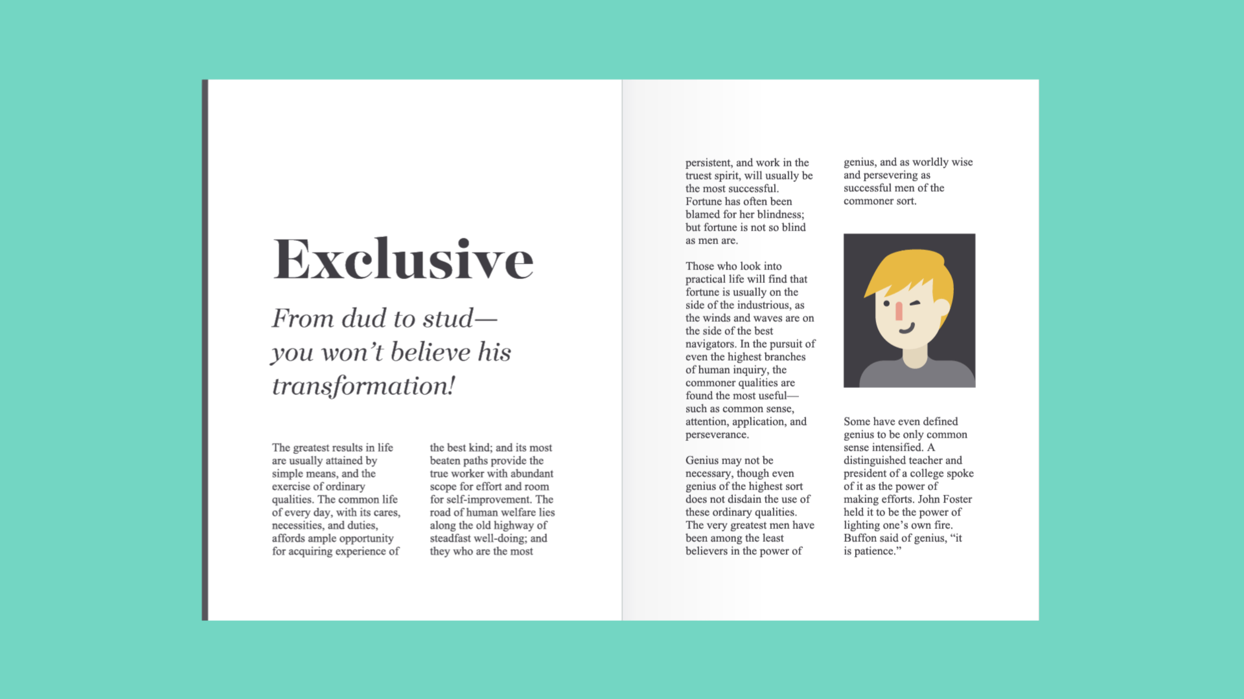
Serif fonts have little strokes called serifs attached to the main part of the letter.
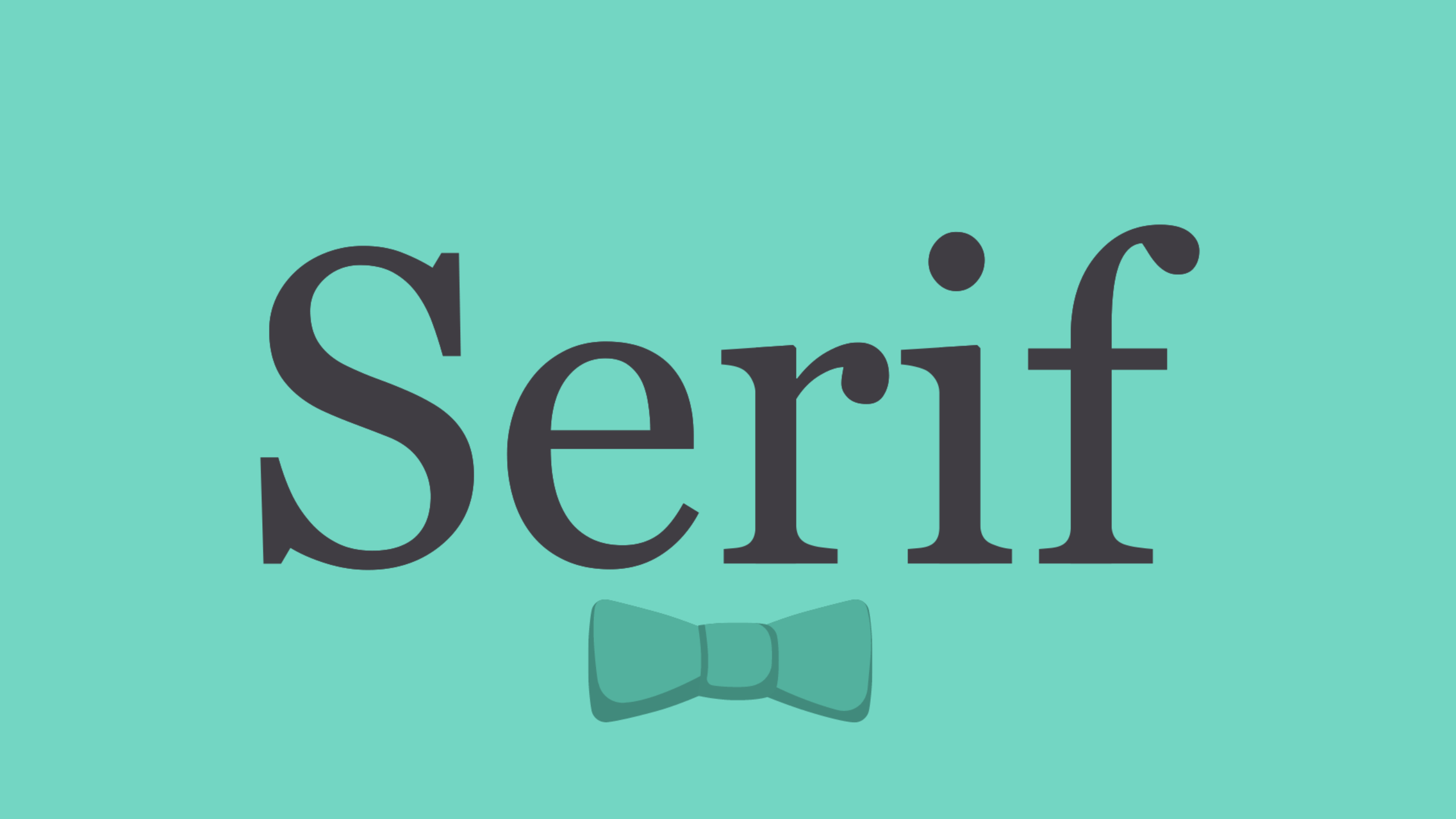
Because of their classic look, they're a good choice for more traditional projects. They're also common in print publications, like magazines and newspapers.
Sans serif fonts
Sans serif fonts don't have that extra stroke—hence the name, which is French for without serif.
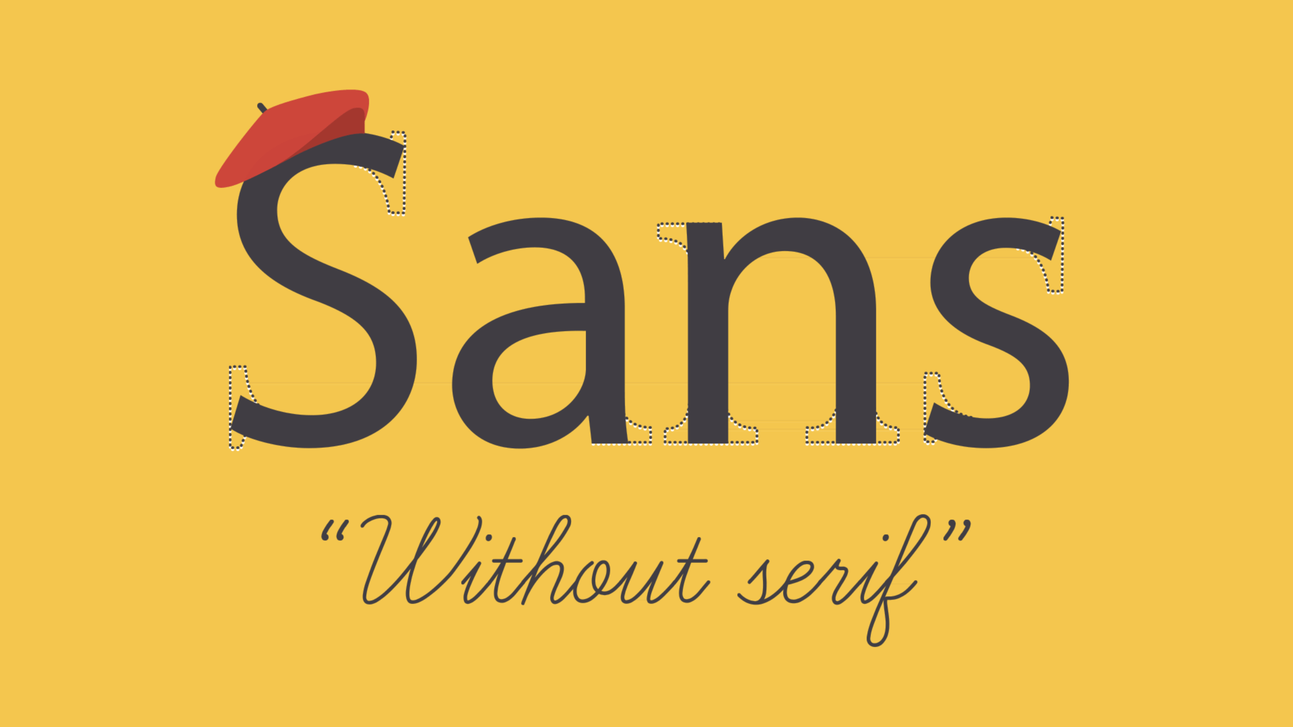
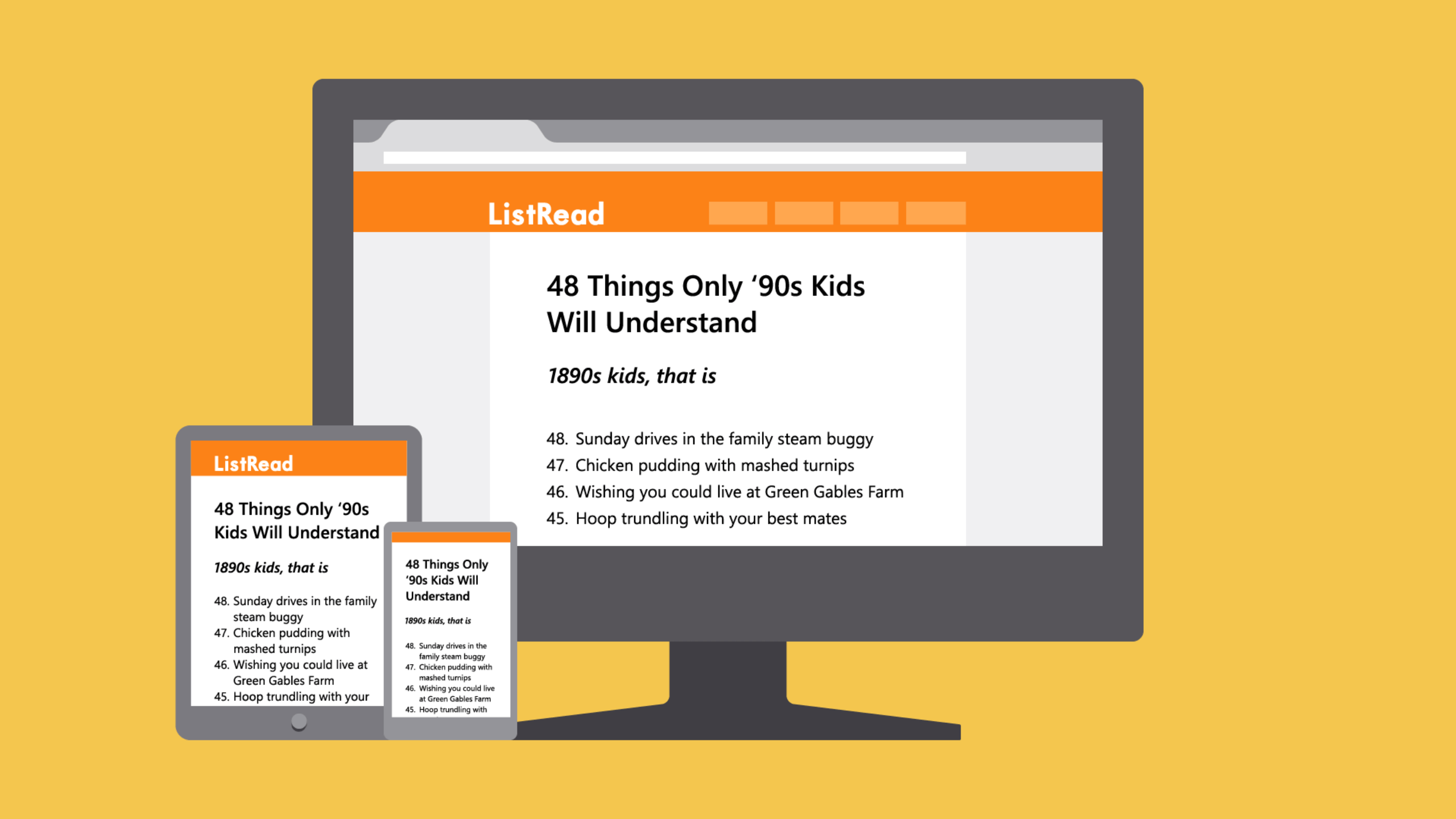
This style is considered more clean and modern than serif fonts. Also, it tends to be easier to read on computer screens, including smartphones and tablets.
Display fonts
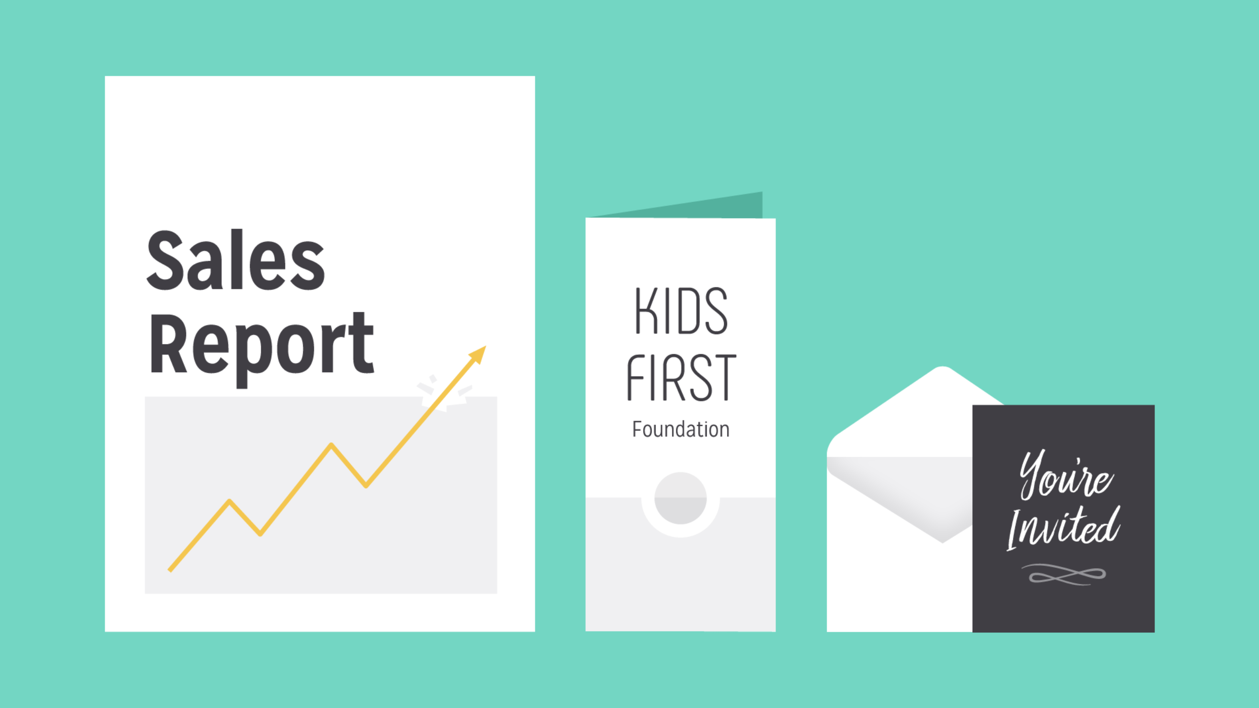
Display fonts come in many different styles, like script, blackletter, all caps, and just plain fancy.
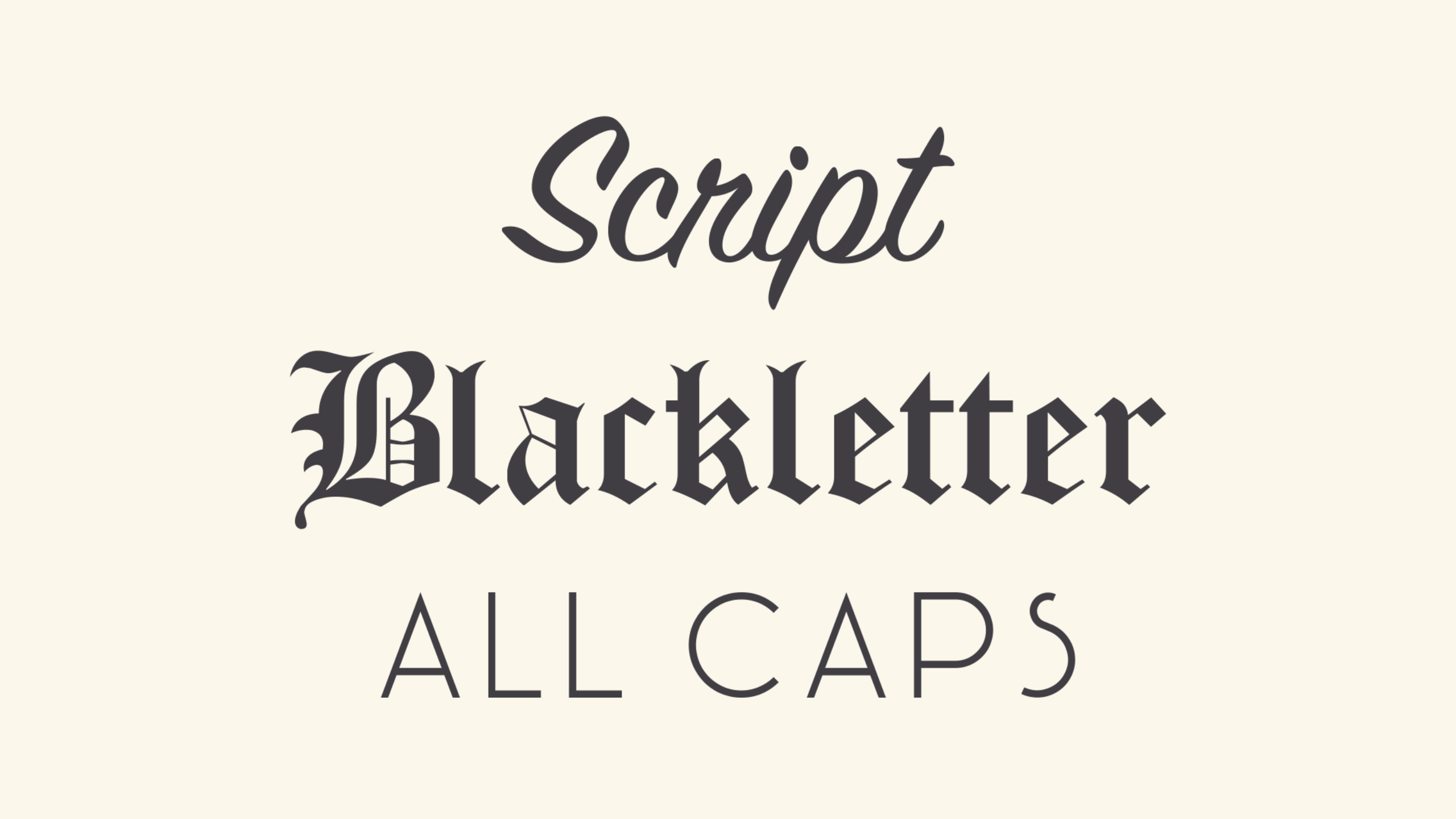
Because of their decorative nature, display fonts are best for small amounts of text, like titles and headers and more graphic-heavy designs.
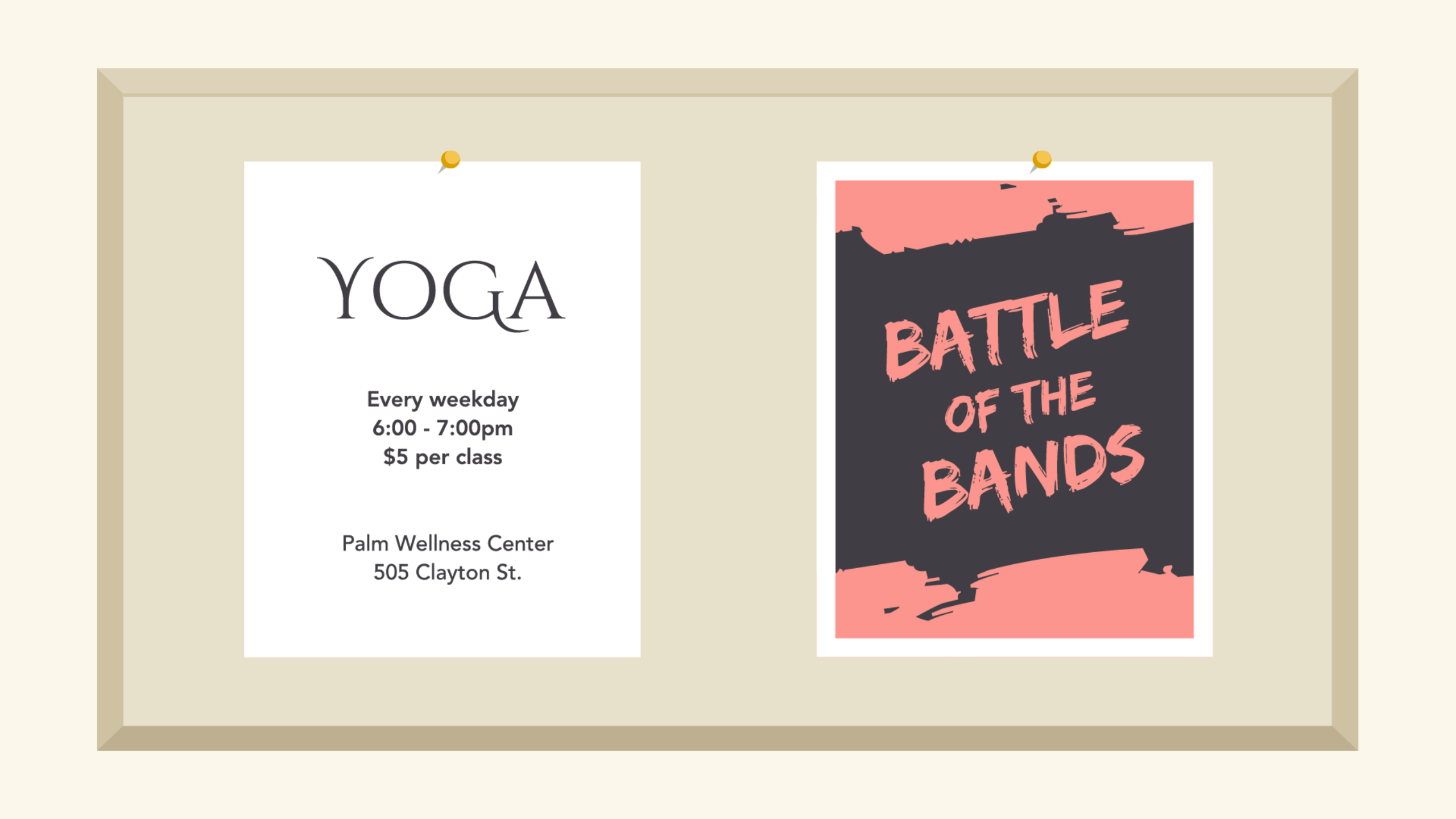
Choosing a font
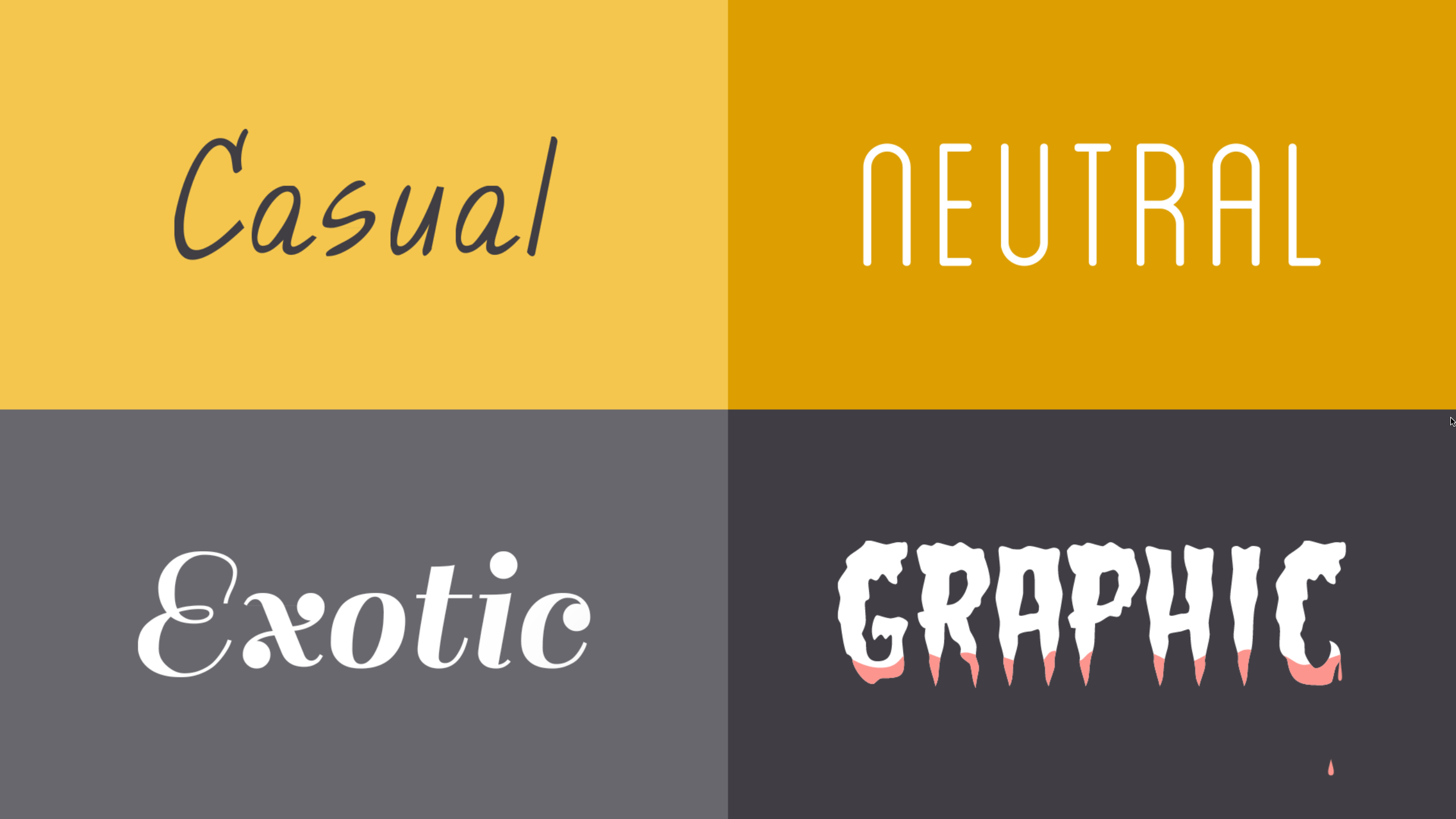
In a way, fonts have their own language. They all have something to say beyond the words on the page. They can come across as casual or neutral, exotic or graphic. That's why it's important to think about your message, then choose a font that fits.
Fonts to avoid
Some fonts come with extra baggage, including Comic Sans, Curlz, and Papyrus. There's nothing particularly wrong with these fonts—they just have a certain reputation for being outdated and overused.
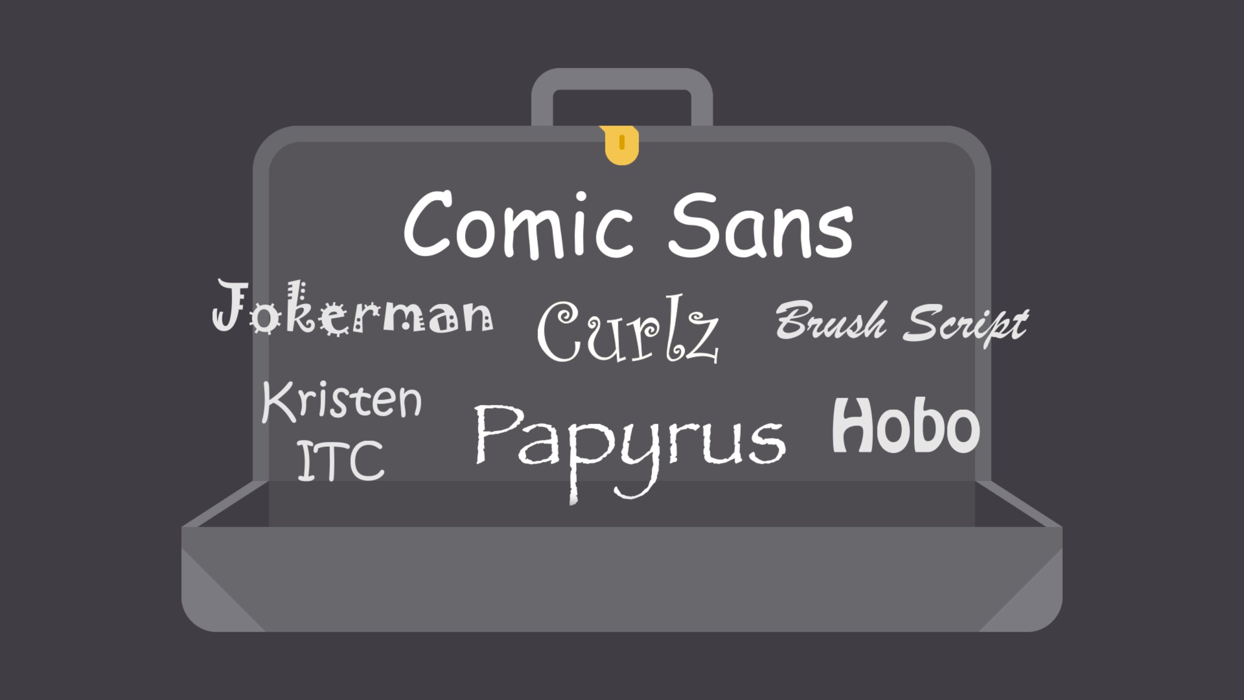
If you find yourself tempted by them, think twice and consider using something else. There are many fonts with a similar look and feel that are less likely to detract from your message.
Combining fonts
When deciding which fonts to use, less is more. It's best to limit yourself to one or two per project. If you need more contrast, try repeating one of your fonts in a different size, weight, or style. This trick is practically foolproof for creating interesting combinations that work.
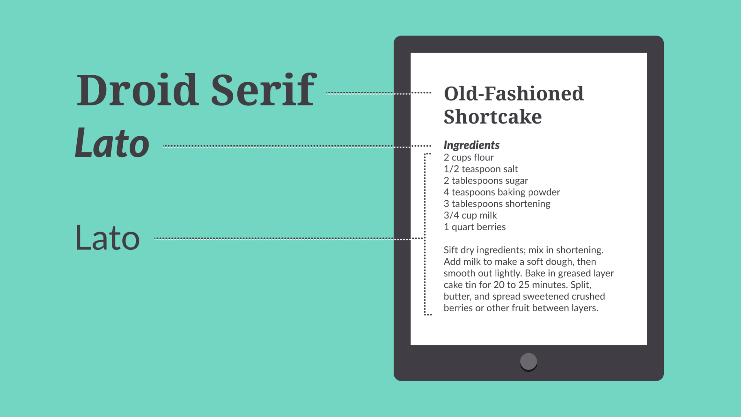
You've probably heard that opposites attract. The same is true for fonts. Don't be afraid to combine font styles that are different but complementary, like sans serif with serif, short with tall, or decorative with simple. This can be challenging at first, but don't despair. Look to other designs for inspiration, and soon you'll get the hang of it.
Other important terms
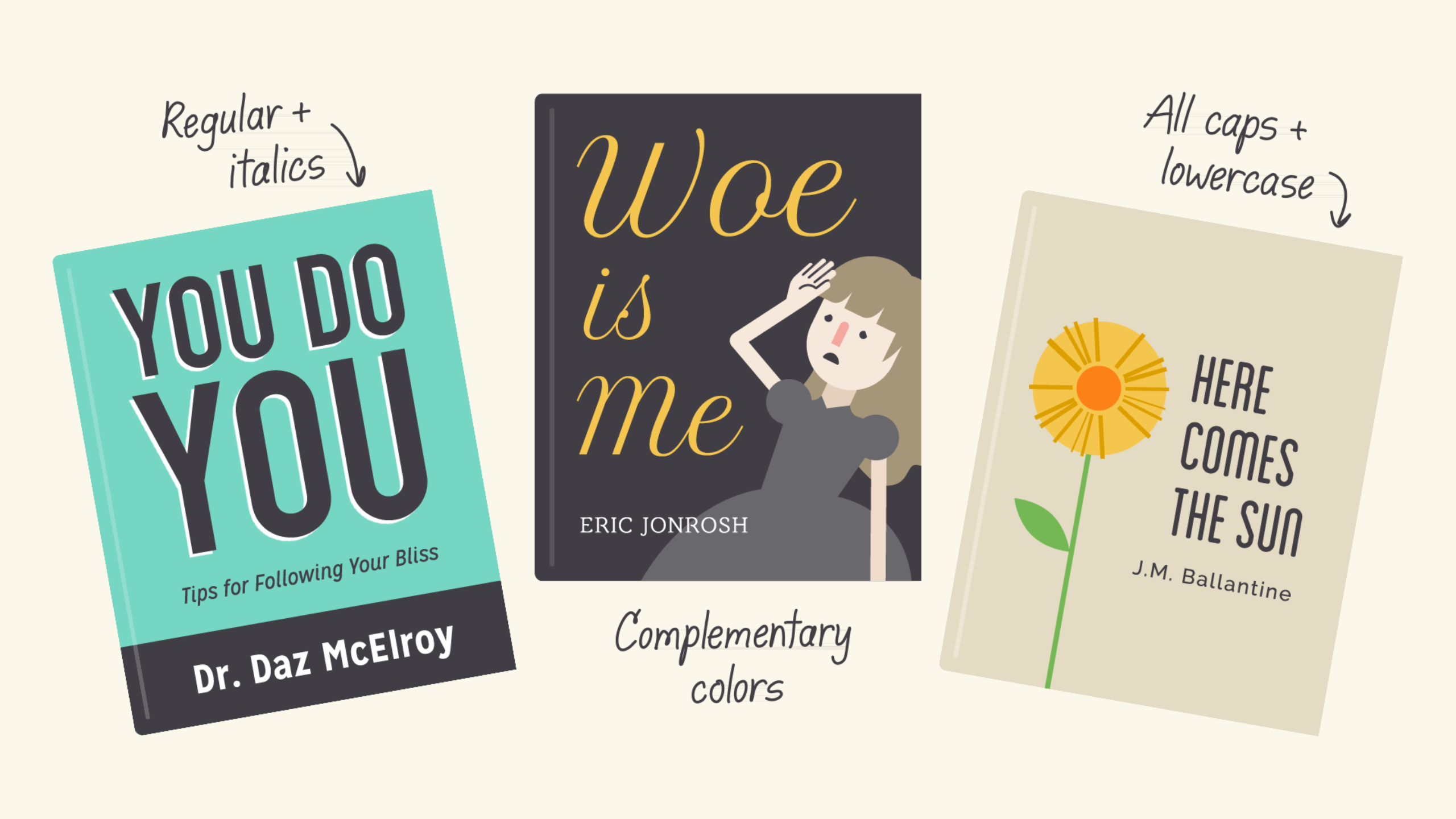
Maybe you've heard terms like kerning, leading, tracking, and hierarchy. For those with more experience, these concepts are essential for creating professional-looking designs. As a beginner, you don't need to know everything about these terms—just enough to inform your work and help you talk about design with more confidence.
Hierarchy
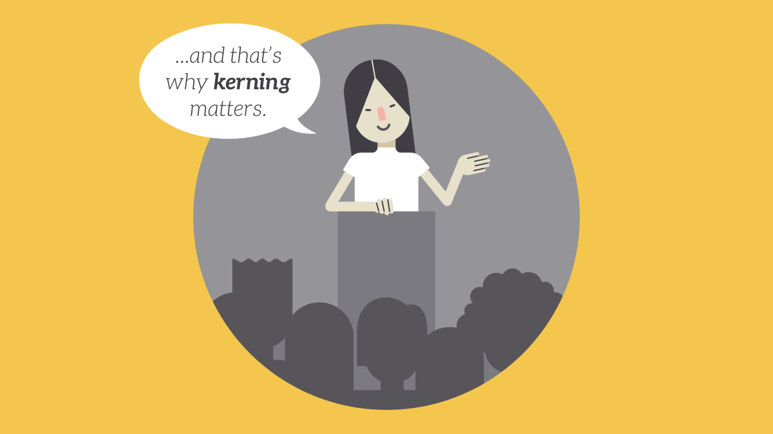
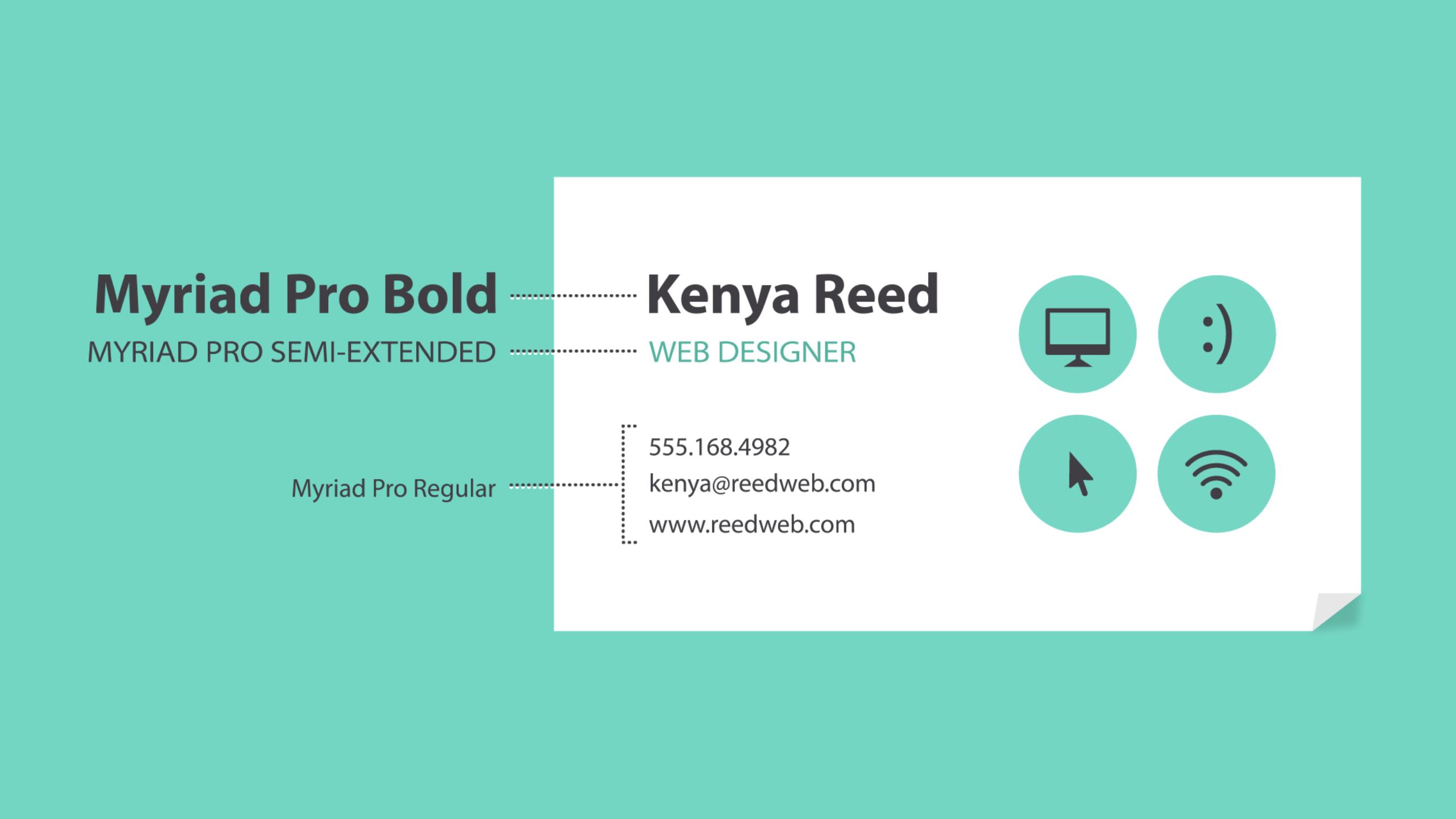
Hierarchy is used to guide the reader's eye to whatever is most important. In other words, it shows them where to begin and where to go next using different levels of emphasis.
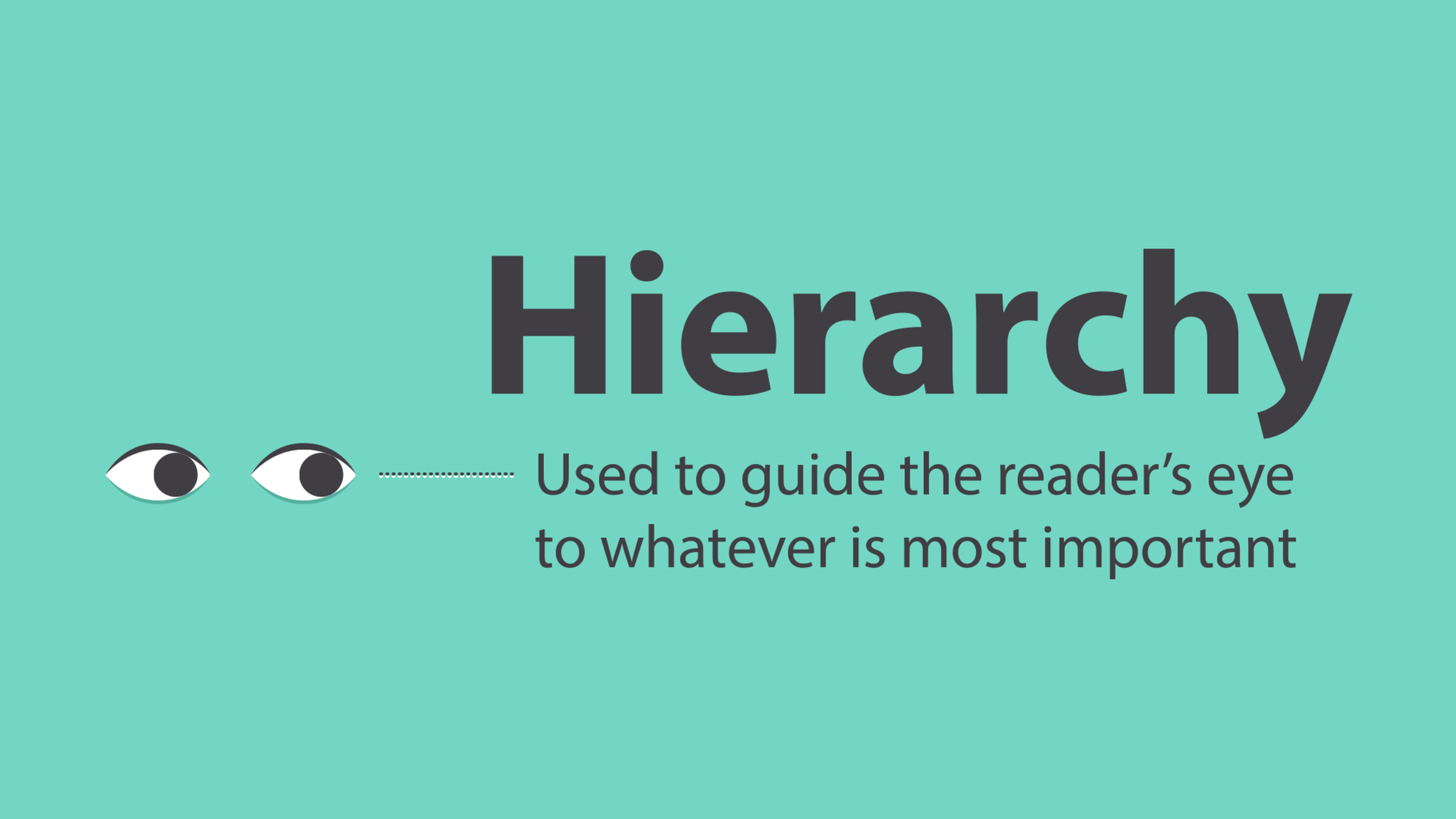
Establishing hierarchy is simple: Just decide which elements you want the reader to notice first, then make them stand out. High-level items are usually larger, bolder, or different in some way. Remember to keep it simple and stick to just a few complementary styles.
Leading
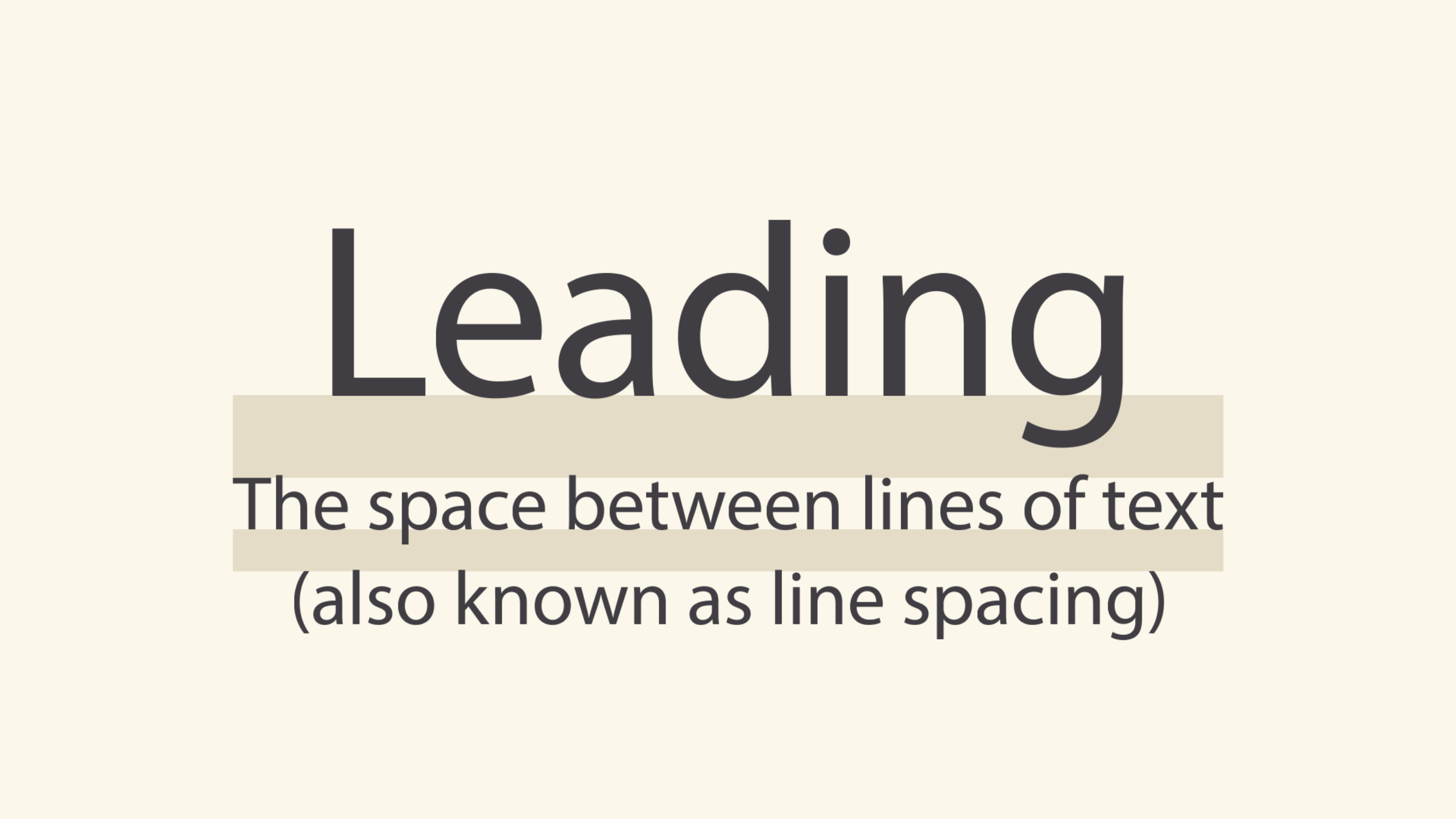
Leading (rhymes with wedding) is the space between lines of text, also known as line spacing.
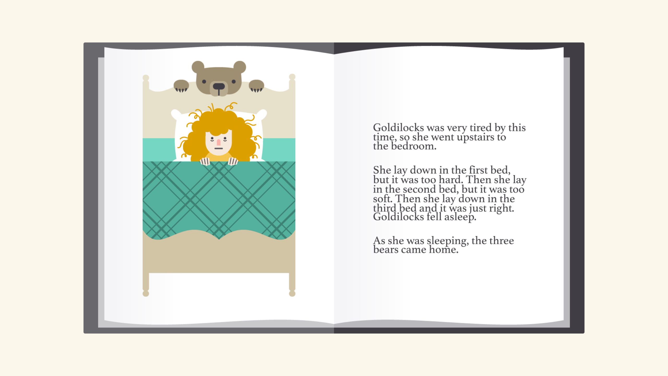
If you're not sure how much line spacing to use, don't fret—the default is usually fine. The goal is to make your text as comfortable to read as possible. Too much or too little spacing, as in the example below, can make things unpleasant for the reader.
Tracking
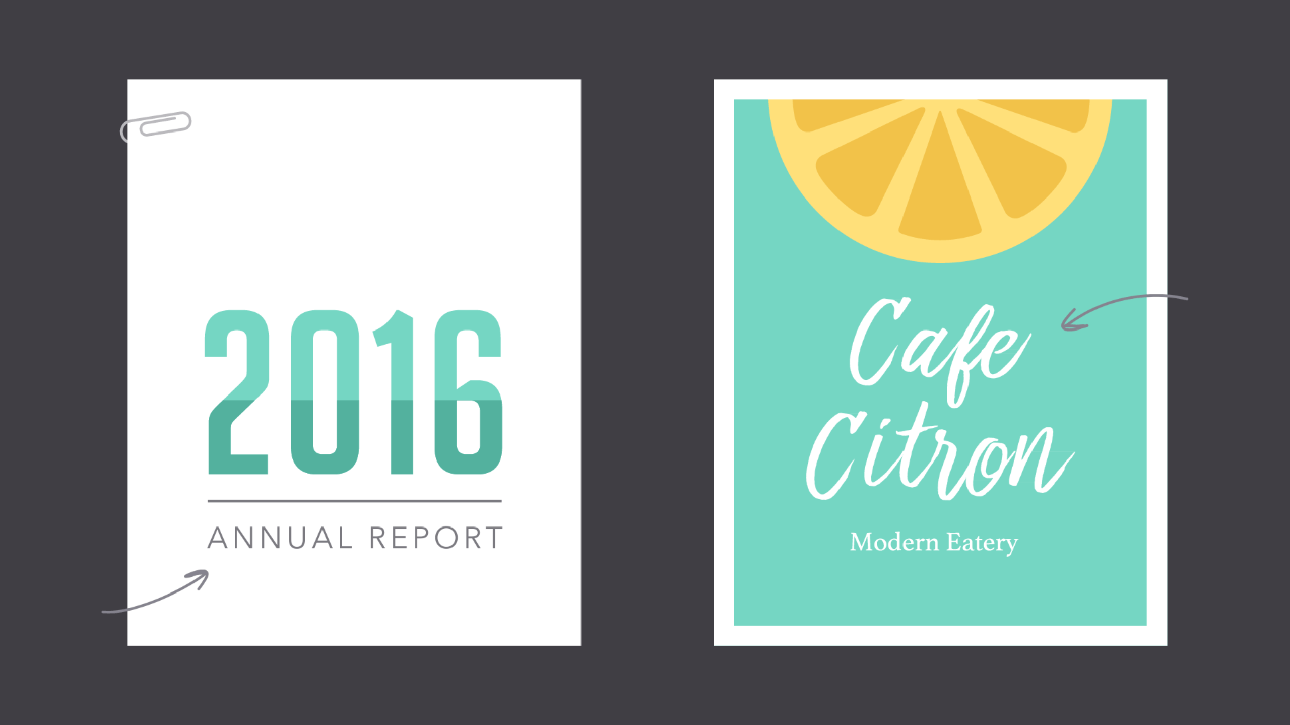
Tracking is the overall space between characters, sometimes called character spacing. Most programs let you condense or expand this depending on your needs.
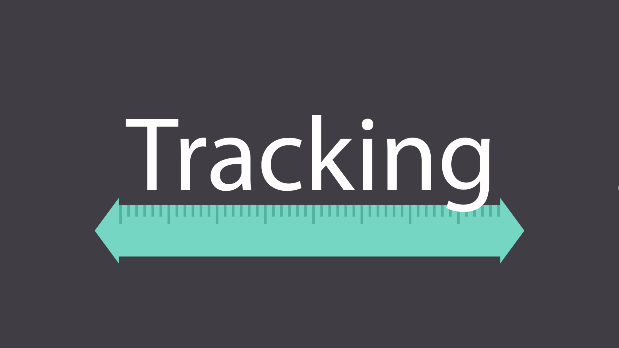
In some designs, you might adjust your tracking to create a certain artistic effect. It can also help you fix fonts that are poorly spaced to begin with.
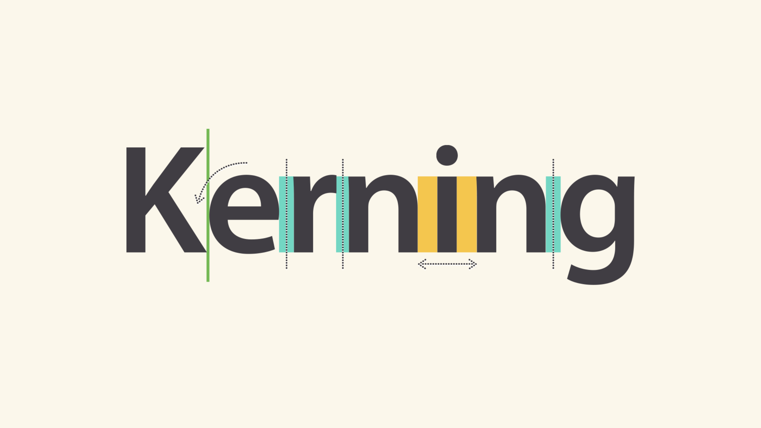
Kerning
Kerning is the space between specific characters. Unlike tracking, it varies over the course of the word because each letter fits together differently.
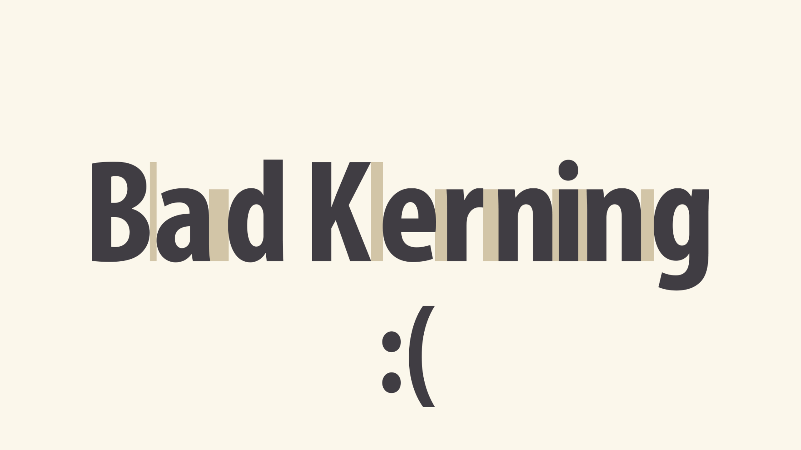
Some fonts have what we call bad kerning, making certain letters look improperly spaced. If a font you're using has bad kerning, it's best to cut your losses and choose something else.
Putting it all together
Well-crafted text can mean the difference between something ordinary and something extraordinary—even if you're just getting started with design. All it takes is an interest in typography and you'll start to notice more, see more, and be able to do more in your own work.
We hope you enjoyed learning the basics of typography!
The power of color
Color plays a vital role in design and everyday life. It can draw your eye to an image. Sometimes it can trigger an emotional response. It can even communicate something important without using words at all.
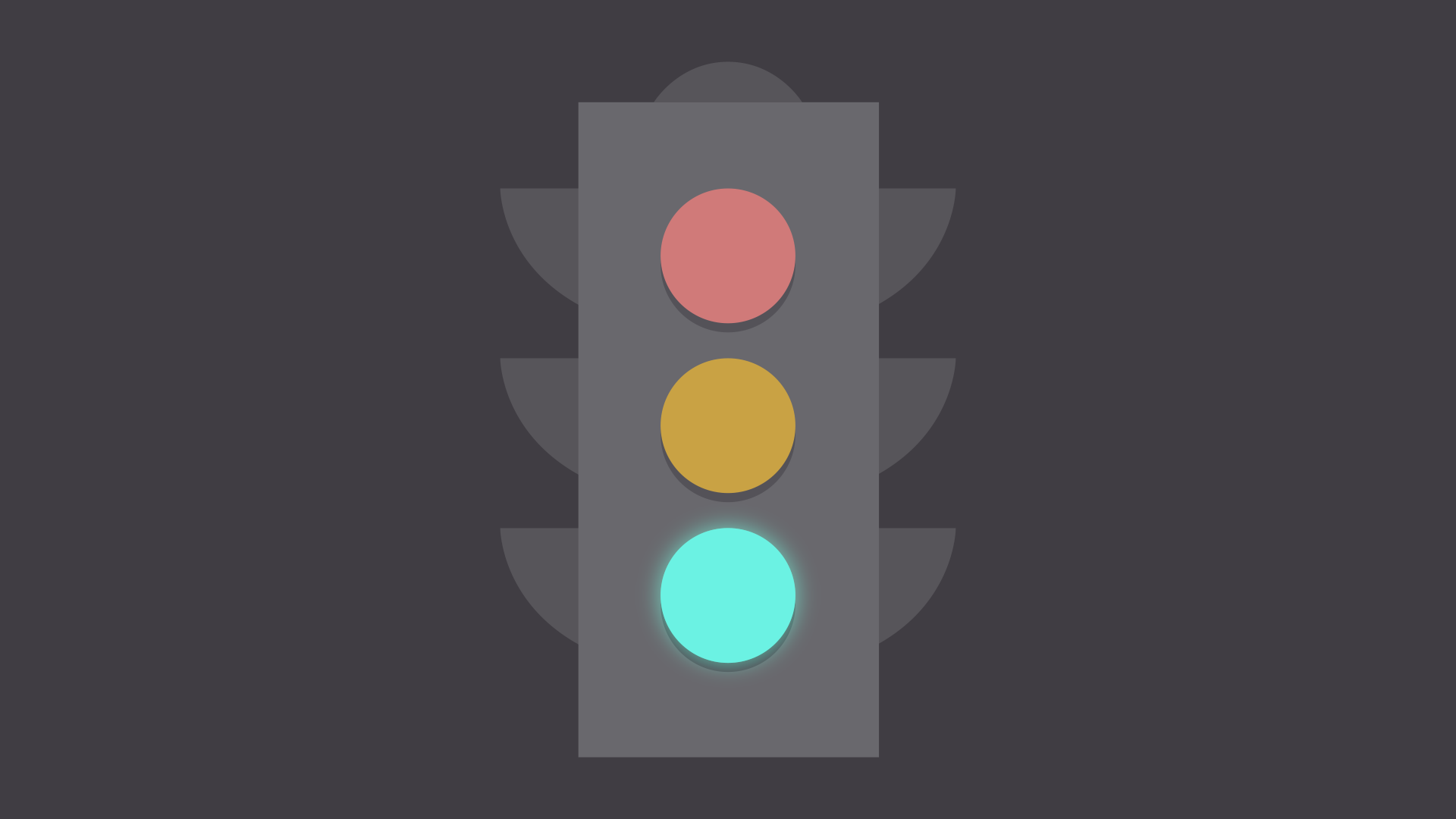
So how do we know which colors look good together and which ones don't? The answer is simple: Color theory.
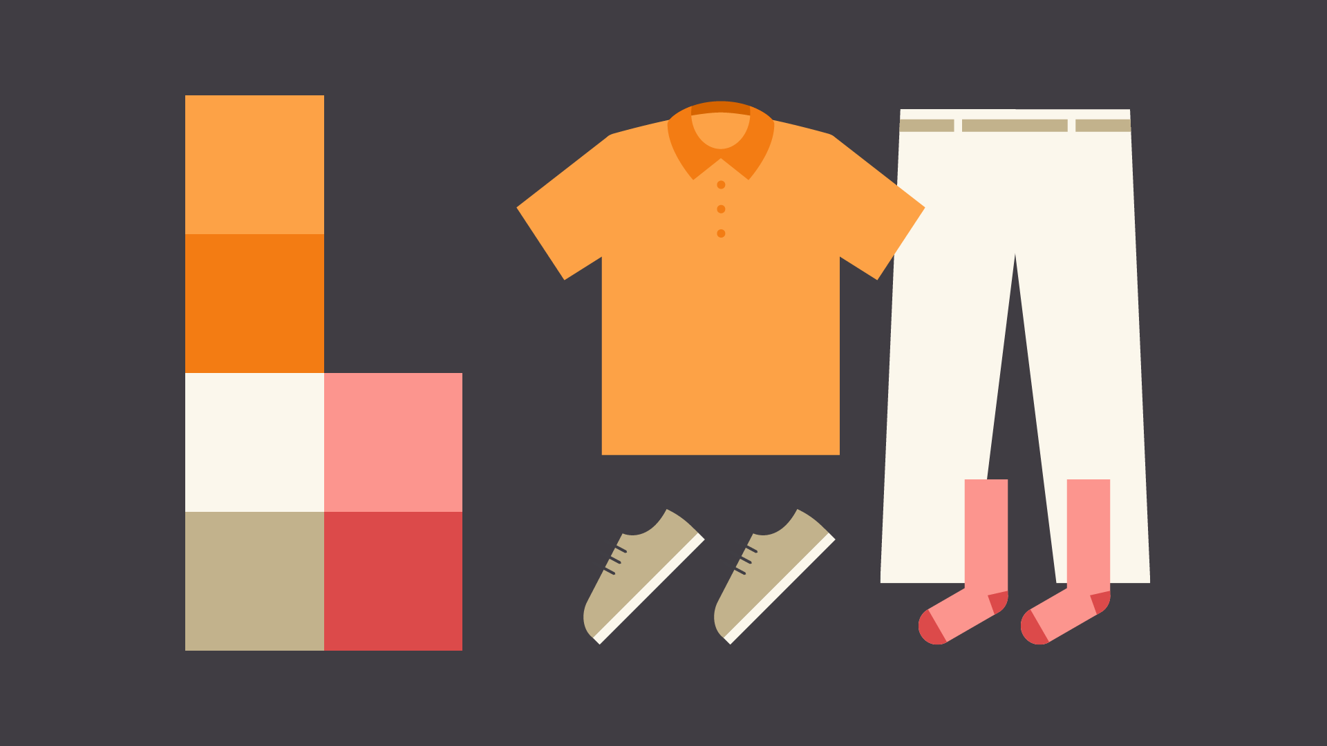
Artists and designers have followed color theory for centuries, but anyone can learn more about it. It can help you feel confident in many different situations, whether it's choosing colors for a design or putting together the perfect outfit. With a little insight, you'll be looking at color in a whole new way.
Color basics
Let's start at the beginning with a refresher on the basics. Remember learning about primary and secondary colors in school? Then you already have some knowledge of color theory.
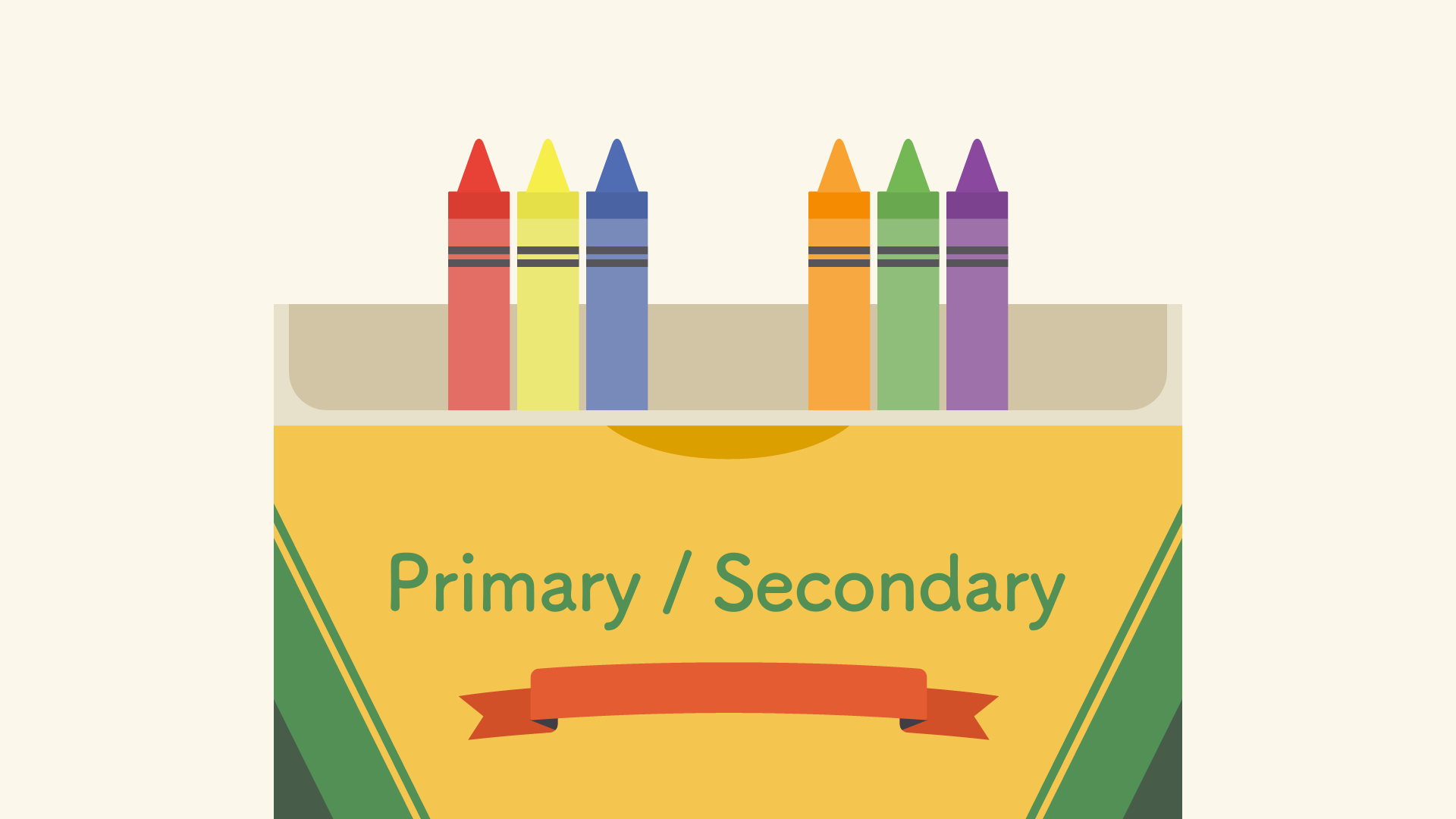
Secondary colors are created by combining two primary colors. Red and yellow make orange; yellow and blue make green; and blue and red make purple.
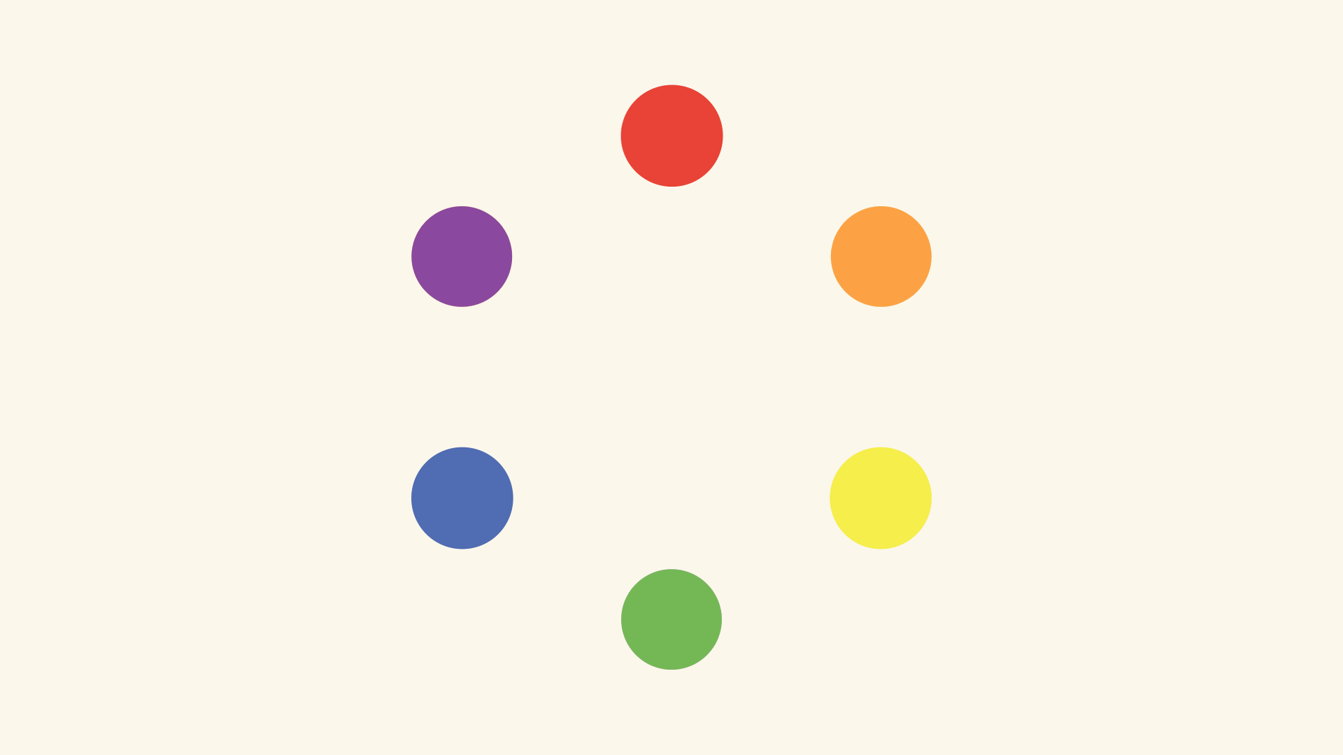
If we mix these colors together, we get even more in-between shades, like red-orange and yellow-green. All together, they form what's called a color wheel. (You can probably see where it gets its name.)
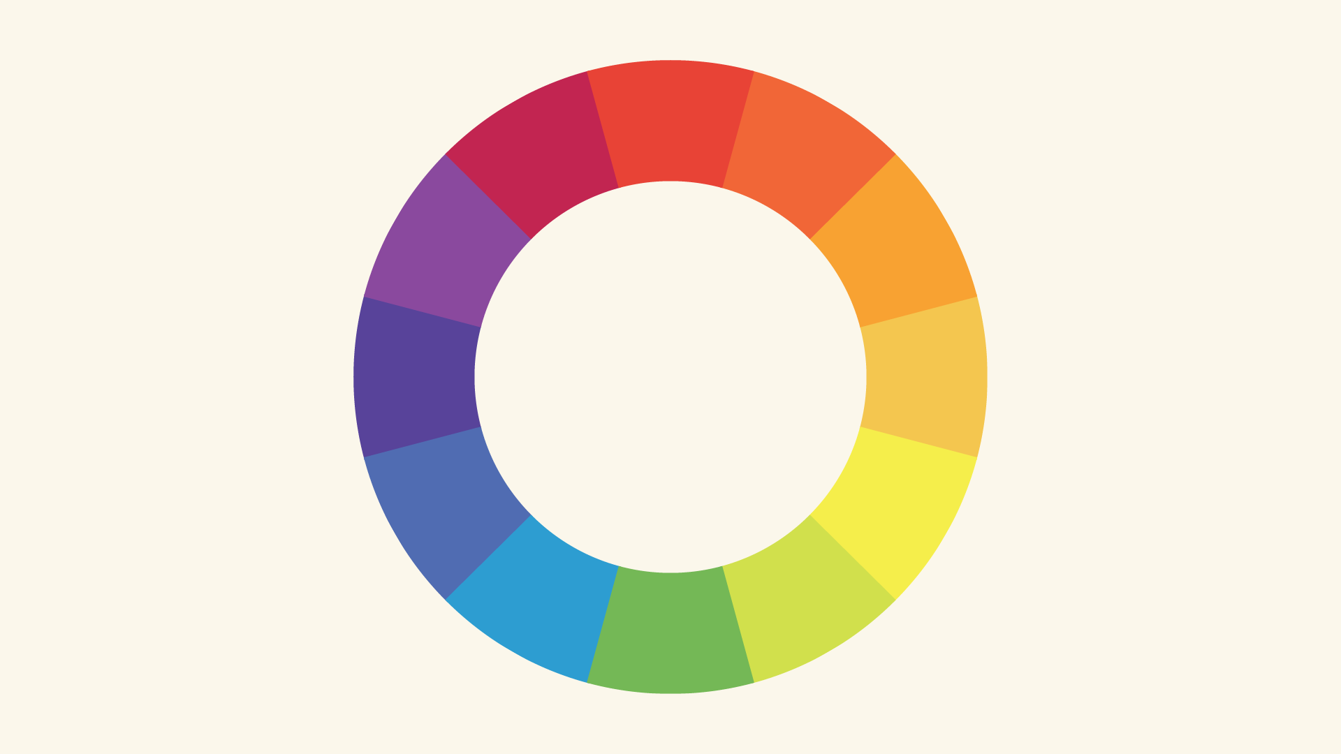
A closer look
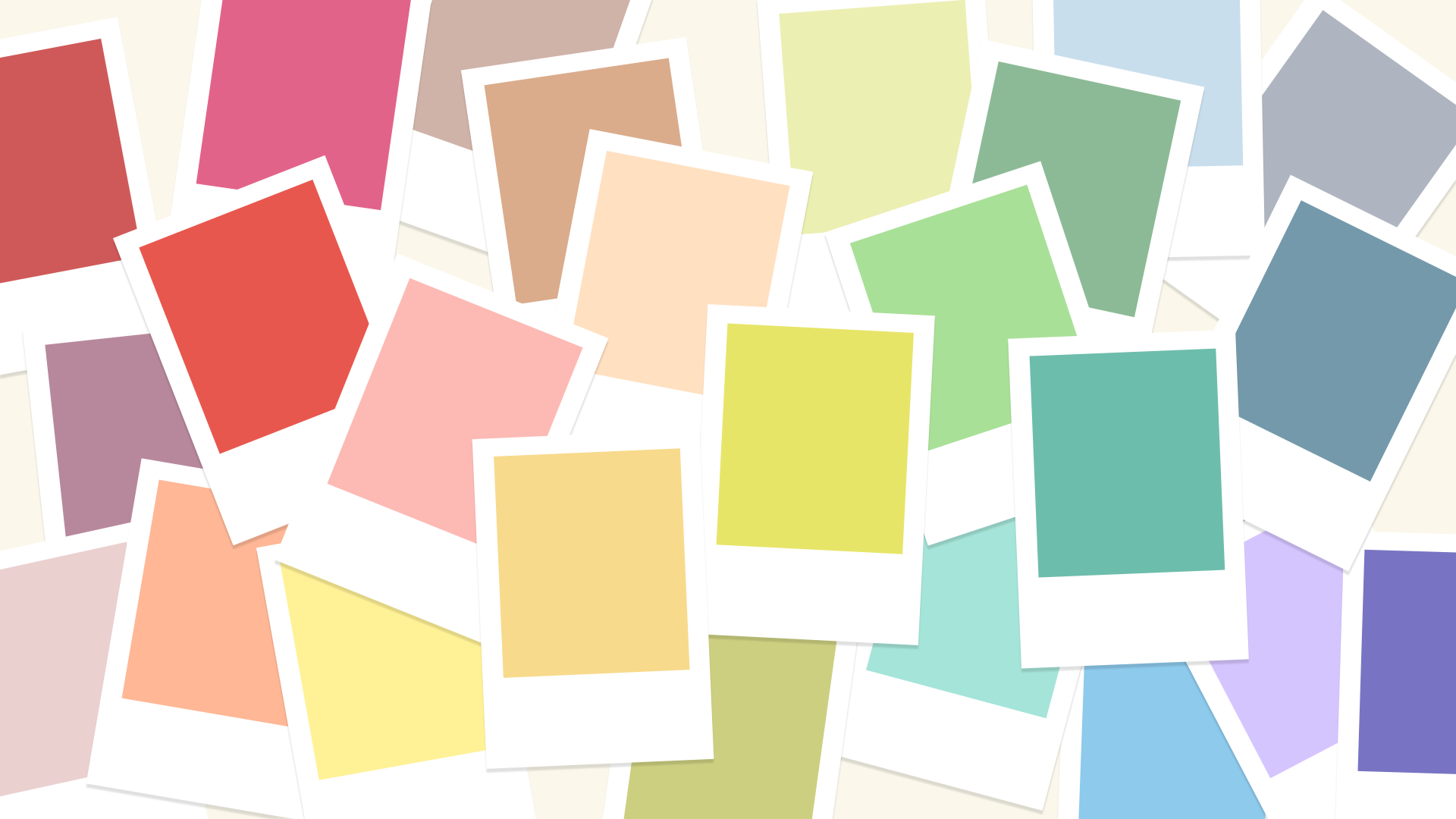
Now that you know about the color wheel, let's take it one step further with hue, saturation, and value. These are terms you might not encounter in daily life, but they're the key to understanding more nuanced colors—like all those little paint chips at the home improvement store.
Hue
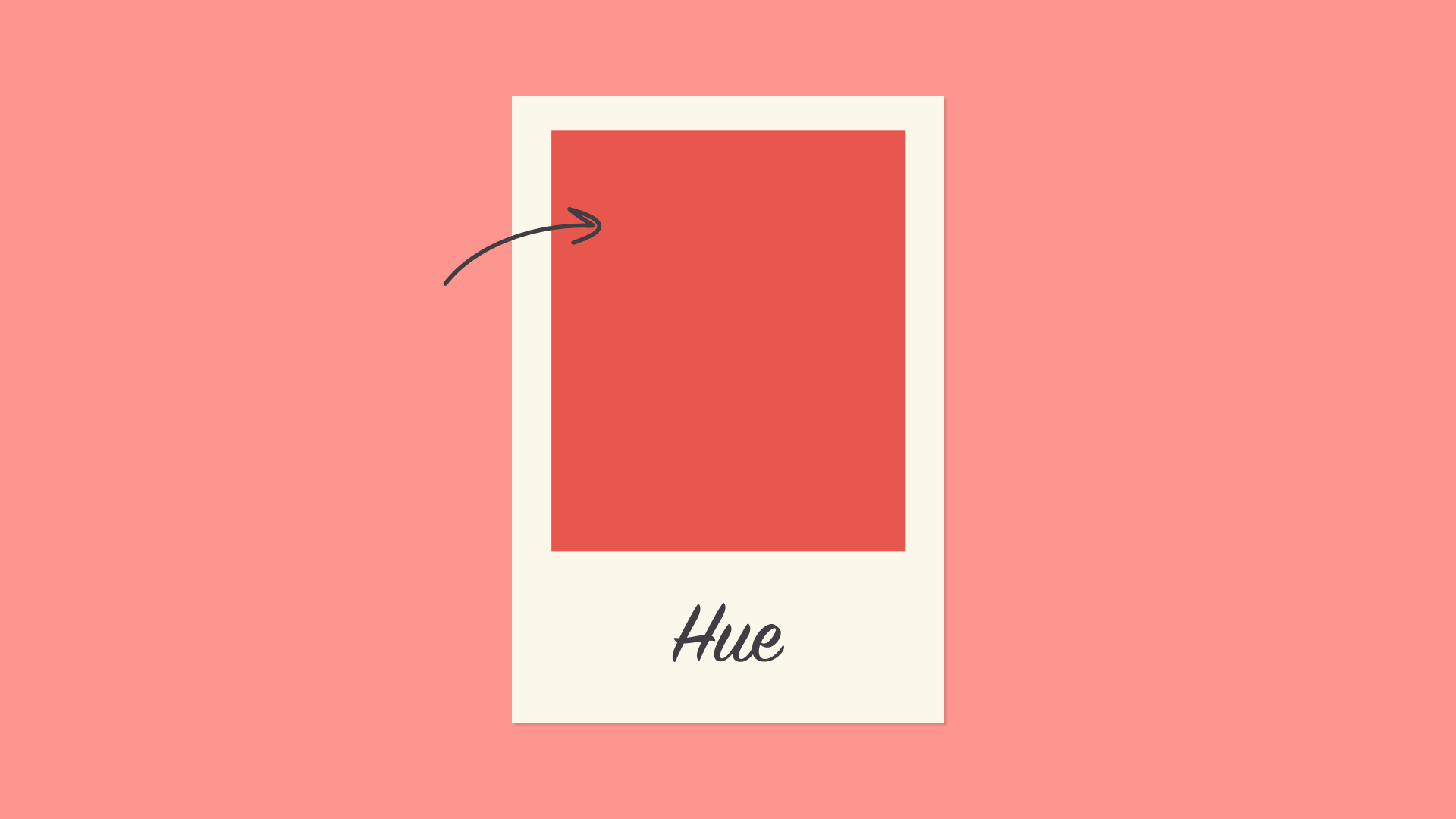
Hue is the easiest one; it's basically just another word for color. In the example below, you might describe the hue as coral pink or light red, depending on your interpretation.
Saturation
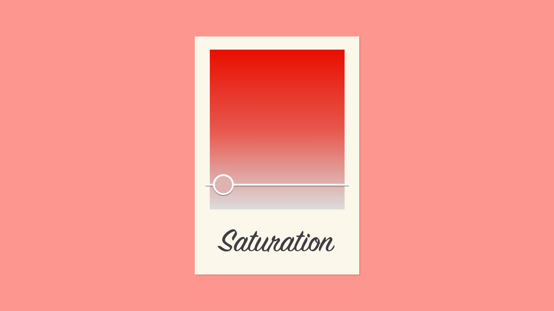
Saturation refers to intensity—in other words, whether the color appears more subtle or more vibrant. Highly saturated colors are brighter or richer. Desaturated colors have less pigment and therefore less oomph.
Value
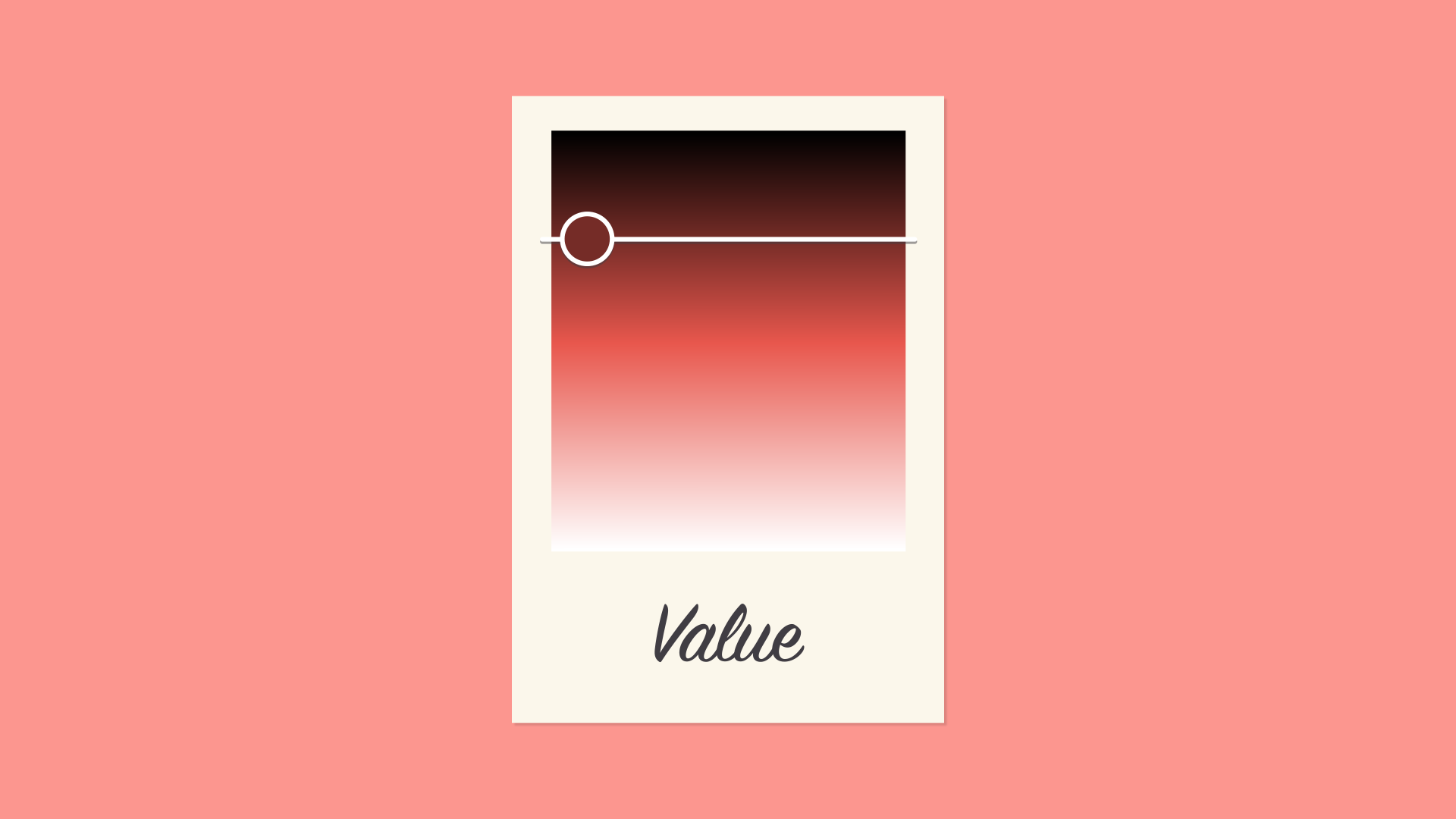
Value has to do with how dark or light the color is, ranging from black to white. As you can see below, this gives us many different shades, from a deep reddish brown to a light pastel pink.
Creating color schemes
So how do we put this all together to create professional-looking color schemes? There are actually tried-and-true formulas based on something called color harmony that can help.
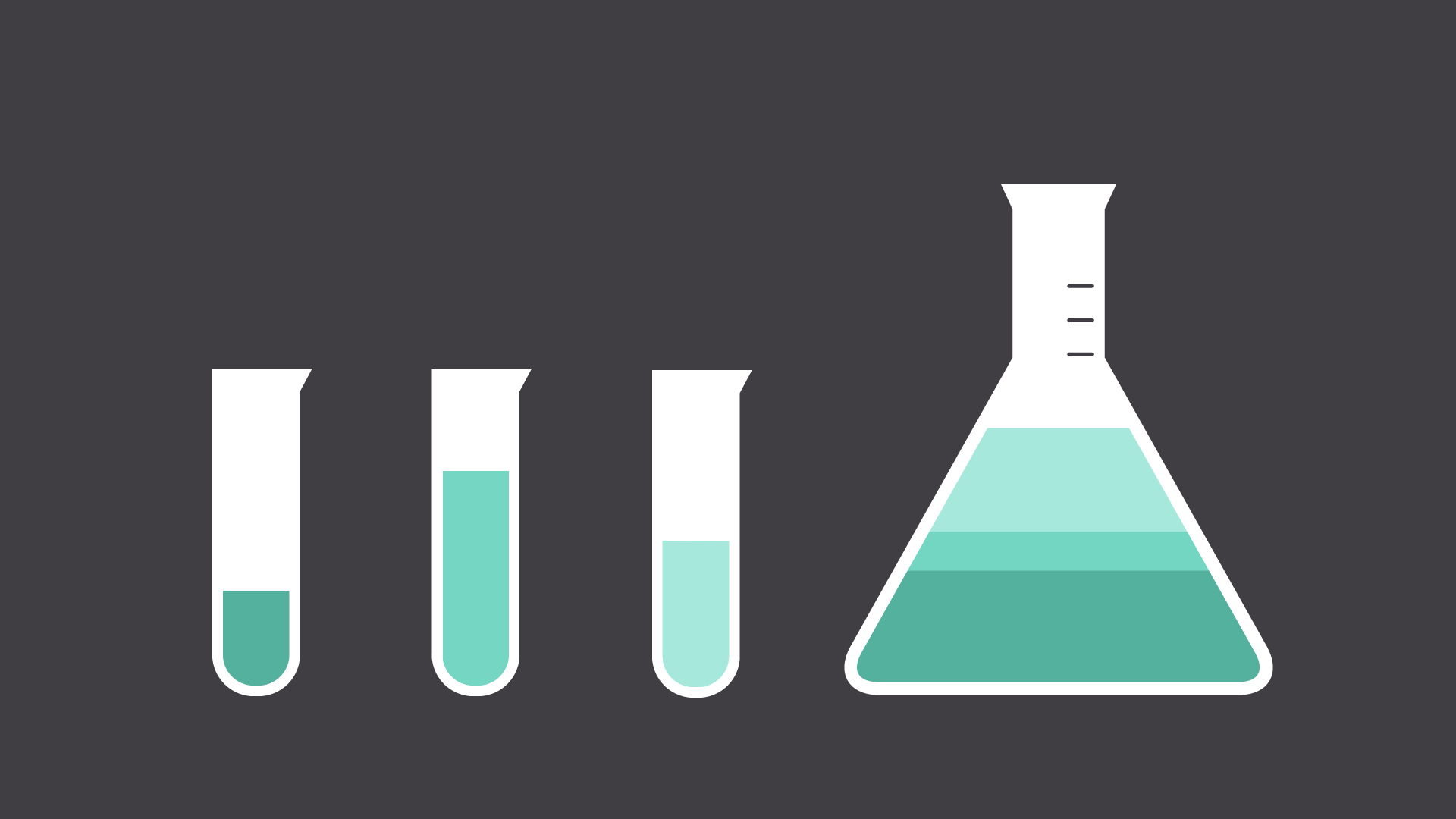
Color harmony uses the color wheel to illustrate time-tested color combinations. We'll explore some of the most common types of harmony below.
Monochromatic
The easiest formula for harmony is monochromatic because it only uses one color or hue. To create a monochromatic color scheme, pick a spot on the color wheel, then use your knowledge of saturation and value to create variations.
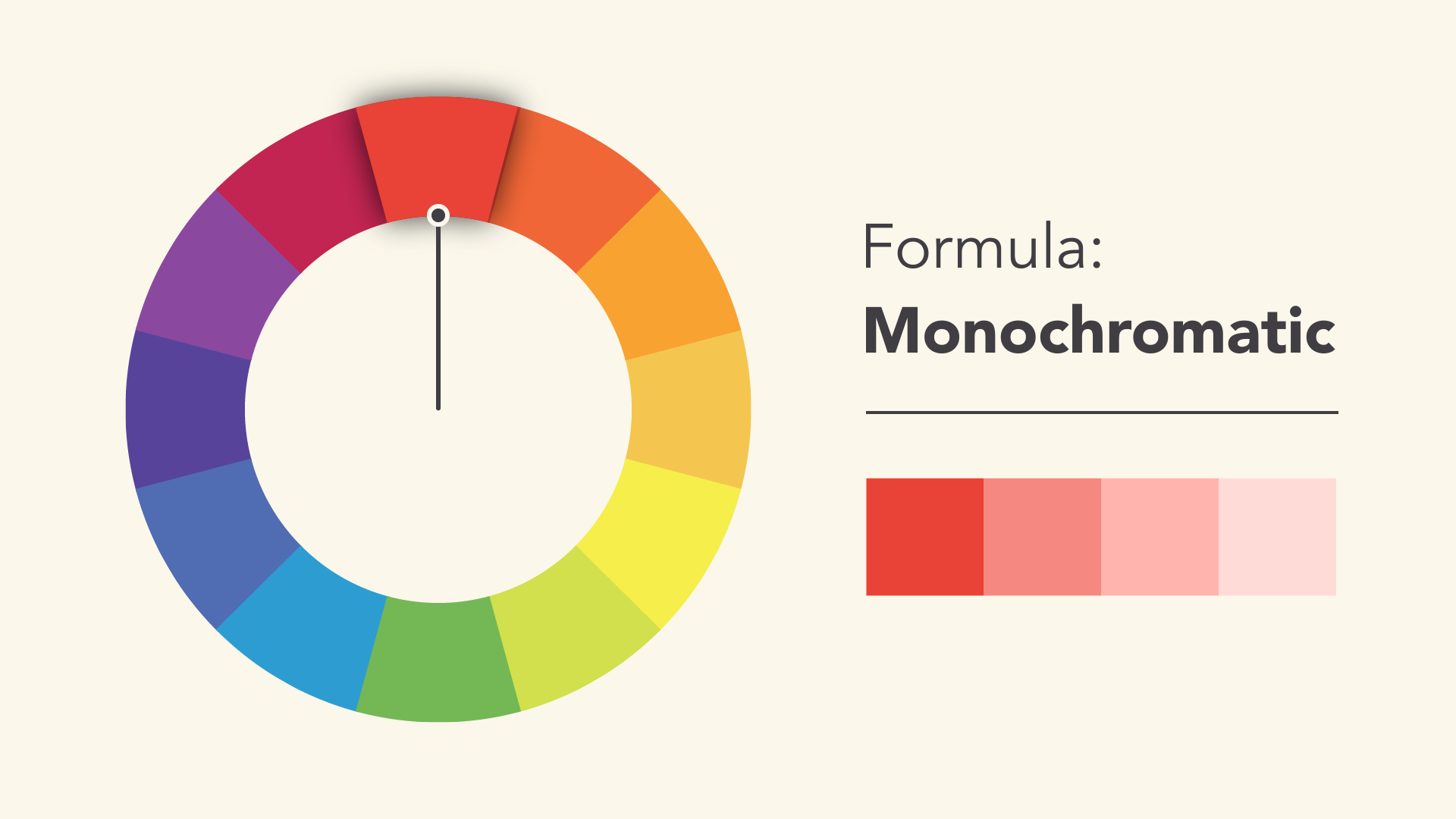
The best thing about monochromatic color schemes is that they're guaranteed to match. The colors suit each other perfectly because they're all from the same family.
Analogous
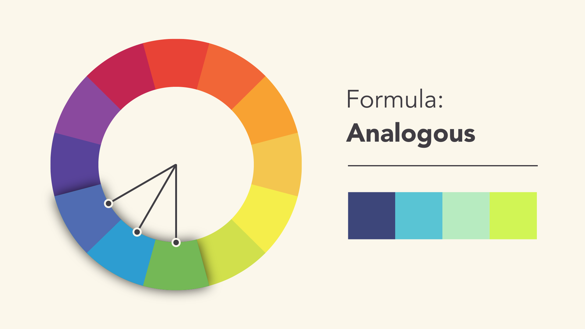
An analogous color scheme uses colors that are next to each other on the wheel, like reds and oranges or blues and greens.
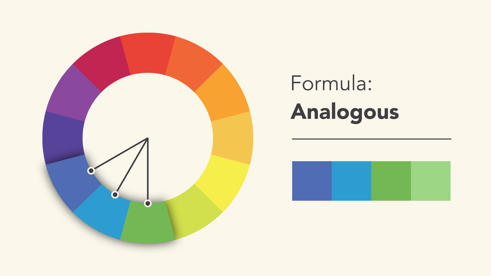
Don't be afraid to play with the palette and create your own unique interpretation. That's what color harmony is all about; the formulas are merely starting points to help guide and inspire you.
Complementary
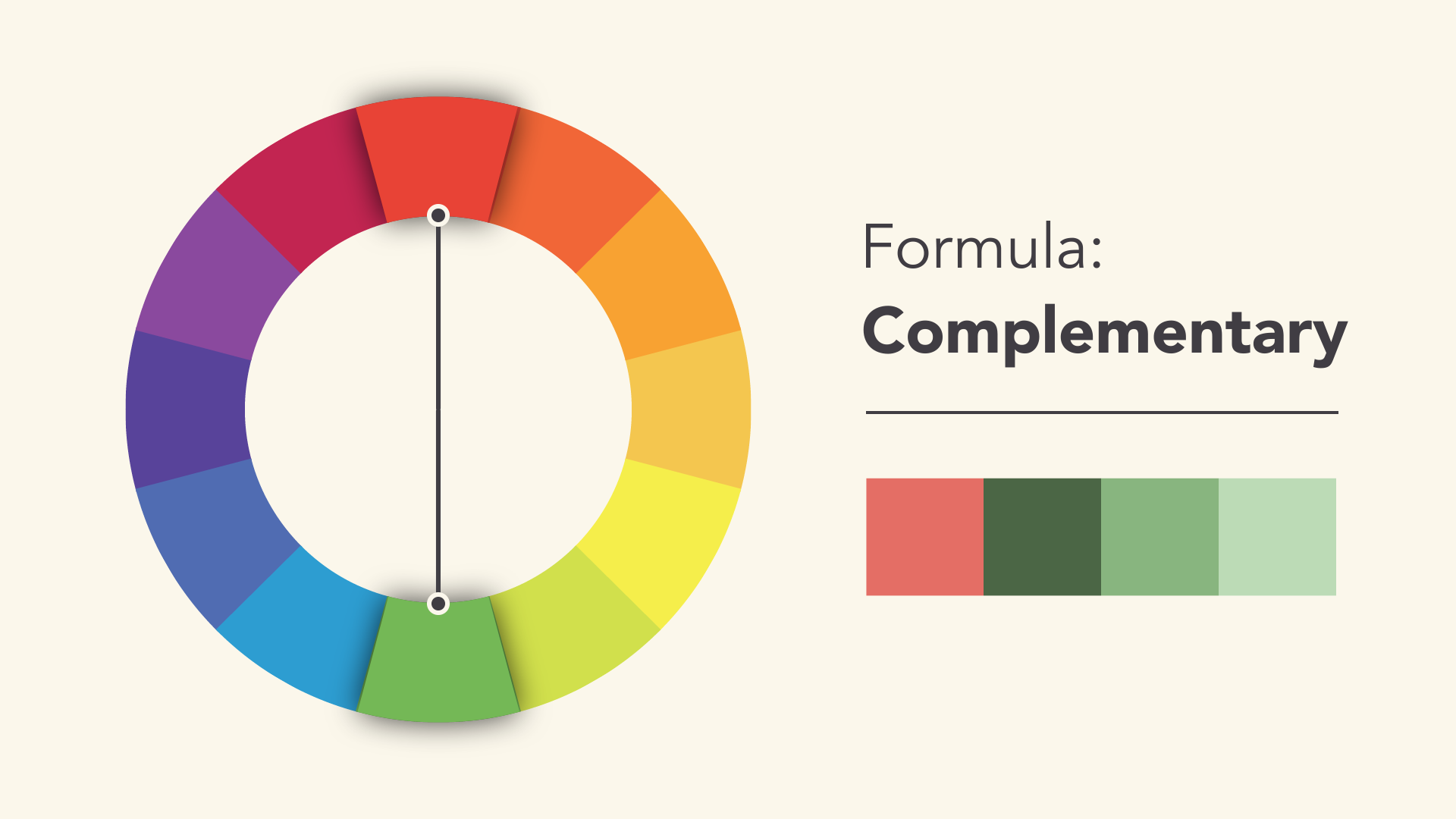
Complementary colors are opposite each other on the wheel; for instance, blue and orange or the classic red and green.
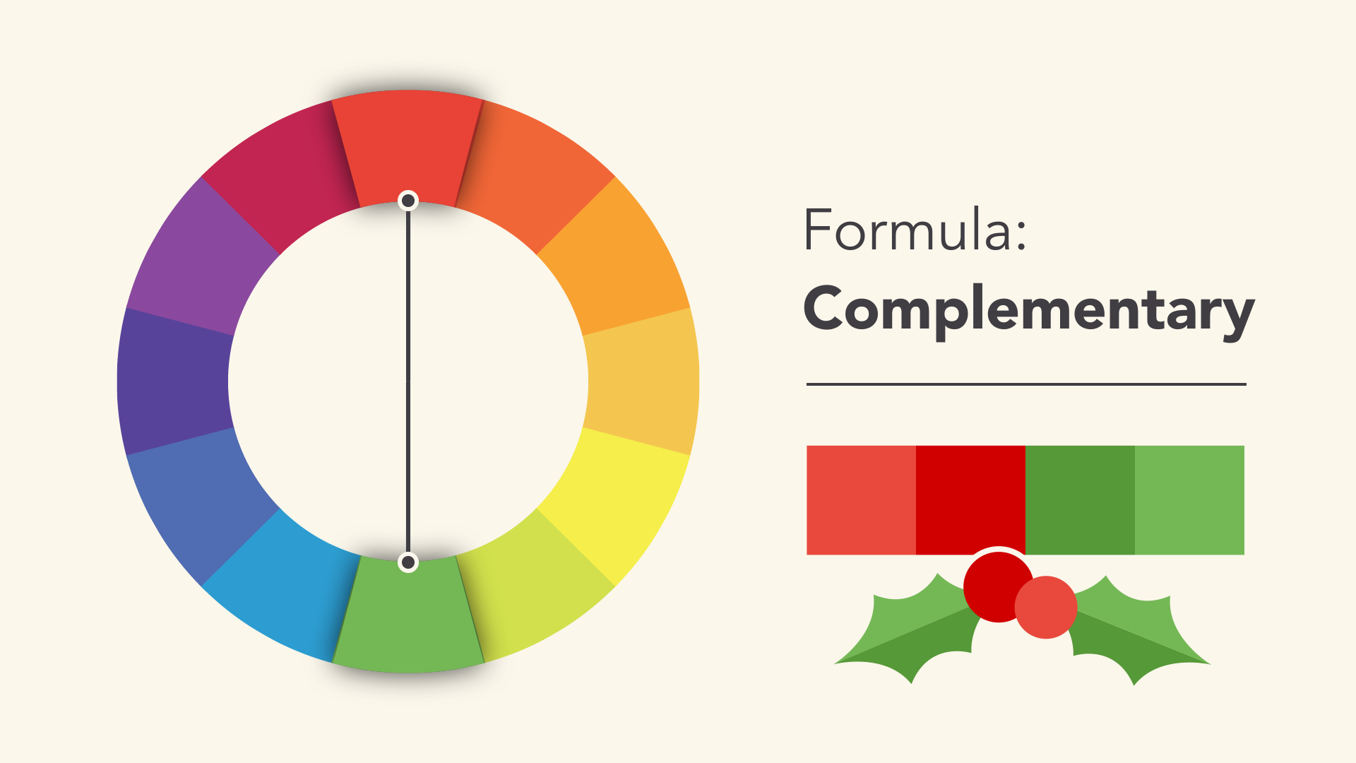
To avoid complementary color schemes that are too simplistic, add some variety by introducing lighter, darker, or desaturated tones.
Split-complementary
A split-complementary color scheme uses the colors on either side of the complement.

This gives you the same level of contrast as a complementary color scheme but more colors to work with (and potentially more interesting results).
Triadic
A triadic color scheme uses three colors that are evenly spaced, forming a perfect triangle on the wheel.
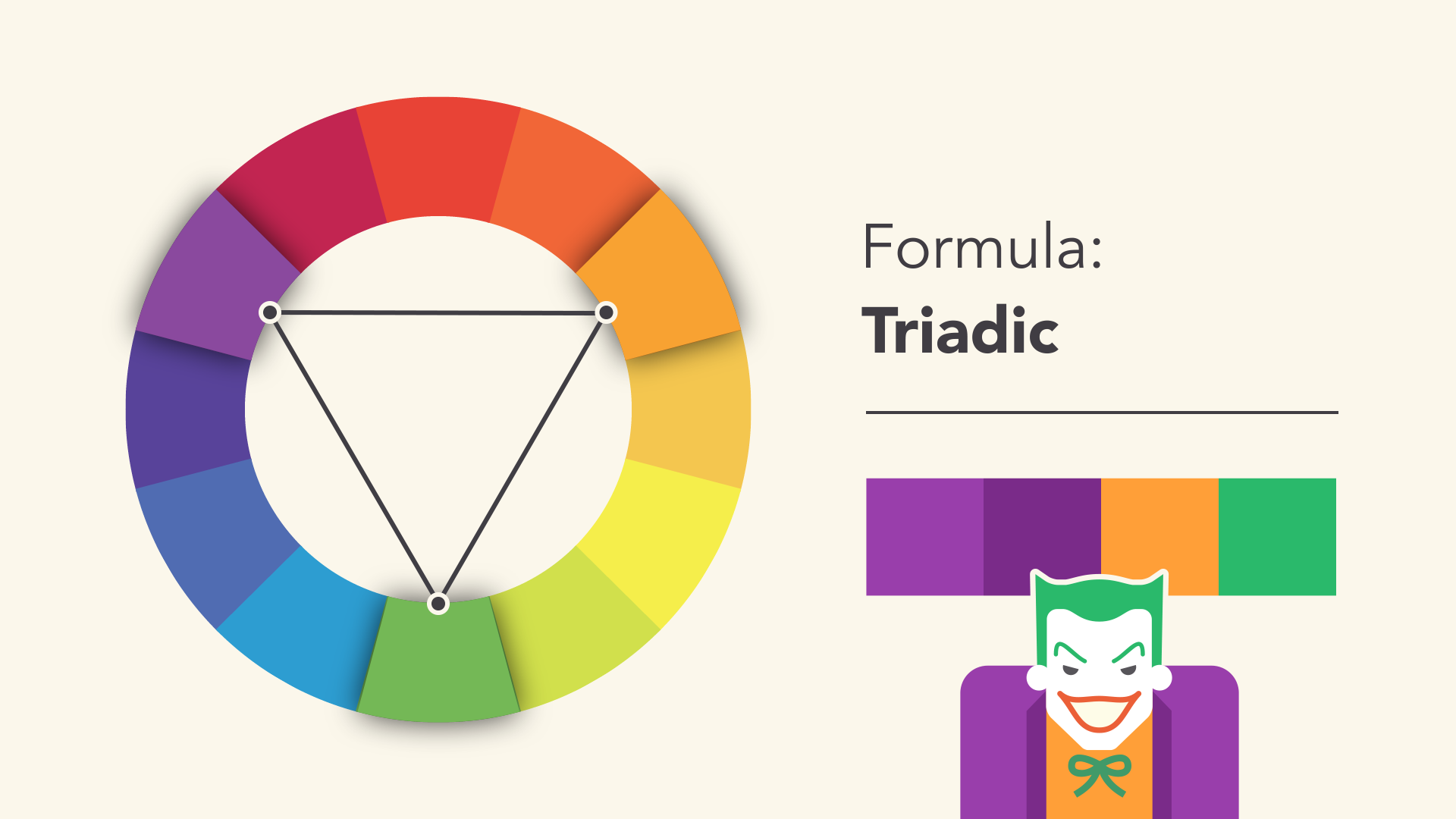
These combinations tend to be pretty striking—especially when they include primary or secondary colors—so be mindful when using them in your work.
Tetradic
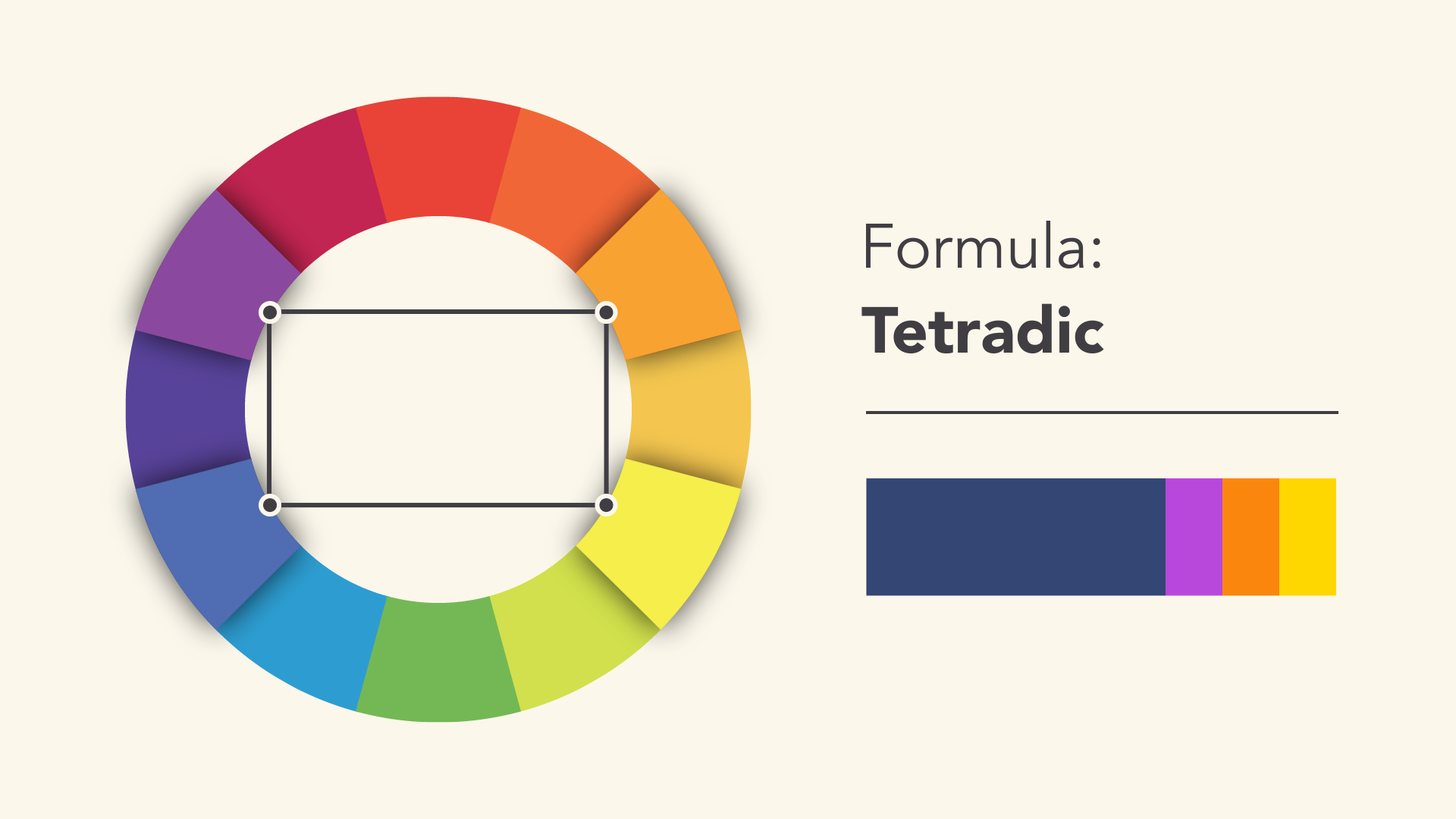
Tetradic color schemes form a rectangle on the wheel, using not one but two complementary color pairs. This formula works best if you let one color dominate while the others serve as an accent.
Avoiding common mistakes
There are a few classic dos and don'ts when it comes to color. For instance, have you ever seen colors that seem to vibrate when they're placed next to each other?
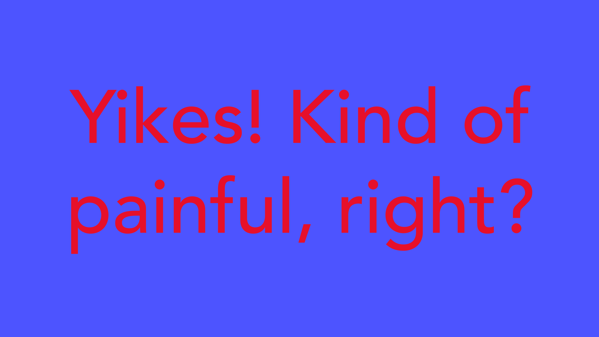
The solution is to tone it down—literally—and there's a simple way do it. Start with one color, and try adjusting its lightness, darkness, or saturation. Sometimes a little contrast is all your color palette needs.
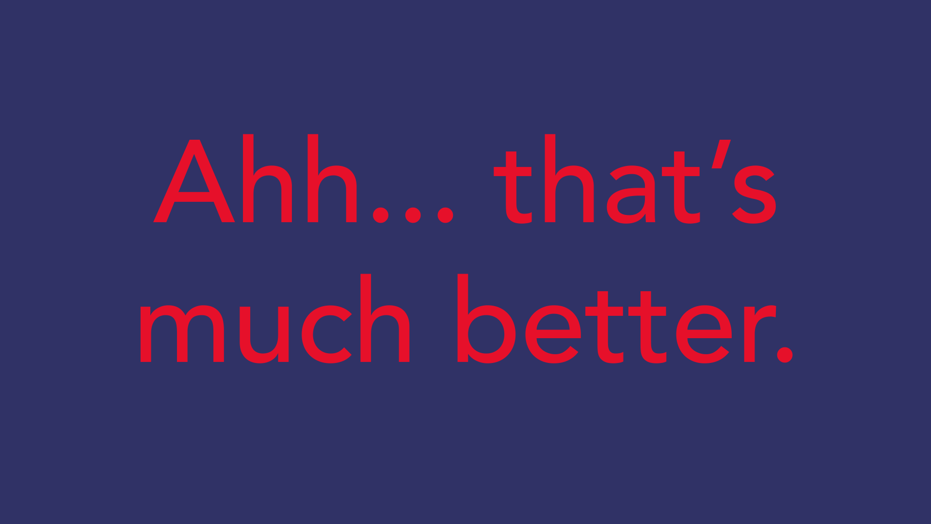
Readability is an important factor in any design. Your colors should be legible and easy on the eyes, especially when working with text.
Sometimes that means NOT using color—at least not in every little detail.

Neutral colors like black, white, and gray can help you balance your design, so when you do use color, it really stands out.

Choosing the right colors
Every color sends a message. It's important to consider the tone of your project, and choose a color palette that fits.
For example, bright colors tend to have a fun or modern vibe.
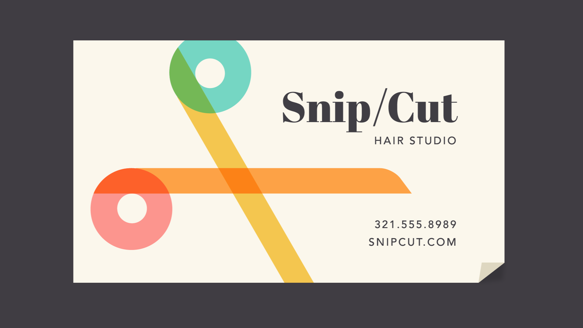
Desaturated colors often appear more serious or businesslike.
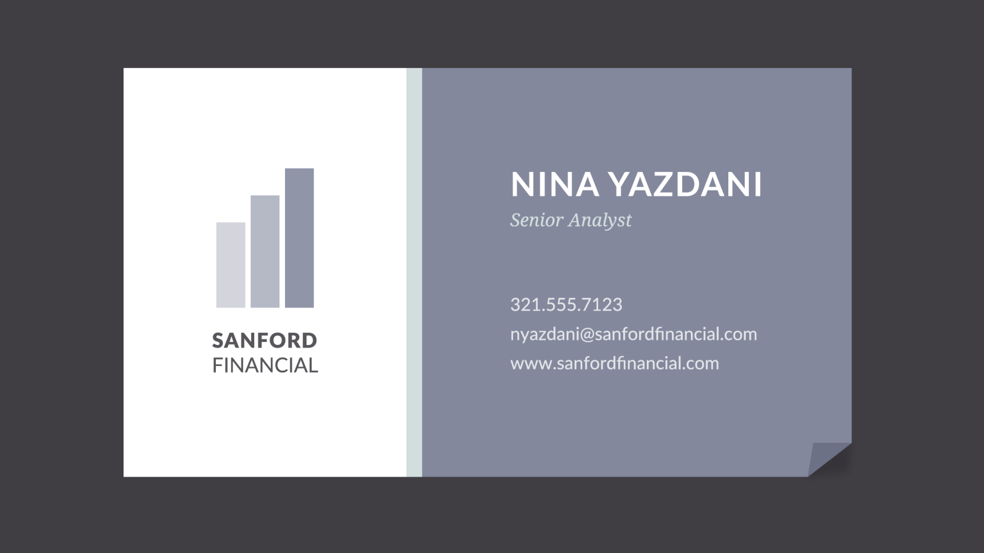
Sometimes it just depends on the context. With practice and creativity, there's no limit to what you can do.
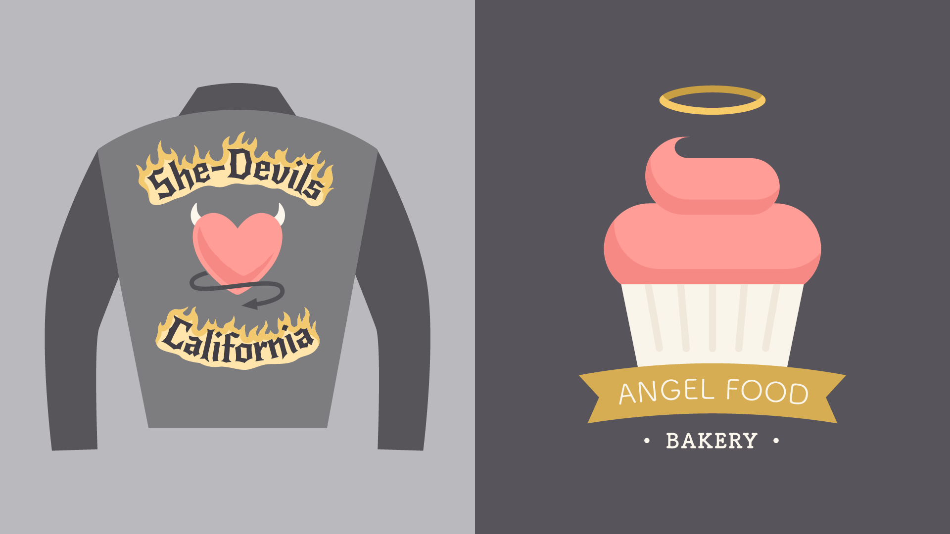
Finding inspiration
You can find ideas for color schemes in all kinds of interesting places, from advertising and branding to famous works of art.
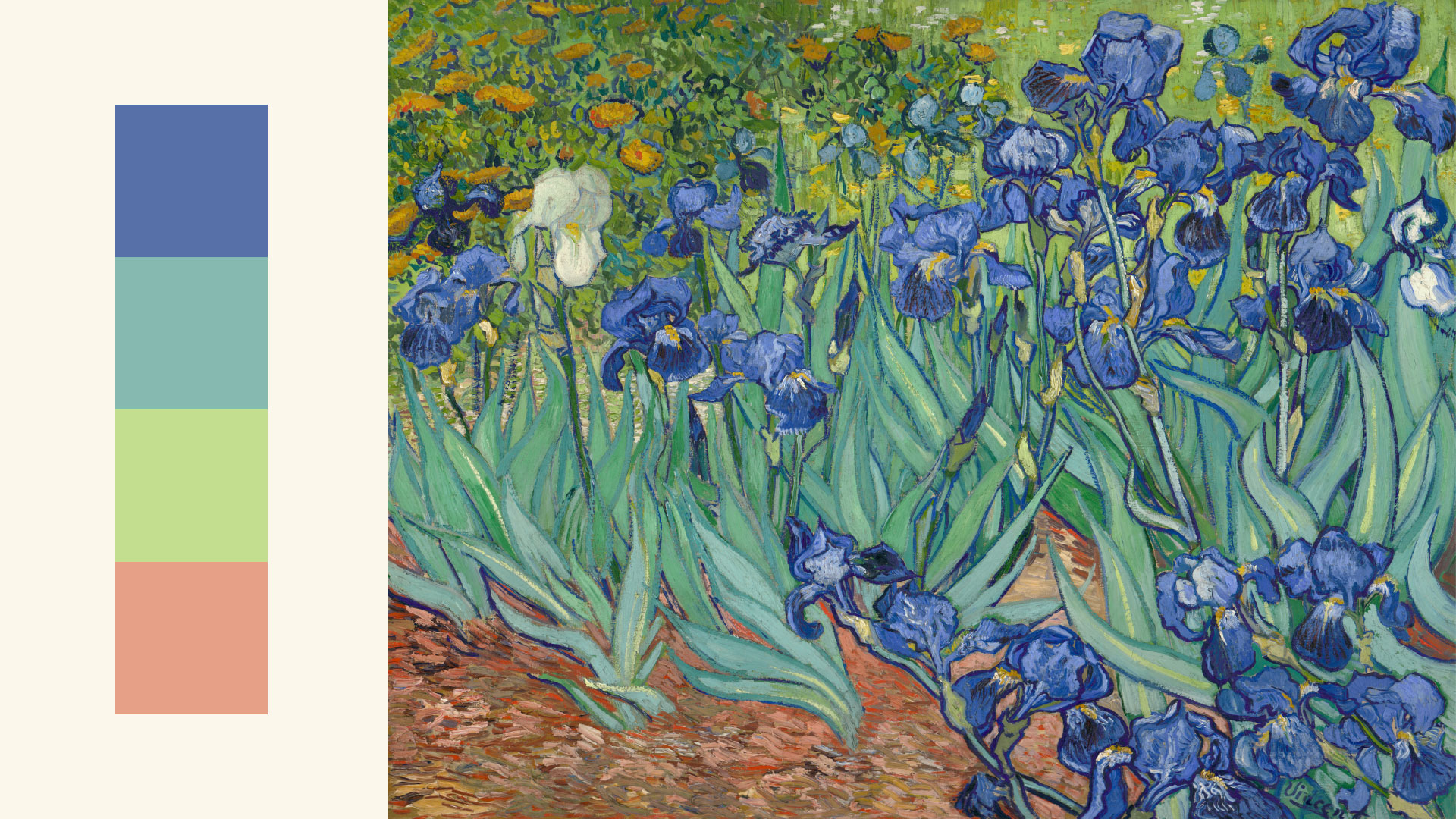
You can even use a web resource to browse color palettes or generate your own.
Experienced designers often take inspiration from the world around them. There's nothing wrong with finding something you like and making it your own.

Putting it all together
Everywhere you look, there's color, color, and more color. It can be intimidating to use it in your work, but it doesn't have to be. Just keep experimenting, and remember what you've learned about color theory. Soon, choosing great-looking colors will feel like second nature.
We hope you enjoyed learning the basics of color!
Be sure to check out the rest of our graphic design topics, including:
What is composition?
In many ways, layout and composition are the building blocks of design. They give your work structure and make it easier to navigate, from the margins on the sides to the content in between.

Why is composition so important? In short, it's the way your content is arranged. It doesn't matter if you're working with text, images, or elements in a graphic; without a thoughtful, well-composed layout, your work would basically fall apart.
Five basic principles
The key to mastering layout and composition is to think like a designer. Luckily, it's easier than it sounds. There are five basic principles that can help you transform your work and sharpen your eye for design. Keep them in mind during your next project, and look for ways to apply them.
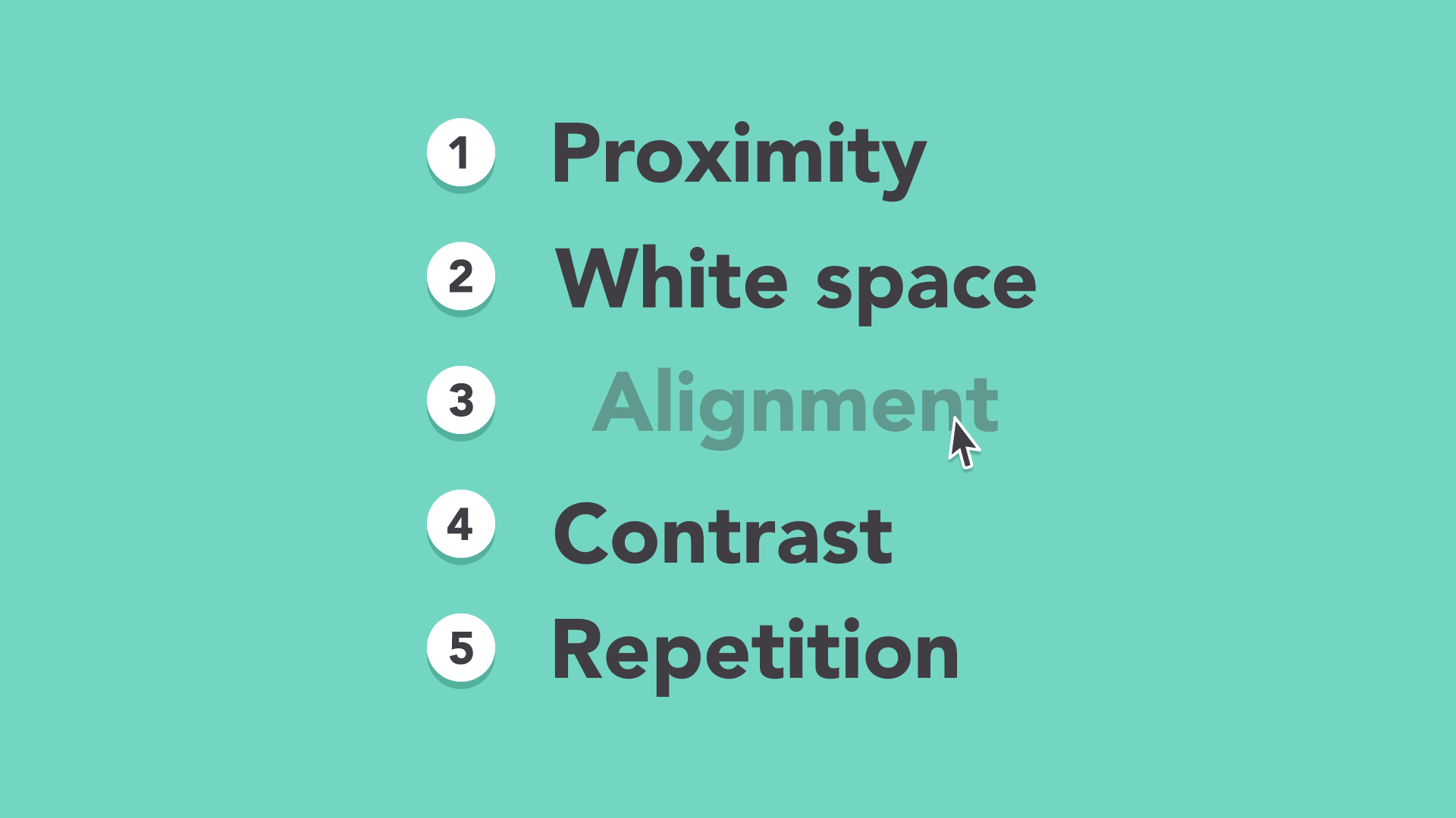
Proximity
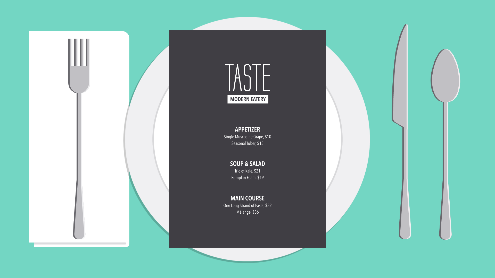
Proximity is all about using visual space to show relationships in your content. In practice, it's pretty simple—all you have to do is make sure related items are grouped together (for instance, blocks of text or elements in a graphic, as in the example below).
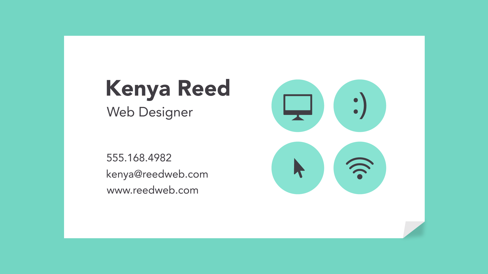
Groups that are NOT related to each other should be separated to visually emphasize their lack of a relationship. All in all, this makes your work easier to understand at a glance, whether it's purely text or something more visual.
White space
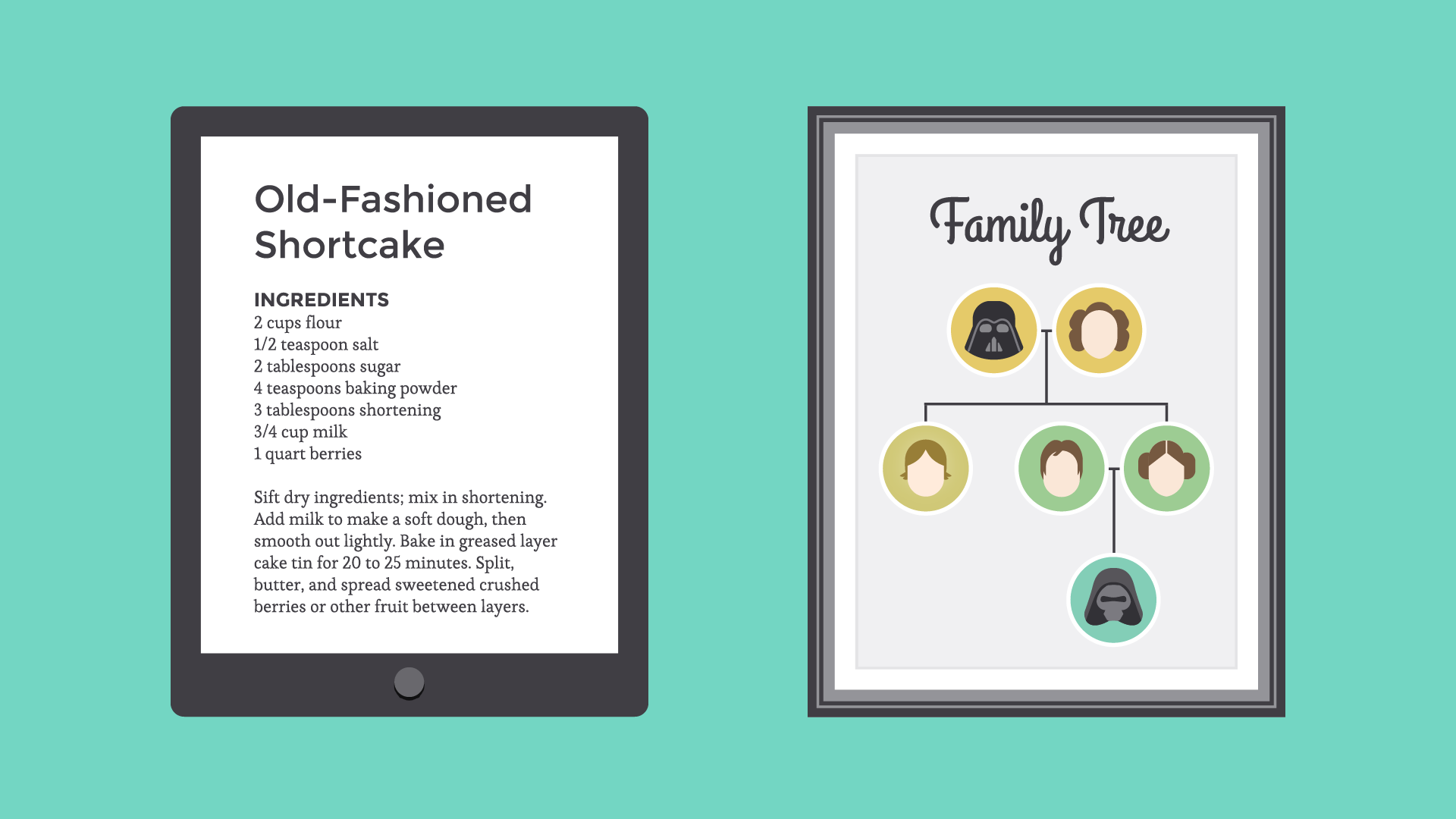
White space is an important part of every composition. Now, this doesn't mean literal white space; it just means negative space, like the spaces between your content, between lines, and even the outer margins.
There's no one way to use white space correctly, but it's good to understand its purpose. White space helps you define and separate different sections; it gives your content room to breathe. If your work ever starts to feel cluttered or uncomfortable, a little white space might be just what the doctor ordered.
Alignment
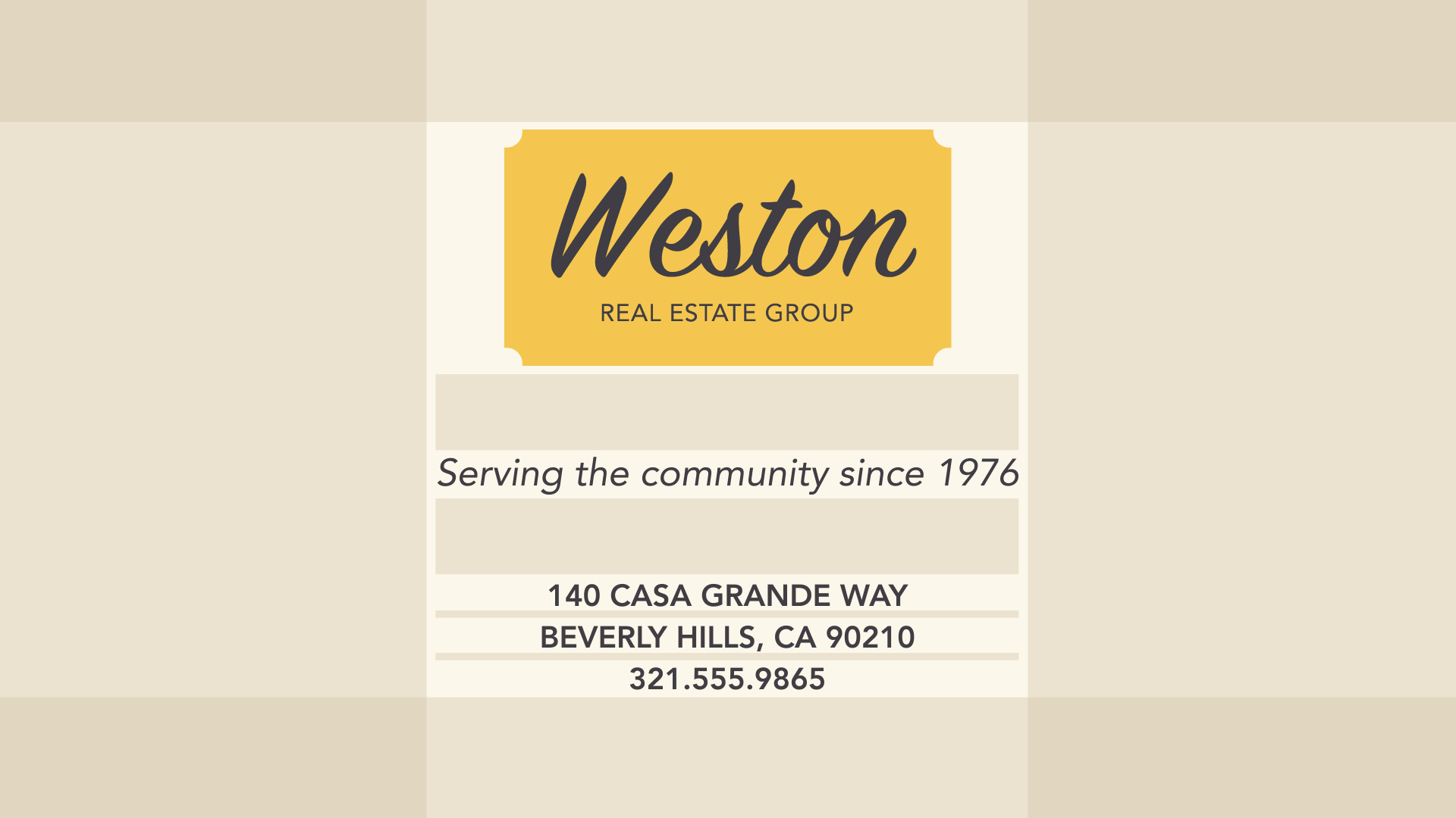
Alignment is something you deal with all the time, even if you don't realize it. Whenever you type an email or create a document, the text is aligned automatically.
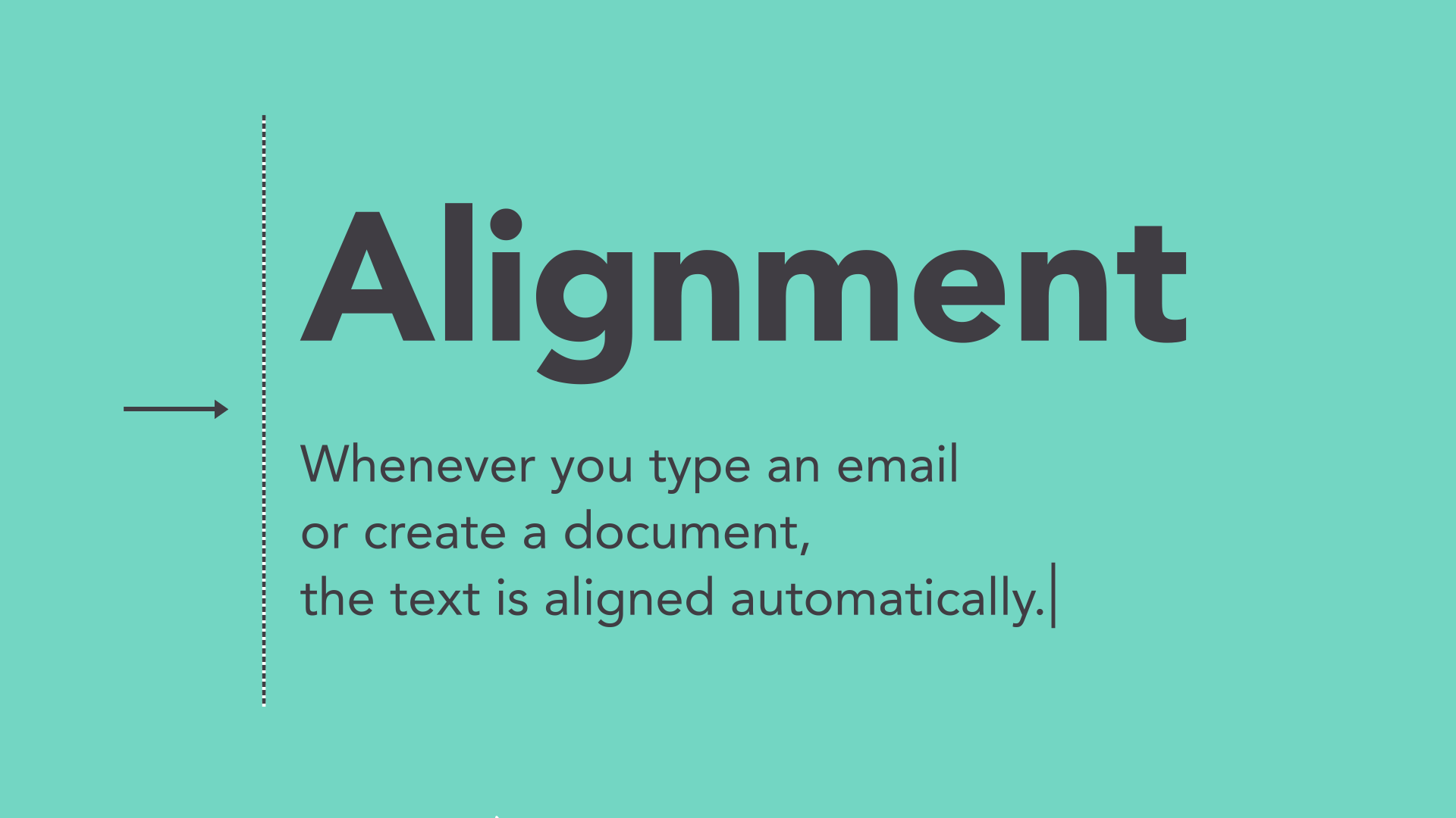
When aligning objects by yourself (for instance, images or separate text boxes), getting it right can be tricky. The most important thing is to be consistent.
It might help to imagine your content arranged inside of a grid, just like the example below. Notice how there's an invisible line centering each image to the text? Each grouping is also evenly spaced and aligned, with equal-sized margins.
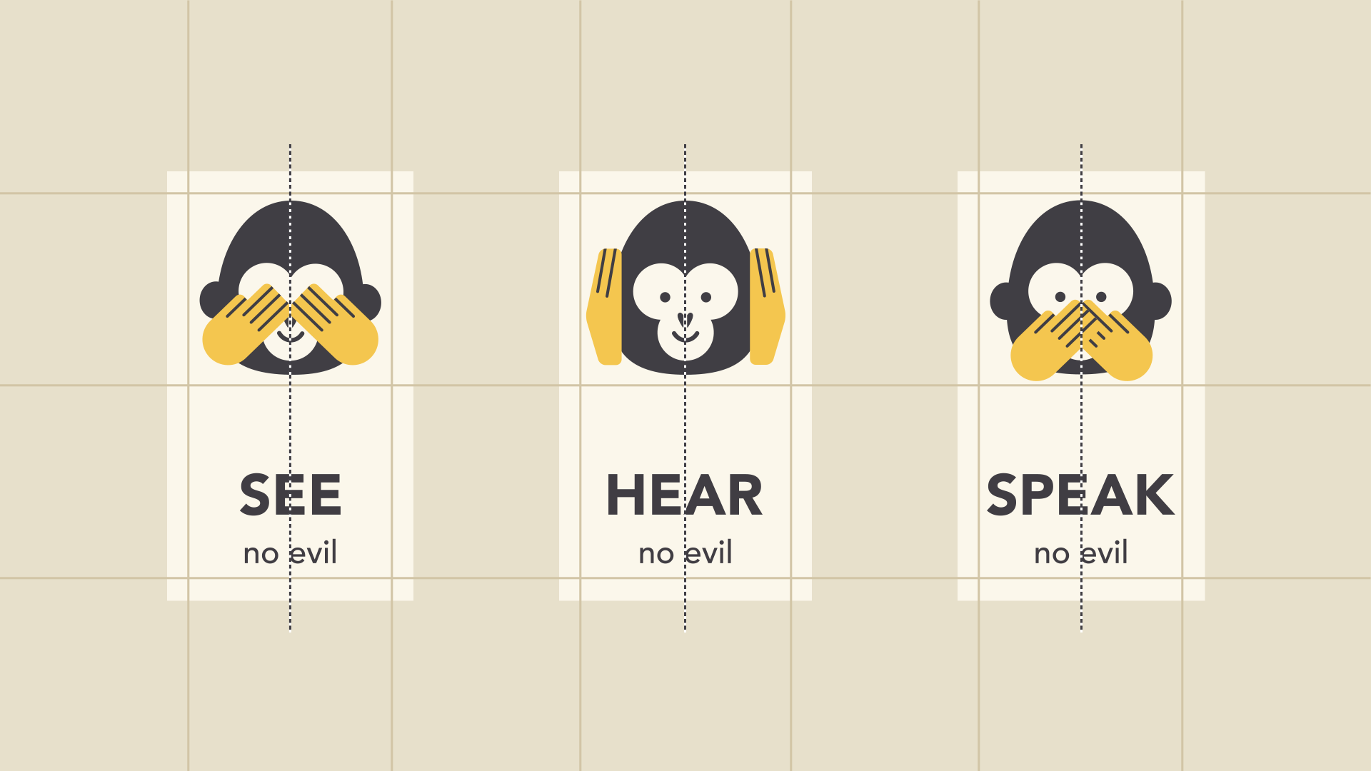
It's this attention to detail that makes the composition easier to navigate. Without consistent alignment, your work could start to feel disorganized.
Contrast
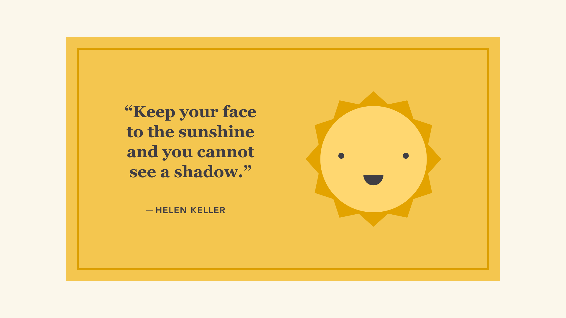
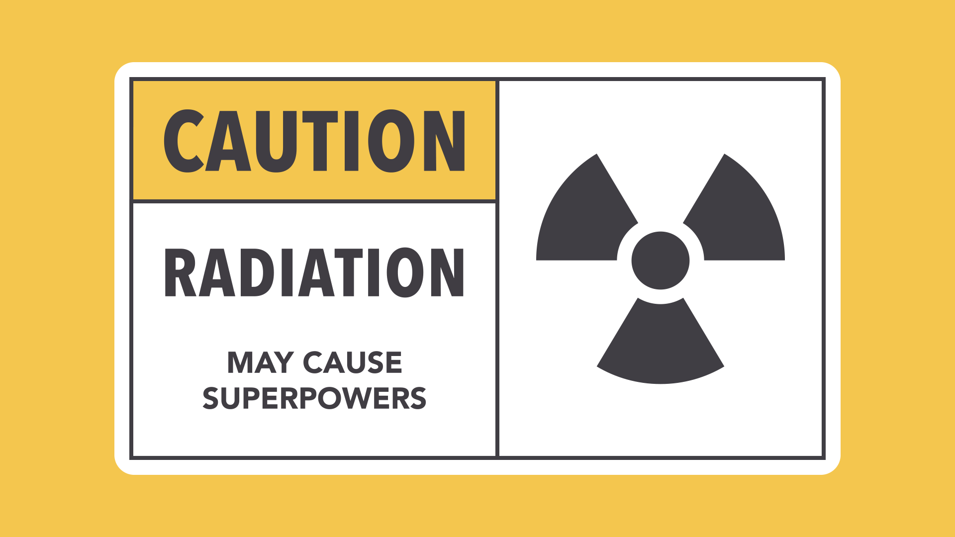
Contrast simply means that one item is different from another. In layout and composition, contrast can help you do many things, like catch the reader's eye, create emphasis, or call attention to something important.
To create contrast in the example below, we've used color, more than one style of text, and objects of differing sizes. This makes the design more dynamic and, therefore, more effective at communicating its message.
Hierarchy
Contrast is also closely tied to hierarchy, which is a visual technique that can help the viewer navigate your work. In other words, it shows them where to begin and where to go next using different levels of emphasis.
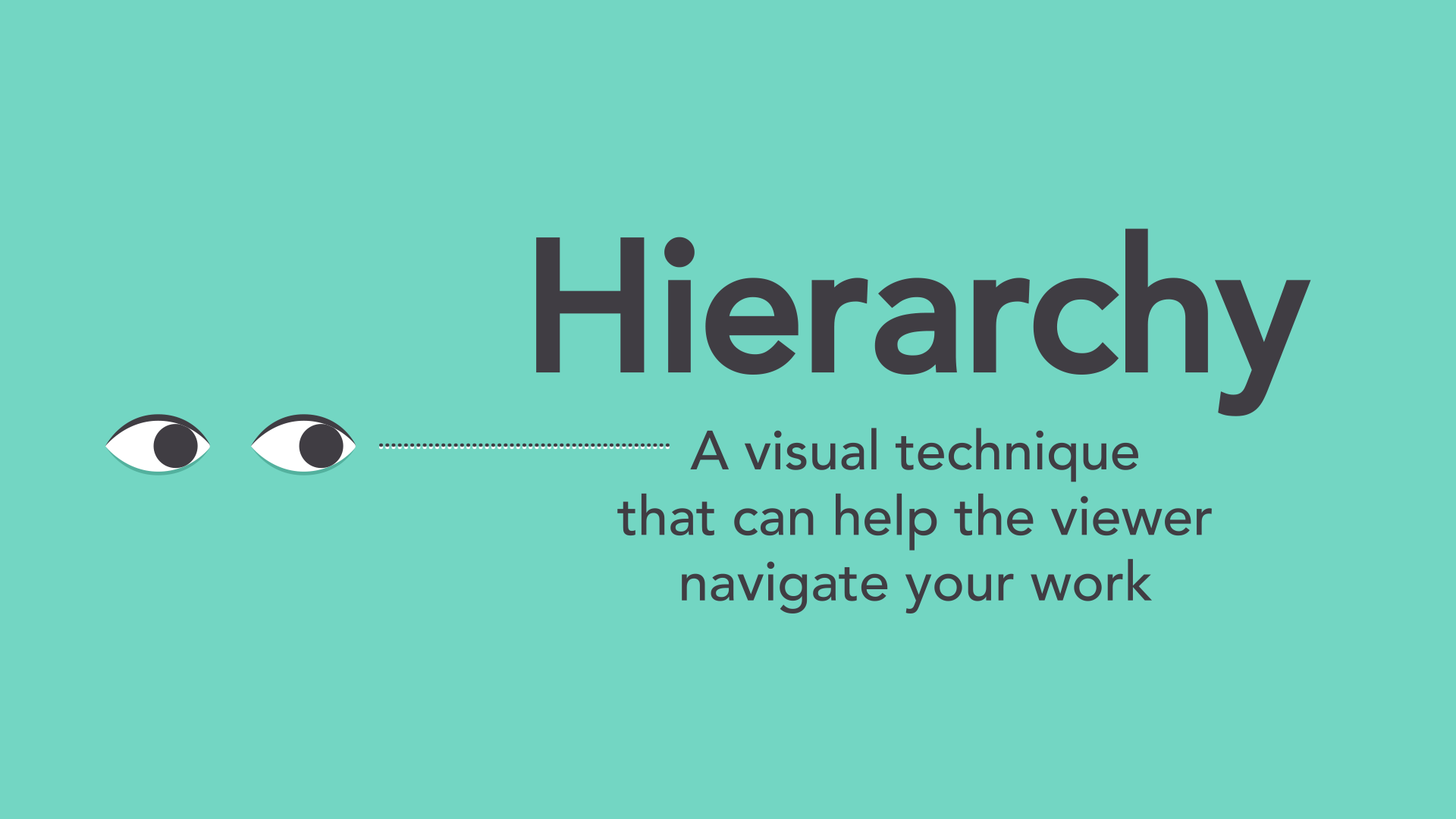
Establishing hierarchy is simple: Just decide which elements you want the reader to notice first, then make them stand out. High-level or important items are usually larger, bolder, or more eye-catching in some way.
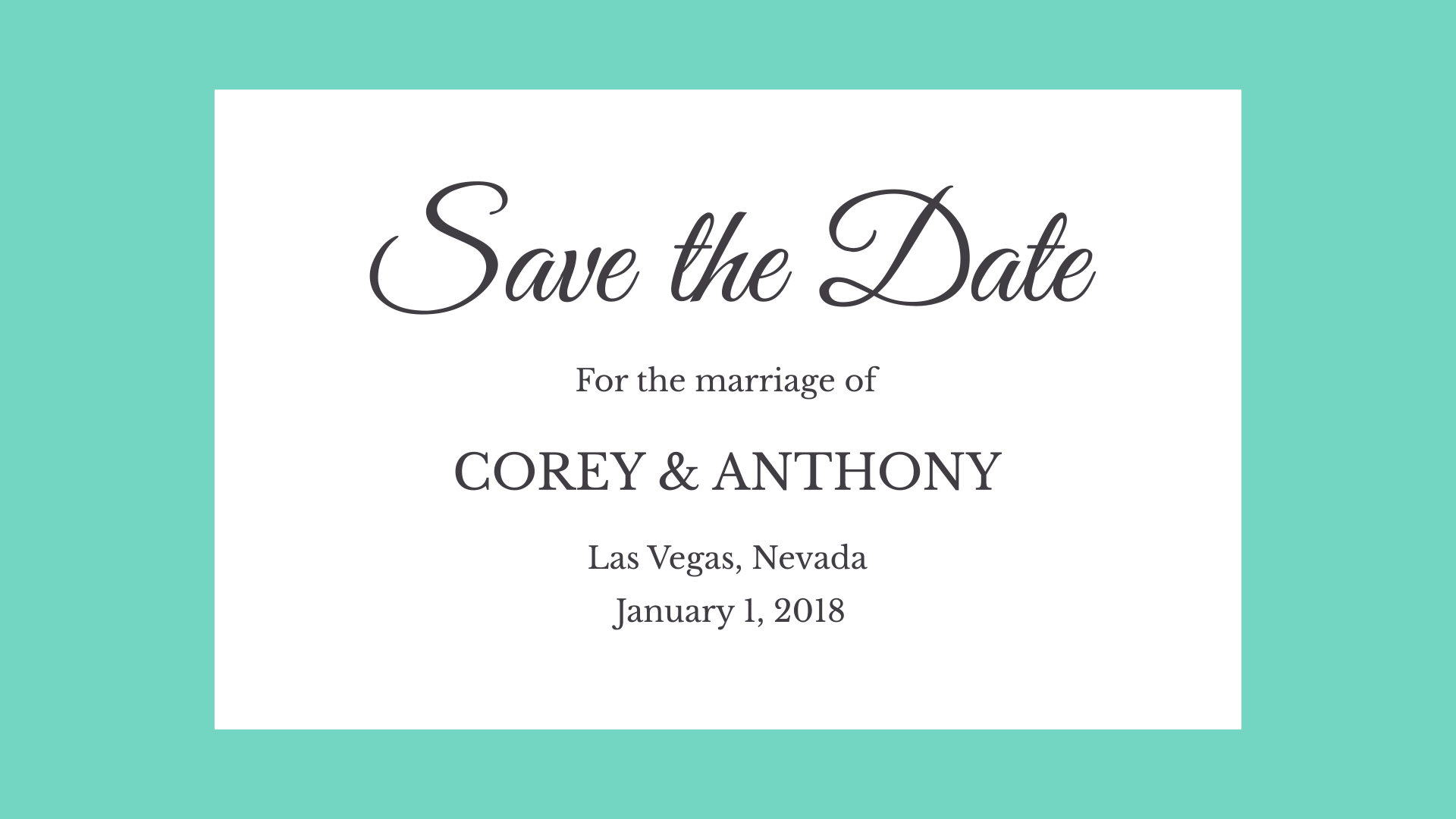
Repetition
Repetition is a reminder that every project should have a consistent look and feel. This means finding ways to reinforce your design by repeating or echoing certain elements.
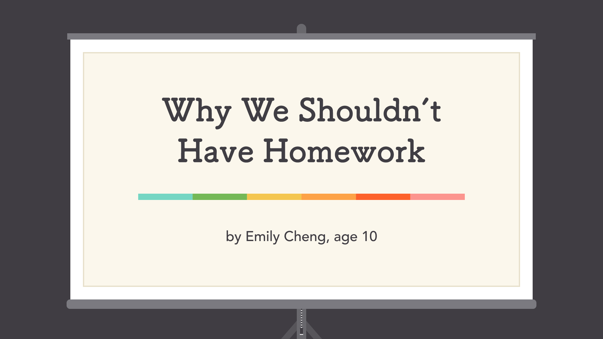
For instance, if you have a specific color palette, look for ways to carry it through. If you've chosen a special header style, use it every time.
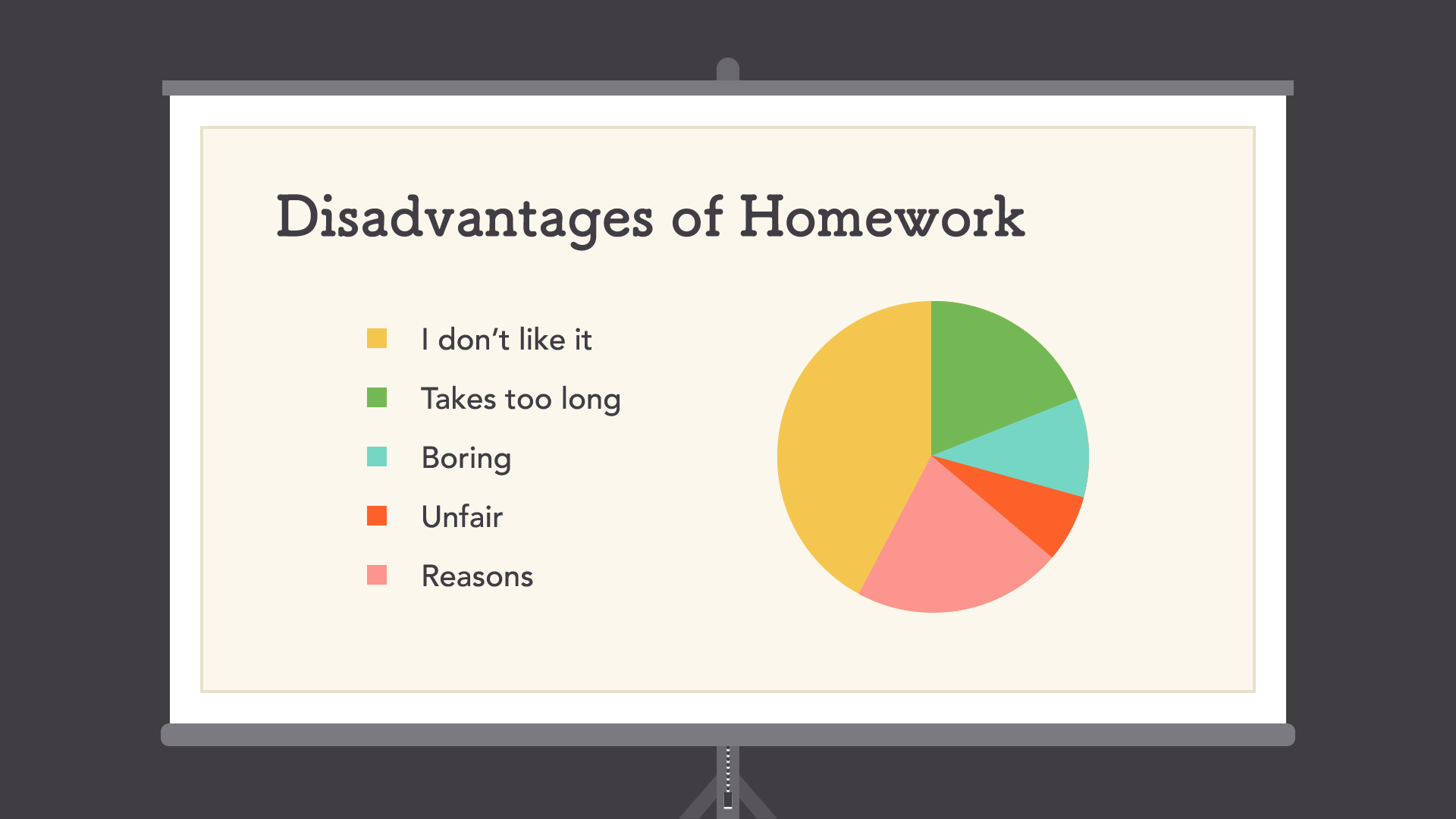
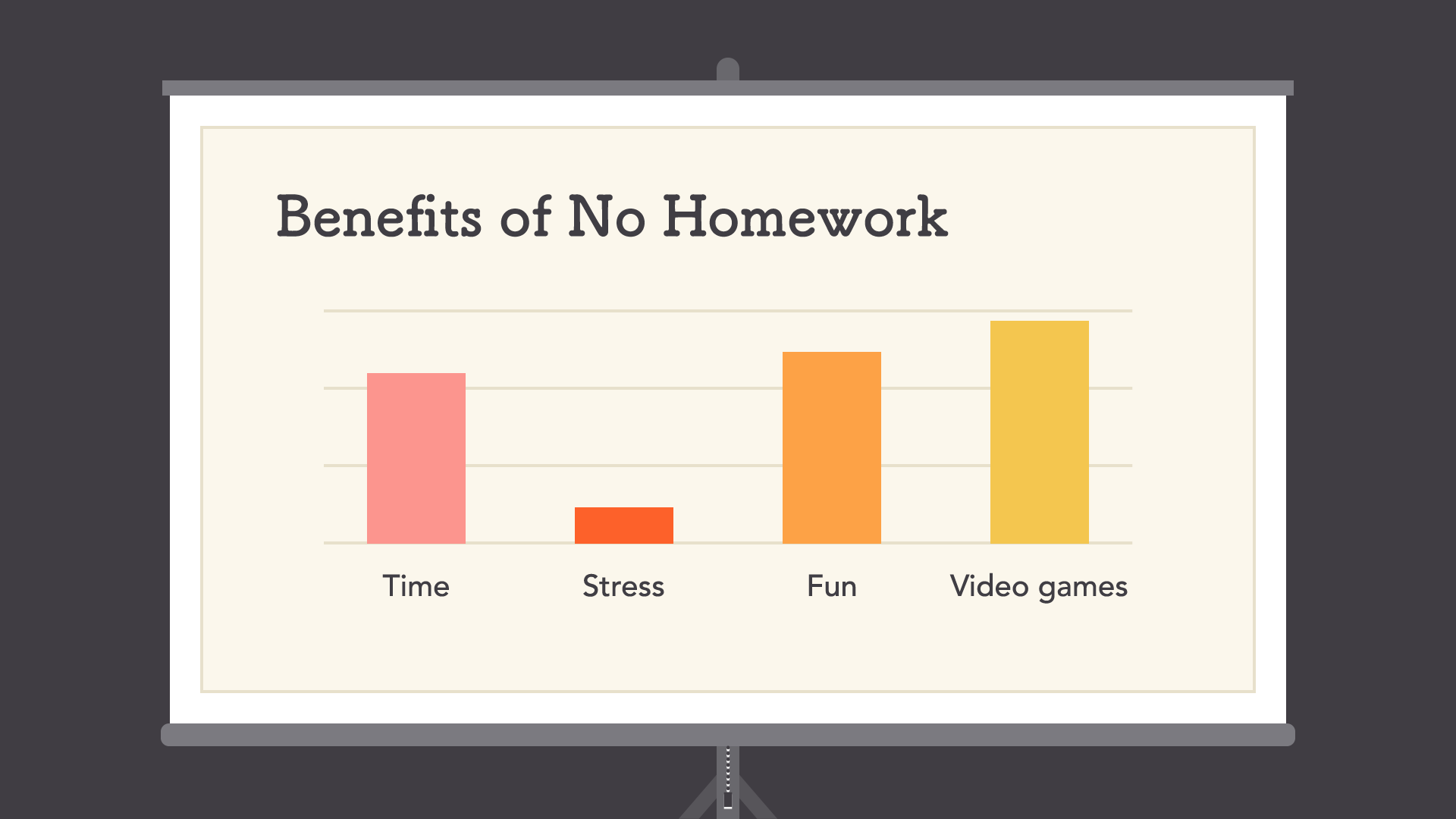
It's not just for aesthetic reasons—being consistent can also make your work easier to read. When viewers know what to expect, they can relax and focus on the content.
Putting it all together
You might say layout and composition are the unsung heroes of design. It's easy to overlook their role, but they're part of everything you do.
The principles you just learned can help you elevate any project. All it takes is a little attention to detail and you can create beautiful, professional-looking compositions.
We hope you enjoyed learning the basics of composition!
The power of images
Images can be a powerful force in design. No matter what the subject, we're naturally drawn to them. From beautiful, high-definition photos to carefully crafted graphics, they're usually the first thing we see.
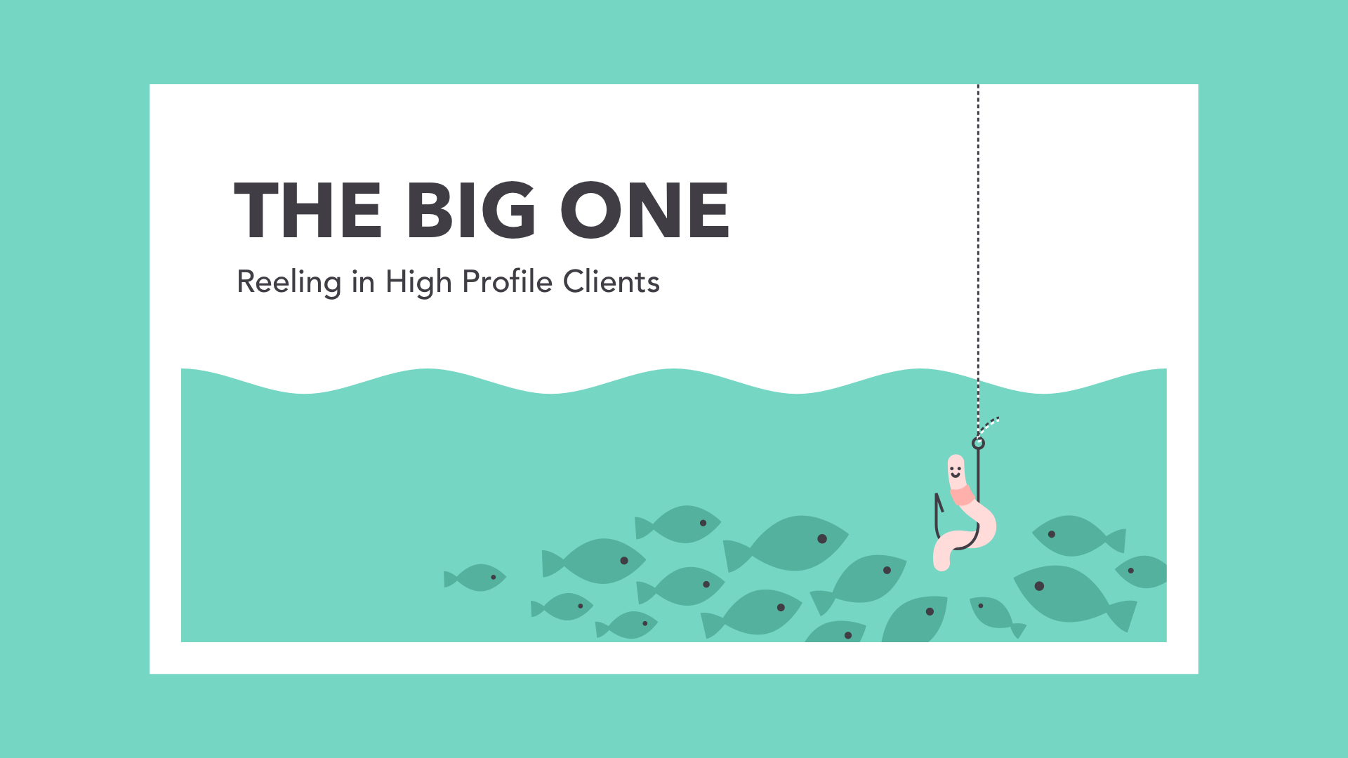
However, images aren't just for decoration. In design, they're the hook that draws the viewer in. Compelling visuals can help you connect with the audience—and make a strong impression—before they've even read a single word.
Finding images
You don't have to be an artist to use images in your work. All it takes is a little creativity and a willingness to think outside the box. With the right resources, you can learn to set your designs apart. First: finding high-quality images for almost any type of project.

Using stock
Maybe you're handy with a camera or have some graphic design experience—that's great! If not, don't panic. There are countless online sources that offer images for exactly this purpose.

The truth is, most people (including professionals) rely on free or low-cost images called stock. Stock is perfect when you need something specific—for example, a photo of a tiny dog in a teacup—and you don't have the time or resources to create it yourself.

Choosing effective stock
Most stock image sites let you browse or search their offerings. Look for results that are relevant to your project, but also unique in some way.
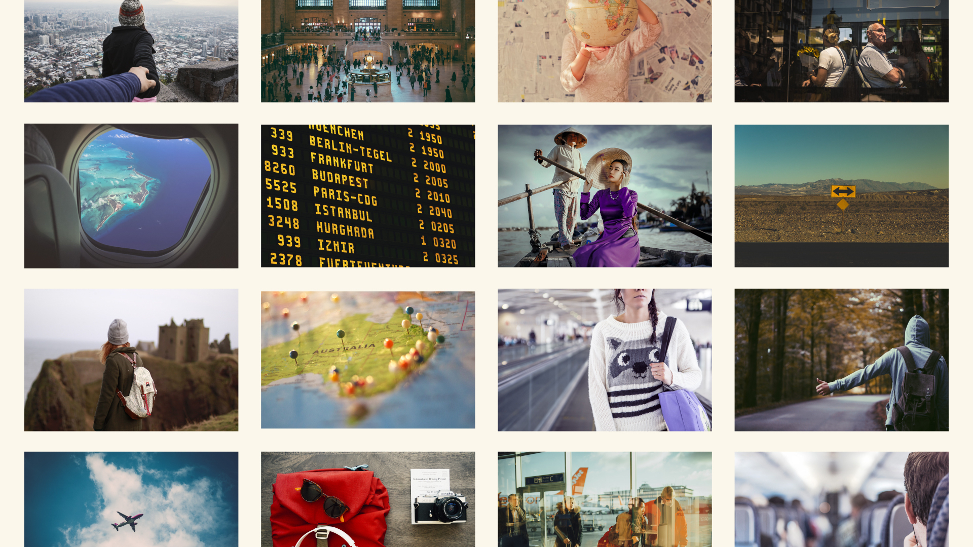
In this example, we've searched for the word travel. The image below would be a fine choice because it subtly illustrates the concept but has a personal feel.

As viewers, we're are naturally drawn to images that feel authentic, like distinct but believable photos and graphics that tell a story. The best images are somewhat open ended. They set the tone for your project but leave room for interpretation.

Some stock images are just too generic to be effective. For instance, how many times have you seen a business presentation with something like the graphic below?

For a more modern, professional design, avoid images that lack context or are too literal in meaning. Instead, look for imagery that's connected to your work, but in a more subtle, relatable way.

Image usage rights
Almost every stock image has a license that states how it can be used. Some are very generous and ask for little or nothing in return. Others are more restrictive and can have serious legal ramifications if disobeyed.
Before you use a stock image, make sure you understand the license associated with it (you might need to do some research if it isn't clearly explained). If the license isn't listed alongside the image, double check the stock provider's policies or FAQs.
To learn more about usage rights in general, review our Copyright and Fair Use lesson. For specific information on images, visit StockPhotoRights.com.
The importance of quality
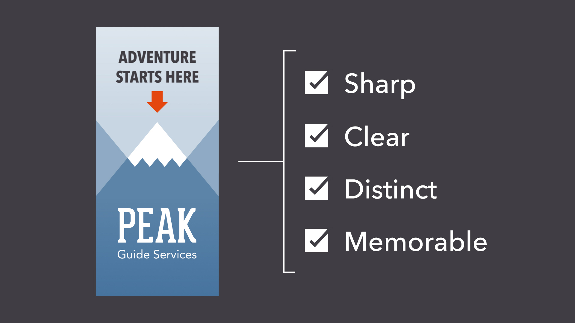
Of course, it's not just about content. There's also a technical side to images, which can have a big impact on your design. It doesn't matter if the photo you've chosen is absolutely perfect in every other way. If it's blurry or pixelated, it could give the wrong impression.

Look for high-quality images that are sharp, clear, and free of distortion. In general, bigger is better, because it gives you more to work with. A large, high-resolution image can always be cropped or sized down, depending on the needs of the project.

Unfortunately, it doesn't work the other way around. If you enlarge a small image—in other words, make it bigger than its original size—there will be a noticeable loss in quality. The image will become blurry and/or distorted, as in the example below.

Raster vs. vector
There's a reason small images lose quality when you enlarge them. It's because they're made up of thousands—sometimes even millions—of tiny little pixels. The word for this type of image is raster.

When you view a raster image at its original size or smaller, the pixels are invisible—they're just too small to see. They only become apparent when you zoom in or make the image larger.

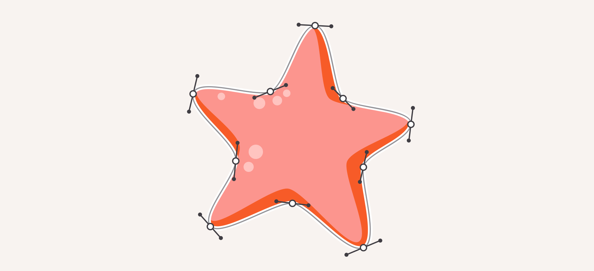
Vector graphics are quite different from raster. You can make them any size, big or small, without losing quality. In the example below, the image has been enlarged, but there's no pixelation—not even a little bit.
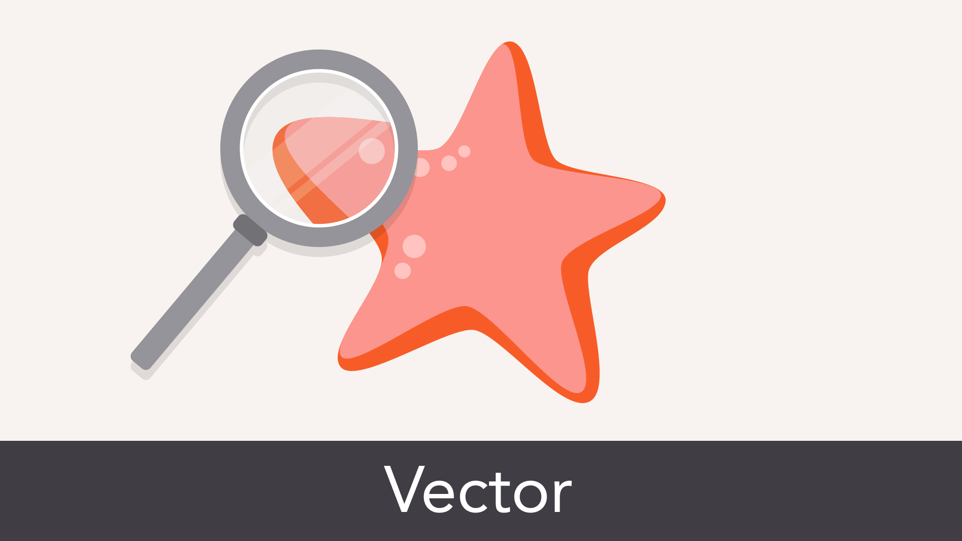
That's because vectors are made of something more complex than pixels. They're rendered using a special form of geometry. You're not likely to find vector graphics outside of professional design settings, but it's good to know what they are.
Editing images
Few stock images are perfect as is, even if they're technically high-quality ones. Maybe the image is the wrong size or the colors could use some work. Fortunately, even basic programs let you make simple adjustments. Look for these options the next time you need to fix or enhance an image.

For a closer look at image editing, read our Image Editing 101 tutorial.
Cropping
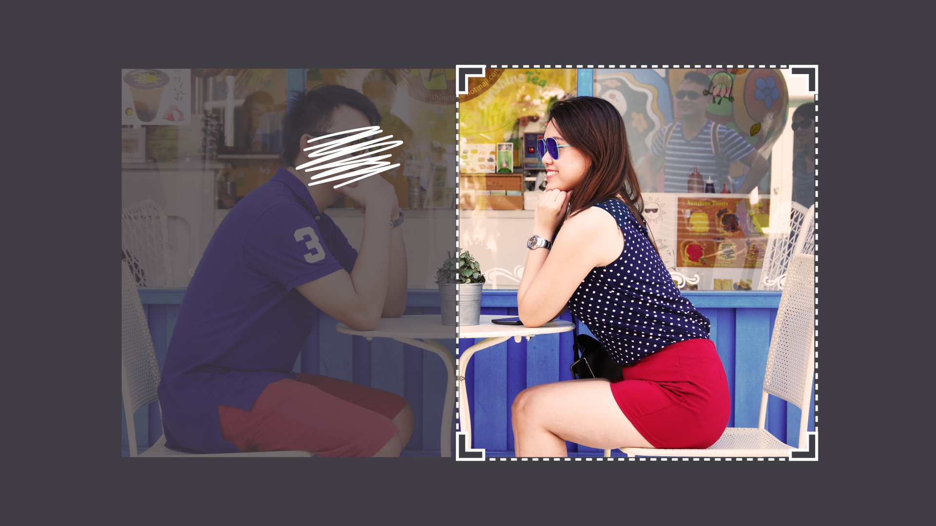
Cropping can be used to change the size, shape, or focus of an image, making it useful in many different situations.

Try this feature if your graphic is the wrong dimensions, or if it includes something you'd rather cut out.
Resizing
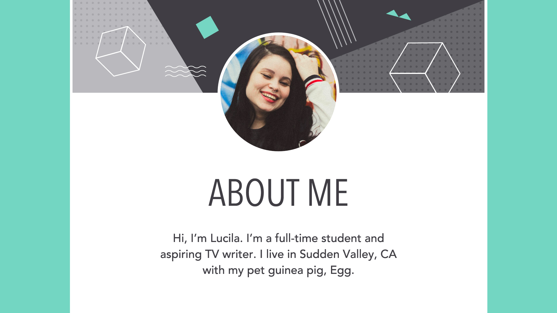
Resizing an image will ensure it's the perfect fit for your project. Just remember that you can't make an image bigger than its original size without affecting its quality.

If the image you're working with simply isn't big enough, it's best to choose something else. You can also find a creative way to work with the image size you have. In the example below, we've added a background image instead of enlarging the portrait.
Other adjustments
Cosmetic adjustments let you enhance certain image qualities, including brightness, contrast, saturation, and color.
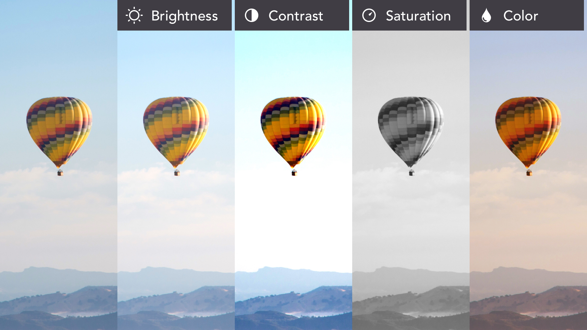
If your favorite program offers filters or presets, you can change your image dramatically with very little time and effort.

Putting it all together
Adding photos, graphics, and other visuals to your work is a great way to make it more engaging. Even a simple background image can transform your design into something special.
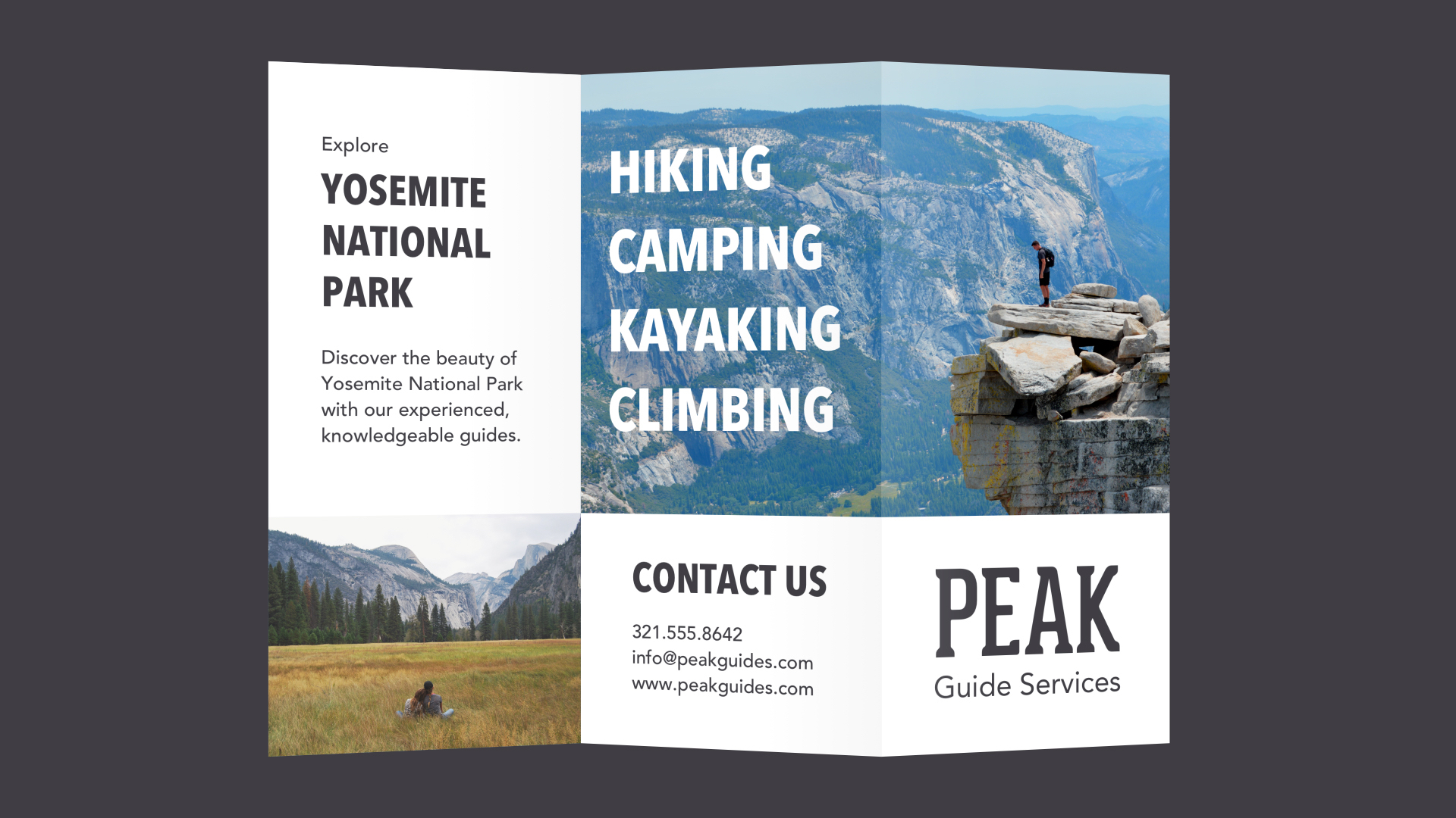
Just remember what you've learned about image quality—both technical and conceptual—and your work is sure to stand out for the right reasons.
We hope you enjoyed learning the basics of images!
The basis of art, design, and more
The fundamentals of design are the foundation of every visual medium, from fine art to modern web design. They're even present in seemingly unimportant details, like the fonts that make up most compositions.
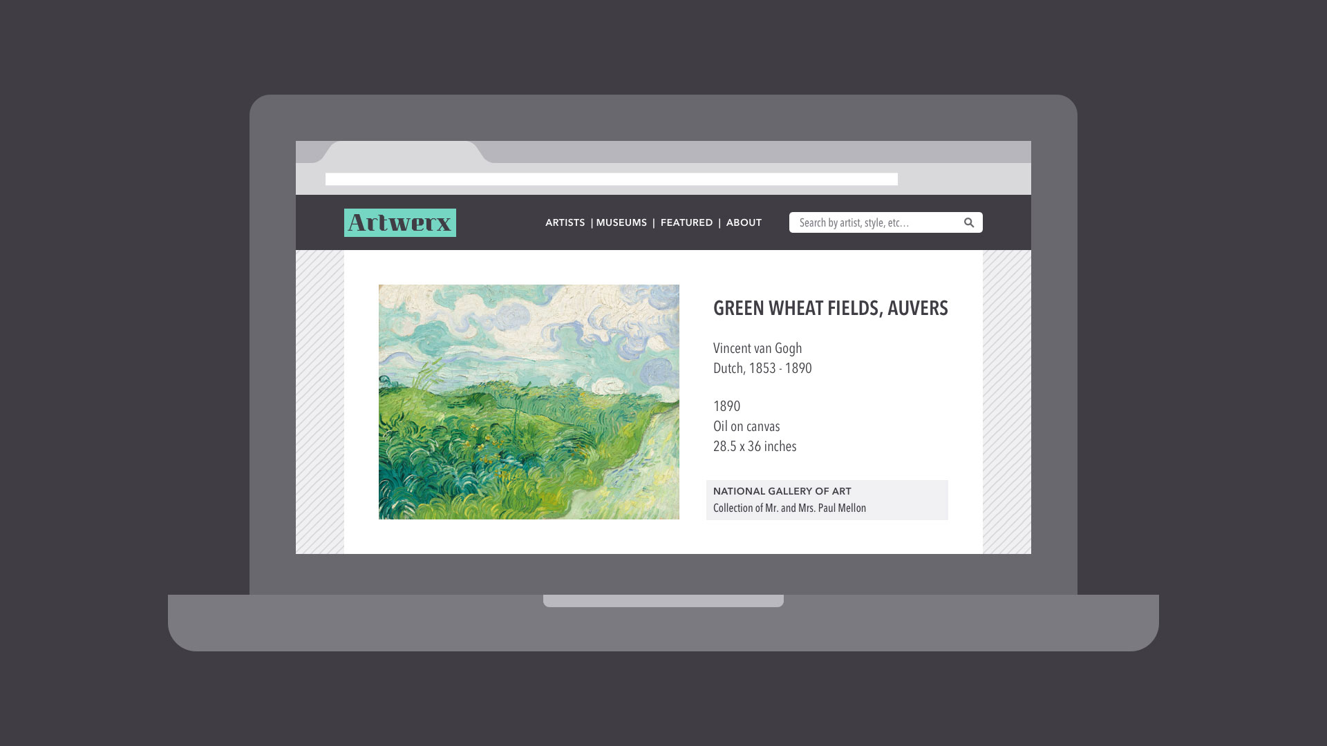
What do these examples have in common? Some very basic elements, including line, shape, form, texture, and balance. They might not seem like much on their own, but together, they're part of almost everything we see and create.
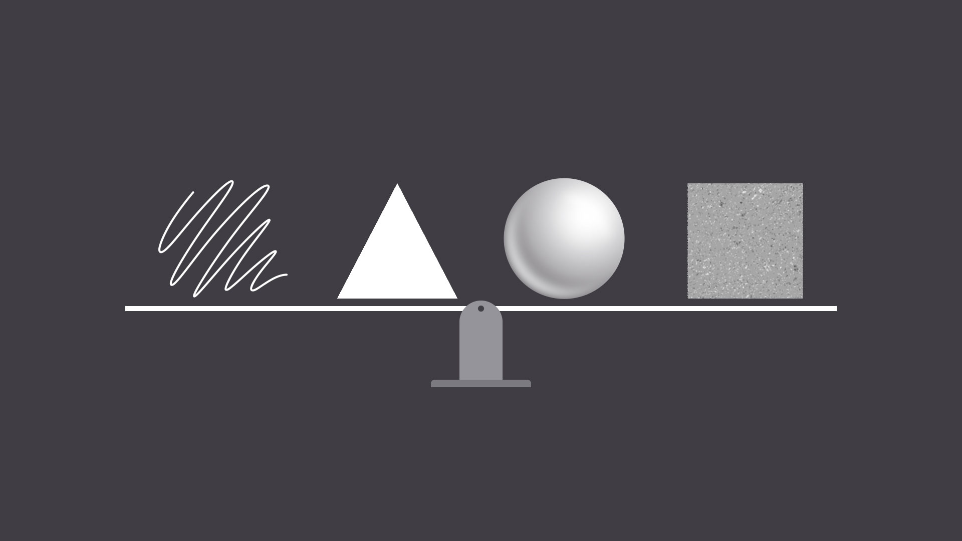
The fundamentals can be intimidating at first, especially if you don't consider yourself an artist. But keep an open mind—there's a lot they can teach you about working with different assets and creating simple visuals from scratch.
Line
A line is a shape that connects two or more points. It can be fat, thin, wavy, or jagged—the list goes on. Every possibility gives the line a slightly different feel.

Lines appear frequently in design; for example, in drawings and illustrations. They're also common in graphic elements, like textures, patterns, and backgrounds.
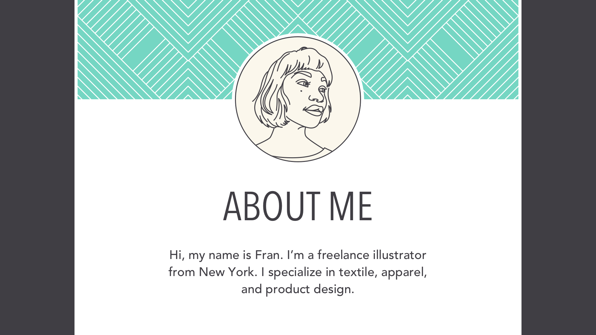
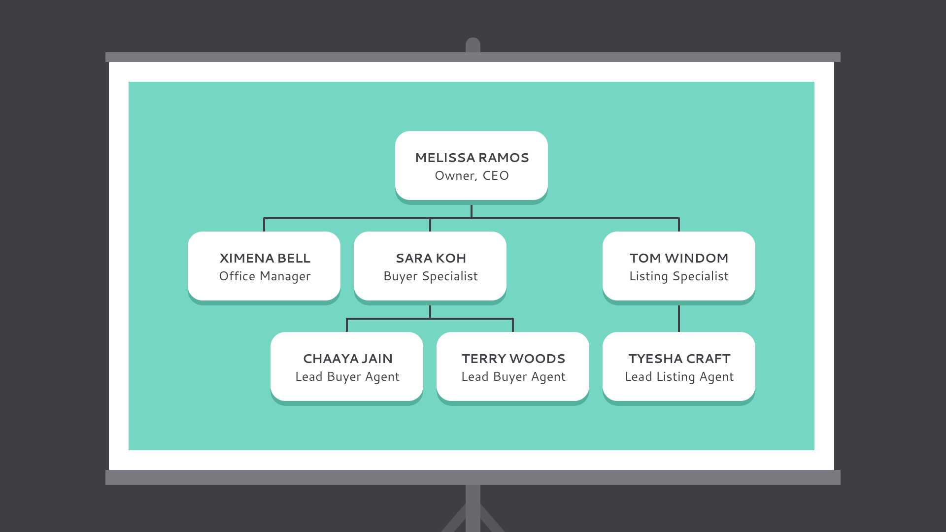
Lines can be used in more humble compositions, too—for organization, emphasis, or just decoration. In the example below, lines have been used to create a flow chart that guides the reader's eye from one element to the next.
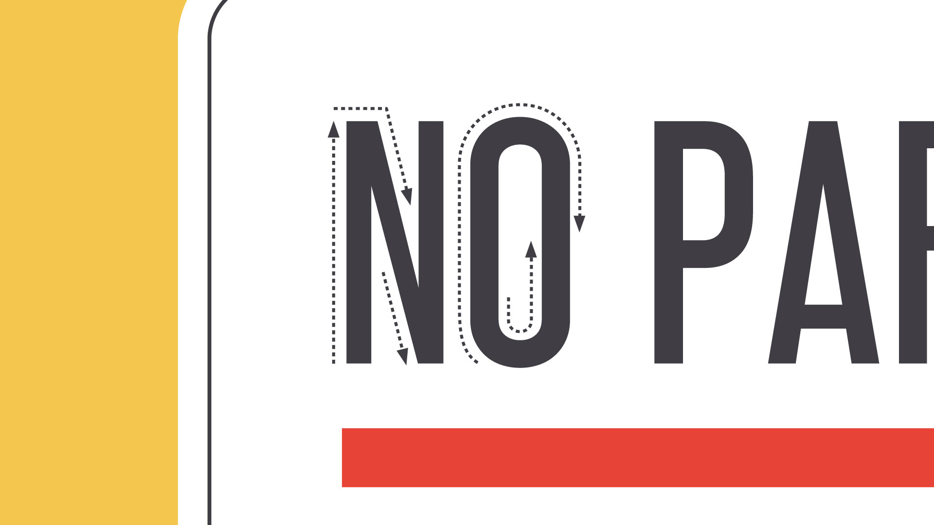
When working with lines, pay attention to things like weight, color, texture, and style. These subtle qualities can have a big impact on the way your design is perceived.

Look for places where lines are hiding in plain sight; for example, in text. Even here, experimenting with different line qualities can give you very different results.
Shape
A shape is any two-dimensional area with a recognizable boundary. This includes circles, squares, triangles, and so on.
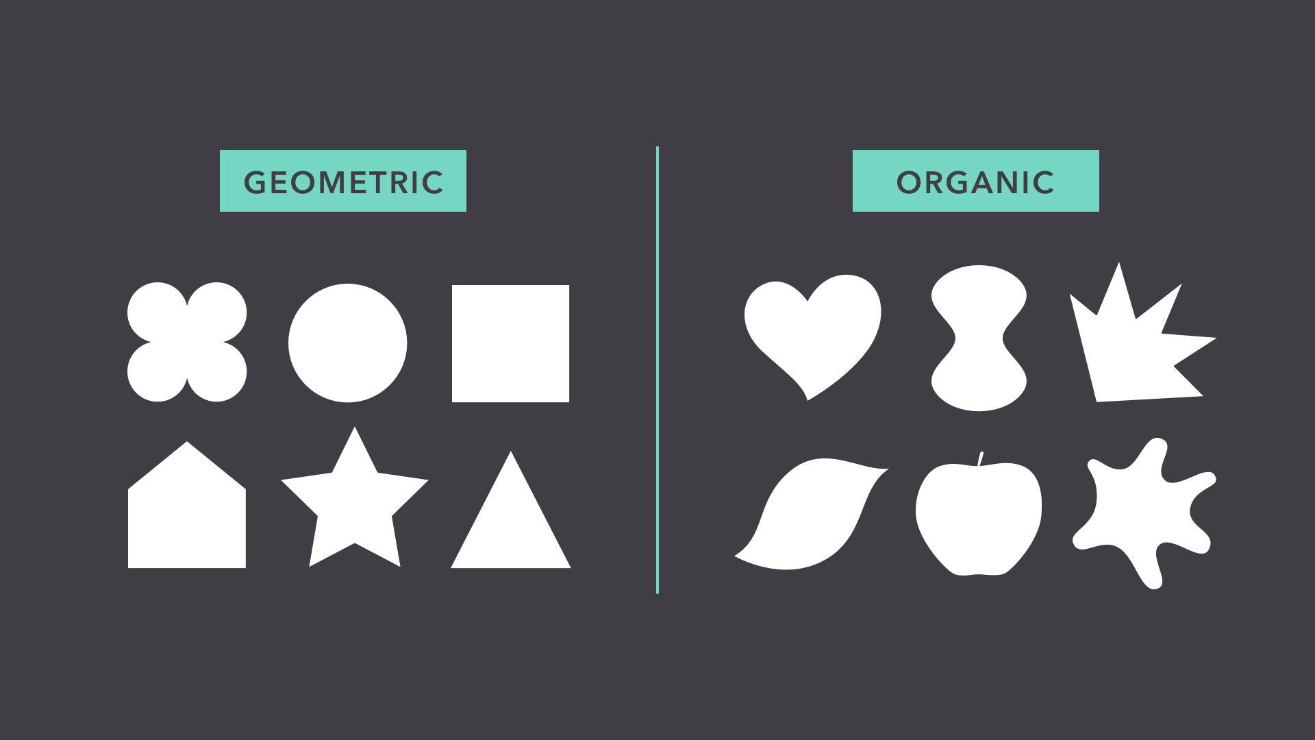
Shapes fall into two distinct categories: geometric (or regular) and organic (where the shapes are more free form).
Shapes are a vital part of communicating ideas visually. They give images heft and make them recognizable. We understand street signs, symbols, and even abstract art largely because of shapes.

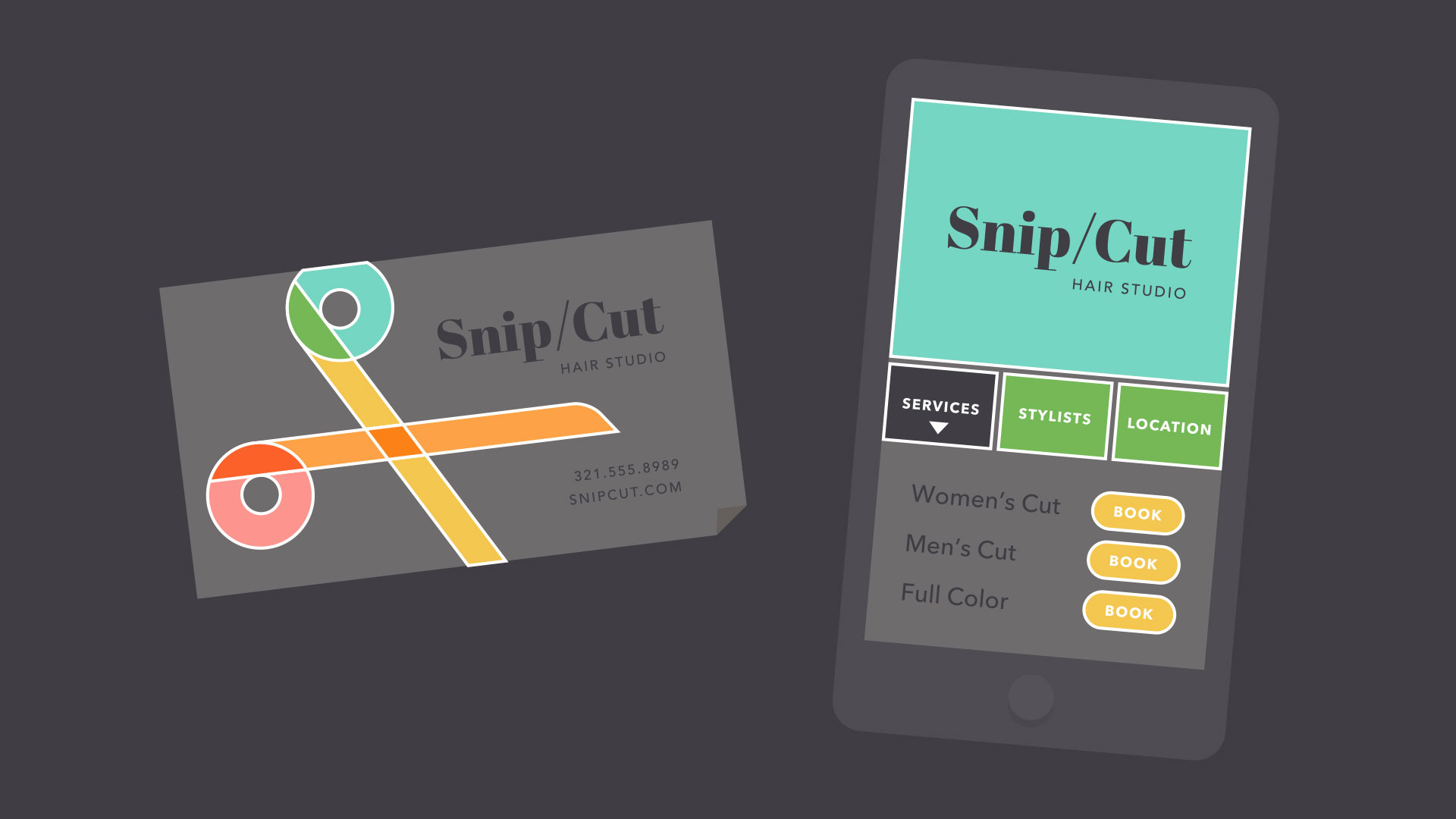
Shapes have a surprising number of uses in everyday design. They can help you organize or separate content, create simple illustrations, or just add interest to your work. See if you can spot the many examples in the image below.

Shapes are important because they're the foundation of so many things. Learn to look for them in other designs, and soon you'll start seeing them everywhere.
Form
When a shape becomes 3D, we call it a form. Forms make up a variety of things in the real world, including sculptures, architecture, and other three-dimensional objects.

However, forms don't have to be three-dimensional shapes. They can also be implied through illustration, using techniques like light, shadow, and perspective to create the illusion of depth.
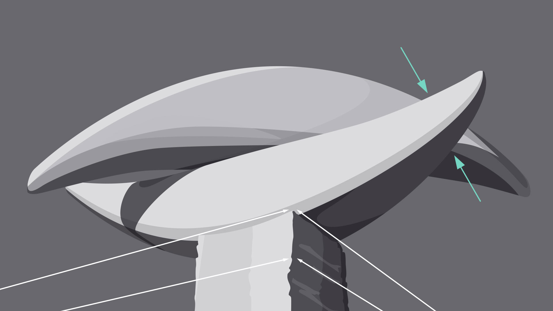
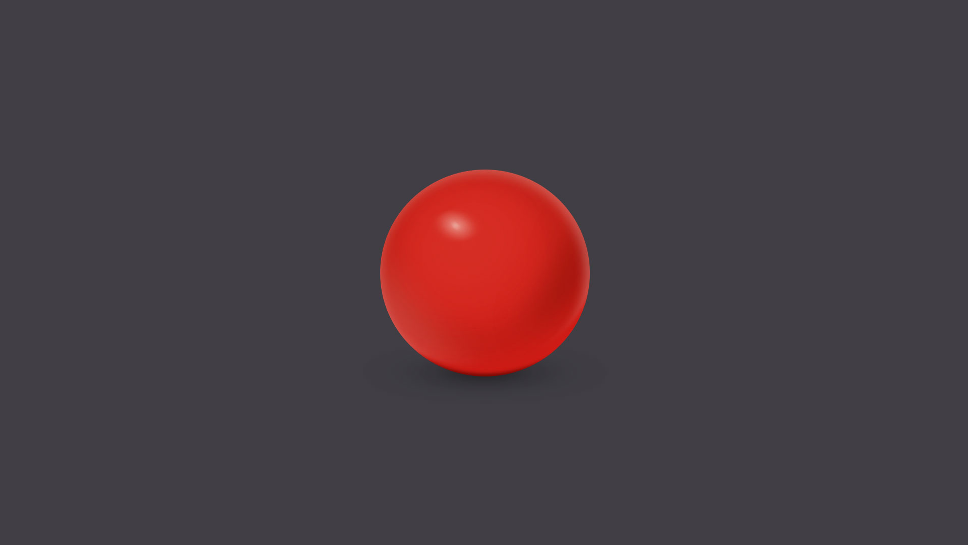
In two-dimensional design, form makes realism possible. Without it, renderings like the image below—a ball with highlights and shading—simply wouldn't be the same.
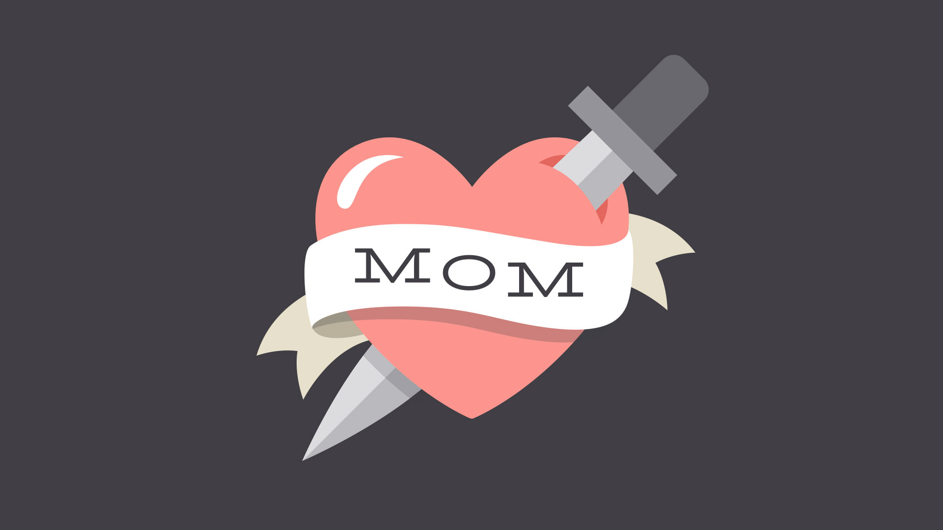
Even images that are less realistic use similar techniques to create dimension. Below, the lighting and shading are stylized, but still hint at form and depth.
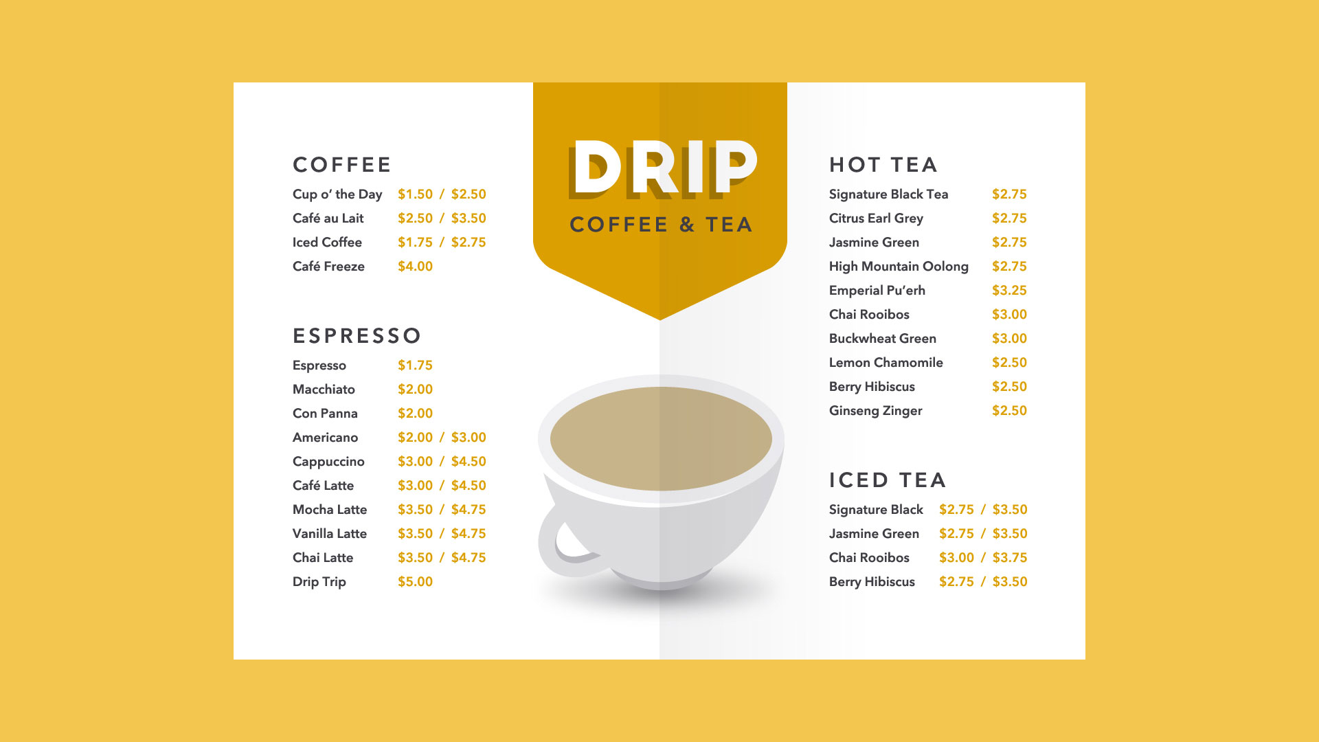
In everyday composition, the purpose of form is the same, but on a smaller scale. For example, a simple shadow can create the illusion of layers or give an object a sense of place.
Basic forms can bring a touch of realism to your work, which is a powerful tool when used in moderation.
Texture
Texture is the physical quality of a surface. Like form, it can be part of a three-dimensional object, as in the example below (a small prickly cactus in a shiny ceramic pot).

Or it can be implied through illustration, suggesting that it would have texture if it existed in real life.

In design, texture adds depth and tactility to otherwise flat images. Objects can appear smooth, rough, hard, or soft, depending on the elements at play.

For beginners, textures make great background images and can add a lot of interest to your work. Look closely, and you may find texture in unexpected places, like distressed fonts and smooth, glossy icons.

Just be careful not to go overboard—too much texture in a single design can quickly become overwhelming.

Balance
Balance is the equal distribution of visual weight (more specifically, how much any one element attracts the viewer's eye). Balance can be affected by many things, including color, size, number, and negative space.

Mastering balance can be tricky for beginners because it does take some intuition. Luckily, the design world is full of examples that can help you understand its different iterations.
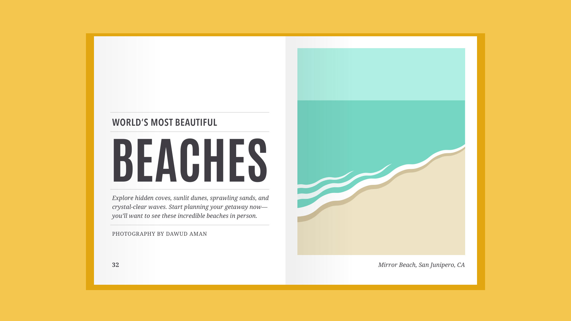
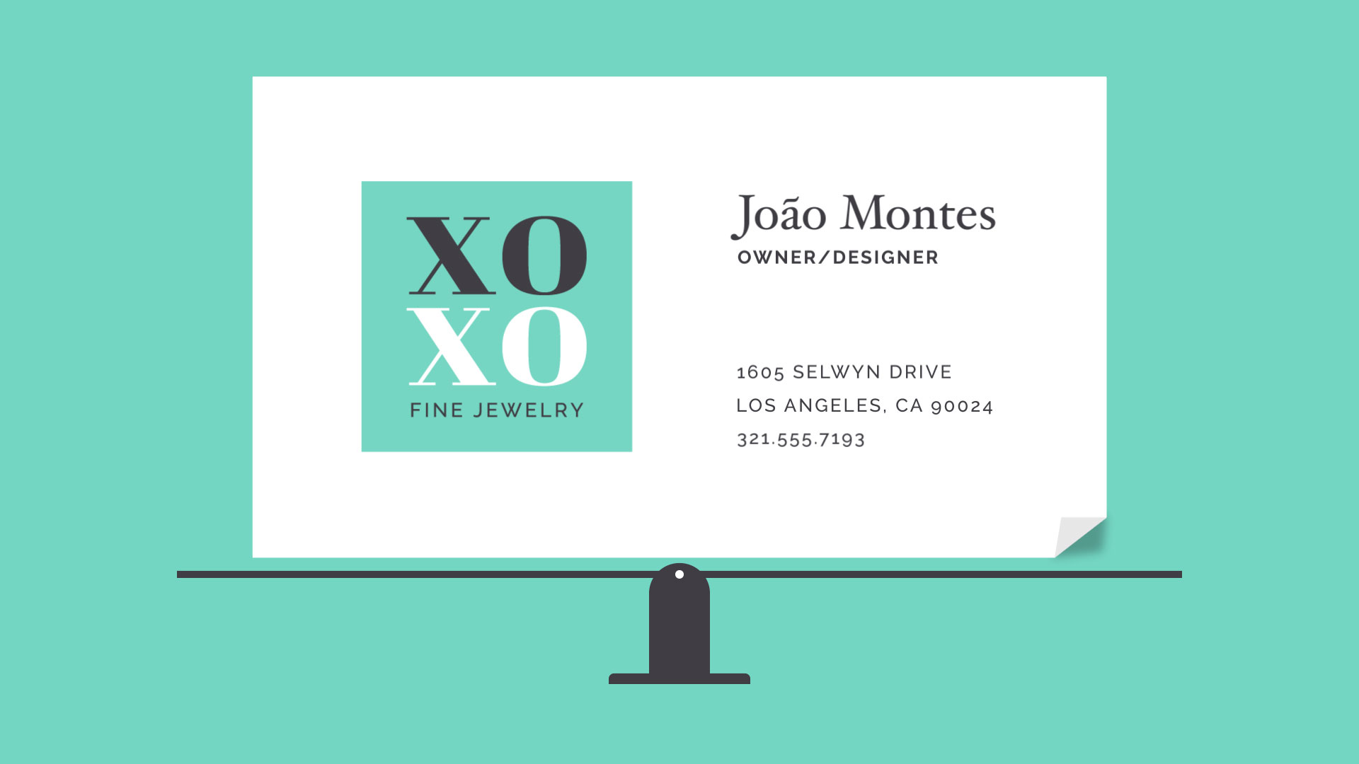
Symmetrical designs are the same or similar on both sides of an axis. They feel balanced because each side is effectively the same (if not identical).
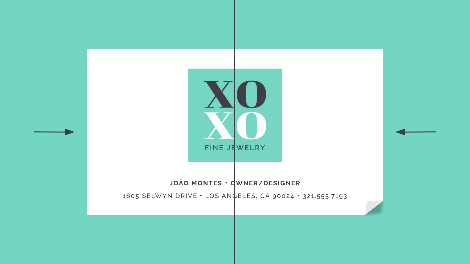
Asymmetrical designs are different, but the weight is still evenly distributed. The composition is balanced because it calls attention to the right things (in this example, the person's name and company logo).
The rule of thirds
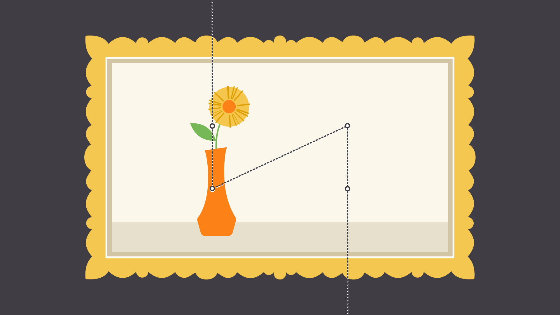
Many people, including designers and photographers, use a strategy called the rule of thirds. This imagines your work area divided into a 3x3 grid. The focal point of the image is placed on or near one of the grid lines, creating visual balance with the rest of the space.
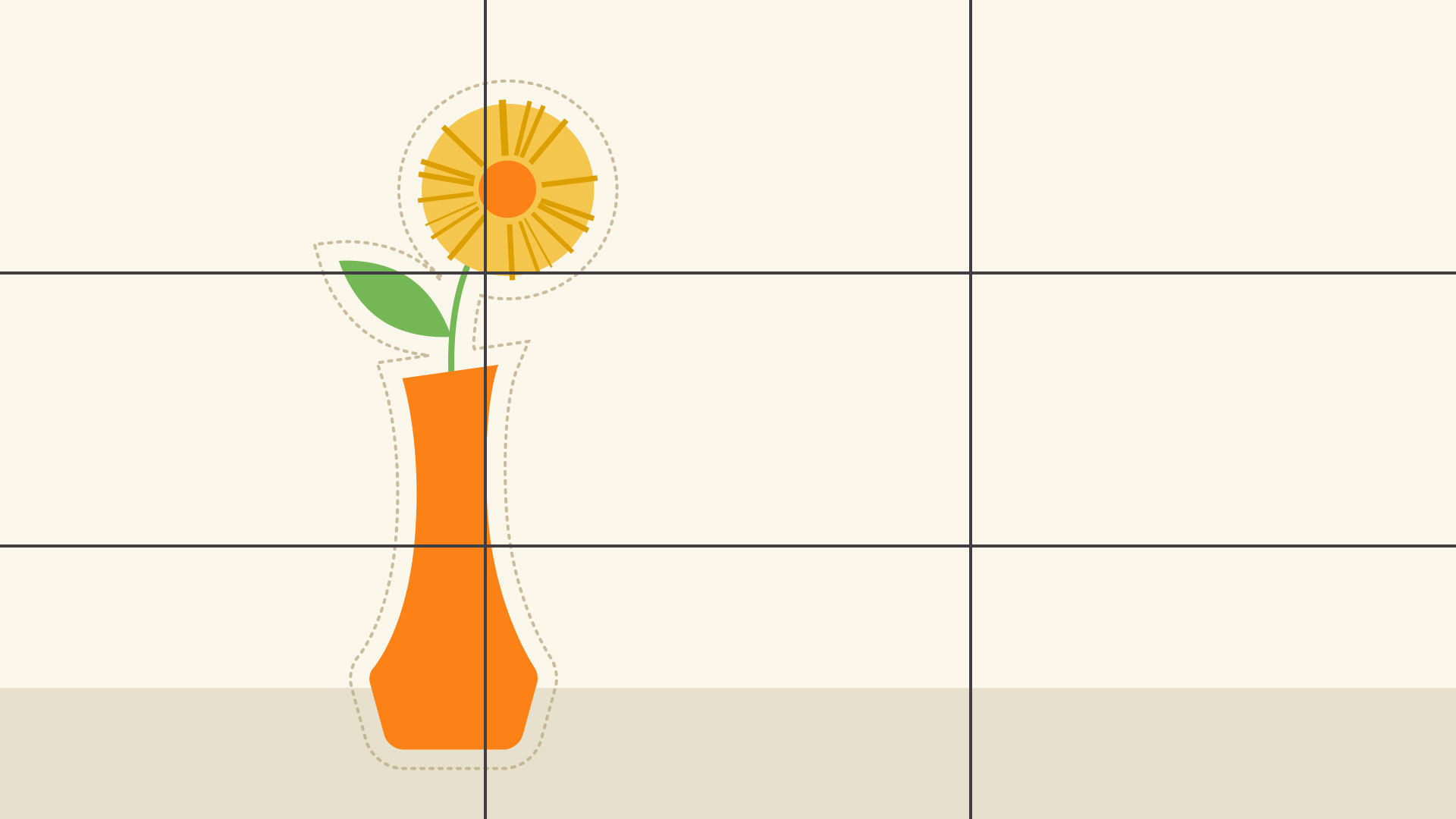
We find this type of composition appealing because, according to studies, the human eye naturally follows this path when scanning a design.
Putting it all together
The fundamentals of design are all about the bigger picture—in other words, learning to appreciate the many small details that make up every composition.
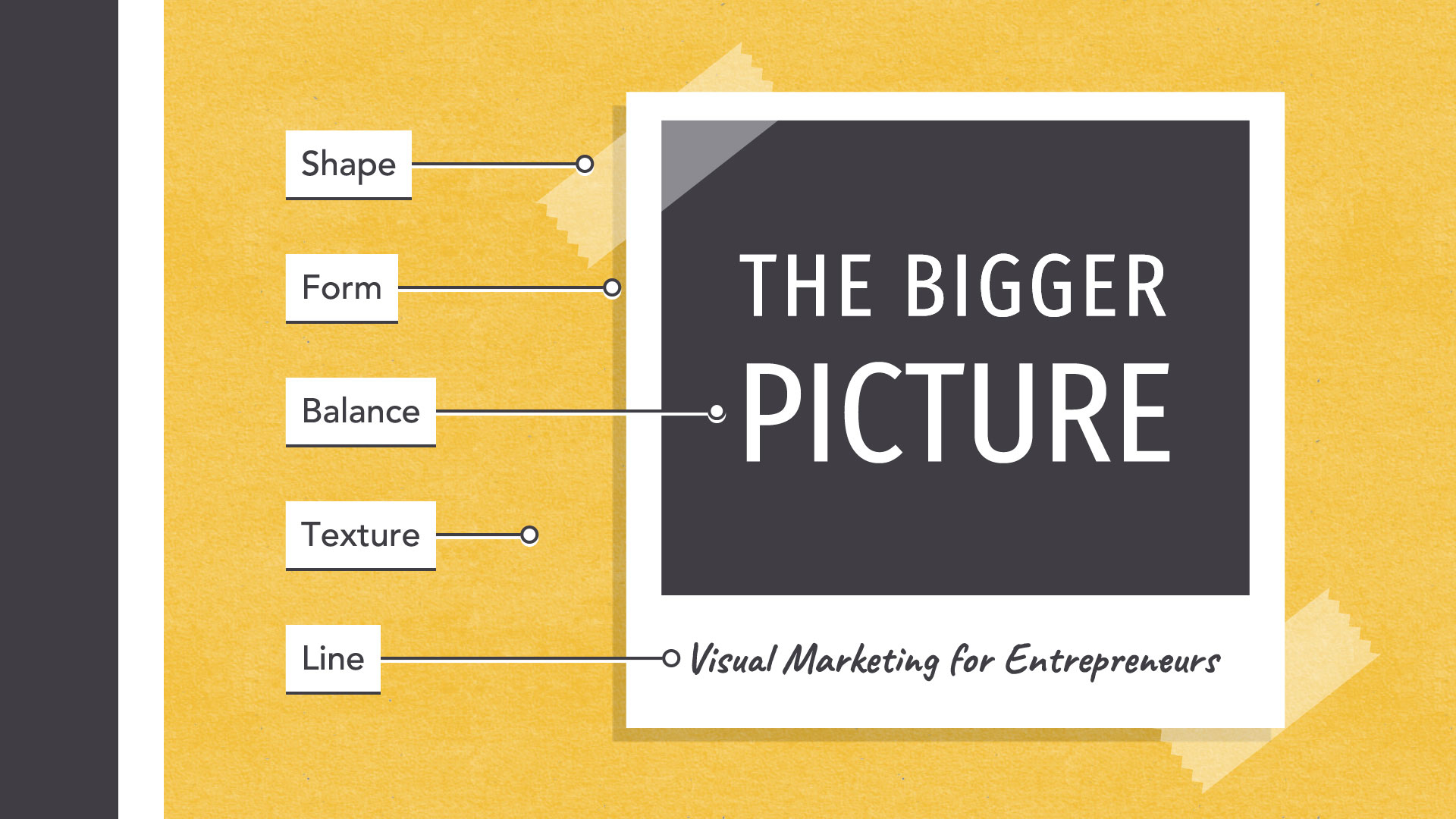
This insight can be applied to almost any type of project, whether you're creating your own graphics or just looking for simple ways to enhance your work.
We hope you enjoyed learning the fundamentals of design!
Created by
Shavikant Chauhan
Welcome to my website! My name is Anil Chauhan, and I am a 3D modeling and animation expert with over 15 years of experience in the field. I have a passion for creating visually stunning 3D models, animations, and graphics, and I'm excited to share my expertise with you. Whether you're a beginner or an experienced artist, I can help you improve your skills in 3D modeling, texturing, lighting, animation, rigging, CG graphics, and VFX. Let's work together to bring your creative ideas to life!
Welcome to my website! My name is Shavikant Chauhan, and I am a 3D modeling and animation expert with over 15 years of experience in the field. I have always had a passion for creating visually stunning 3D models, animations, and graphics, and my work has been featured in a variety of industries including film, television, advertising, and video games.
Throughout my career, I have had the opportunity to work on a wide range of projects, from small independent films to large-scale productions. This has given me a diverse set of skills and a deep understanding of the 3D animation process from start to finish. I have expertise in complete 3D modeling, texturing, lighting, animation, rigging, CG graphics, and VFX, and I'm always eager to take on new and exciting challenges.
As a tutor, I am dedicated to sharing my knowledge and experience with aspiring artists and professionals alike. I believe that everyone has the potential to create amazing 3D models and animations, and I'm committed to helping my students achieve their goals. Whether you're a beginner looking to get started in the world of 3D animation, or an experienced artist looking to take your skills to the next level, I can provide personalized training and guidance to help you achieve your creative vision.
Comments (0)
Search
Popular categories
Adobe After Effects 2025
30Unreal Engine
15zbrush
10Light
10Maya Animation
8zbrush tutorial jewelry
7Latest blogs
Introduction to Arnold in Maya
Mon, 24 Feb 2025
Substance to Maya Workflow
Sat, 22 Feb 2025

ZBrush User Interface Overview
Fri, 21 Feb 2025
Write a public review