Created by - Shavikant Chauhan
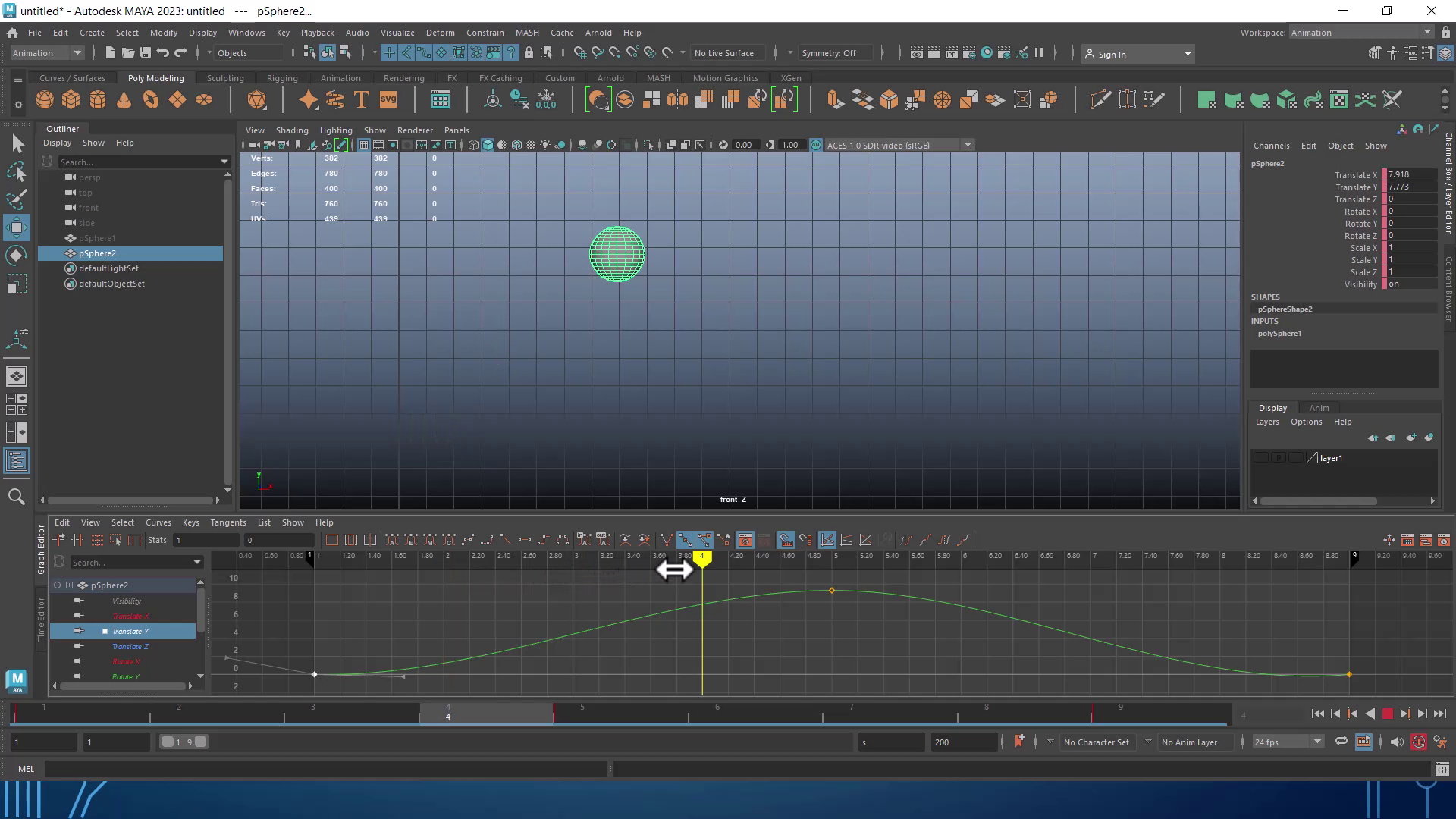
Maya Animation with 12 Principle describe
1. Squash and Stretch:2. Anticipation:3. Staging:4. Straight-Ahead and Pose-to-Pose:5. Follow-Through and Overlapping Action:6. Slow In and Slow Out:7. Arcs:8. Secondary Action:9. Timing:10. Exaggeration:11. Solid Drawing:12. Appeal:Applying these 12 Principles of Animation in Maya will help you create more engaging and realistic animations. They serve as a guide for achieving lifelike and visually appealing movement in your 3D animations.https://www.youtube.com/watch?v=tS0PCxM6tzk
More detailsPublished - Thu, 12 Oct 2023
Created by - Shavikant Chauhan
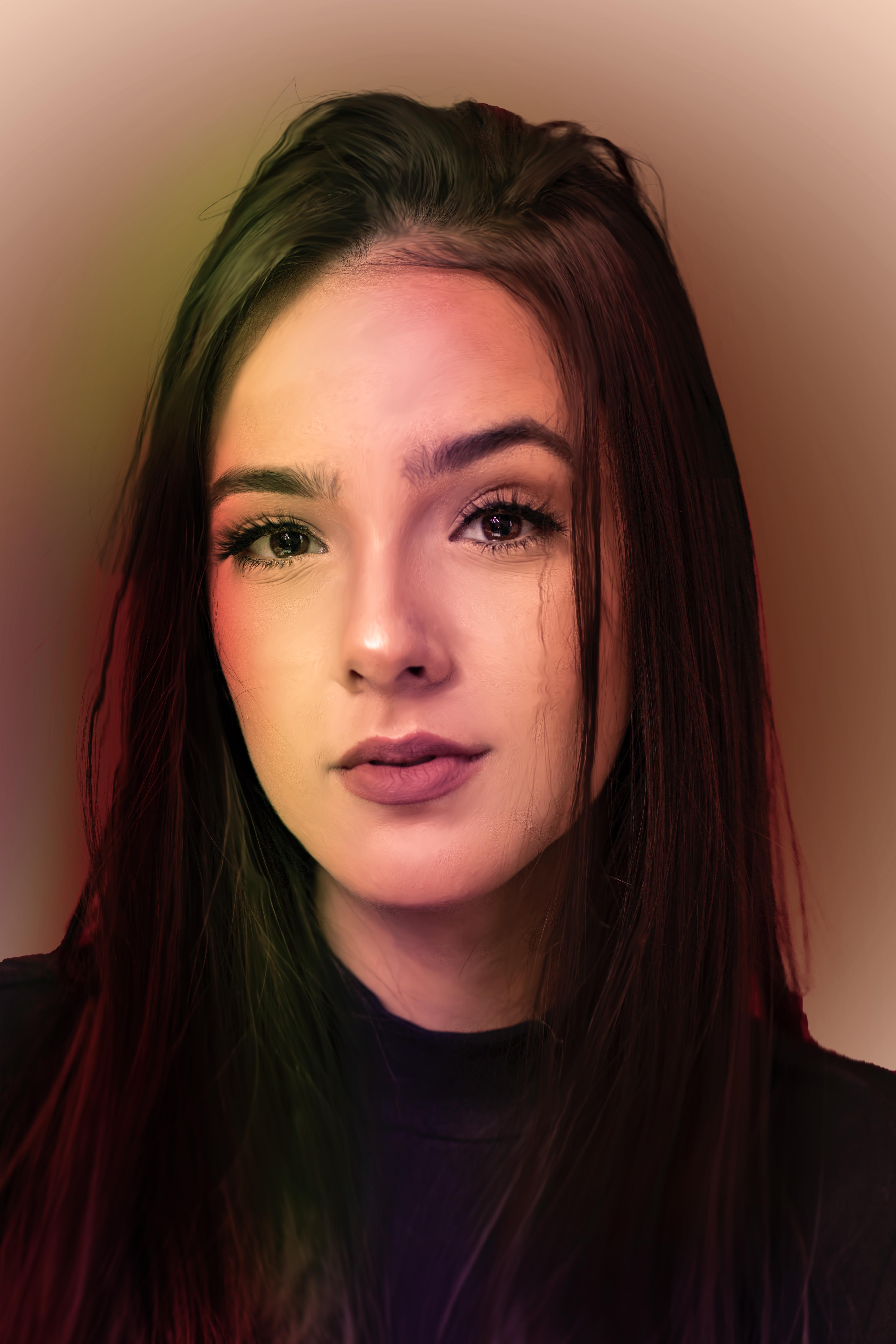
Adobe Photoshop Digital Painting
Adobe Photoshop is a popular software for digital painting, as it offers a wide range of tools and features that are well-suited for creating digital artwork. Here's a step-by-step guide on how to get started with digital painting in Adobe Photoshop:Set up your canvas:Open Adobe Photoshop and create a new document. Choose the size and resolution that you prefer for your digital painting. A larger canvas with a higher resolution is generally better for detailed work.Choose your brushes:Photoshop provides a variety of brushes, and you can also download or create custom brushes. Experiment with different brushes to find the ones that suit your style and needs.Select your colors:You can use the Color Picker to select the colors you want to use in your painting. Photoshop provides various color palettes and options for customizing colors.Start sketching:Begin with a rough sketch of your artwork. You can use the Brush tool with a low opacity setting to create a basic outline of your composition.Layer organization:Utilize layers to separate different elements of your painting. It's a good practice to create separate layers for the background, the main subject, and any additional details.Blocking in colors:Create a new layer underneath your sketch, and use the Brush tool to block in the basic colors of your painting. You can use the Eyedropper tool to sample colors from your reference images or choose them manually.Refining details:Once you have your basic colors in place, start refining the details in your painting. You can create new layers for each element or section you're working on. Experiment with brush opacity and flow settings to achieve the desired blending and texture.Shading and highlighting:To give your artwork depth and dimension, add shading and highlights. Consider the direction of your light source and how it affects the different parts of your painting.Textures and effects:Photoshop offers various tools and filters to add textures and effects to your artwork. You can experiment with filters, layer styles, and blending modes to achieve the desired look.Finishing touches:Pay attention to small details, make any necessary adjustments, and ensure your composition is balanced. Add final touches to enhance the overall quality of your digital painting.Save your work:Save your work regularly to avoid losing progress. You might also want to save a copy of your painting in a format that preserves layers (e.g., PSD) in case you need to make further edits.Export and share:When you're satisfied with your digital painting, export it to the desired file format (e.g., JPEG, PNG) and share it with others or use it for various purposes, such as printing or online display.Remember that digital painting is a creative process, and there are many techniques and styles you can explore. It's a good idea to practice, study other artists' work, and continue learning to improve your skills over time.
More detailsPublished - Fri, 13 Oct 2023

Created by - Shavikant Chauhan
Typography
Typography is everywhere we look. It's in the books we read, on the websites we visit, even in everyday life—on street signs, bumper stickers, and product packaging.But what exactly is typography? Simply put, typography is the style or appearance of text. It can also refer to the art of working with text—something you probably do all the time if you create documents or other projects for work, school, or yourself.Why is Typography Important?Typography is important for a number of reasons, from readability to aesthetics, branding, and emotions. Here are the five key elements of typograph1. Readability2. Aesthetics3. Branding4. Emotion5. AccessibilityCommon types of fontsTypography can be an intimidating subject, but it doesn't have to be. You only need to know a little to make a big difference in the stuff you do every day. So let's get started. First, some common types of fonts and what you need to know about them.Serif fontsSerif fonts have little strokes called serifs attached to the main part of the letter.Because of their classic look, they're a good choice for more traditional projects. They're also common in print publications, like magazines and newspapers.Sans serif fontsSans serif fonts don't have that extra stroke—hence the name, which is French for without serif.This style is considered more clean and modern than serif fonts. Also, it tends to be easier to read on computer screens, including smartphones and tablets.Display fontsDisplay fonts come in many different styles, like script, blackletter, all caps, and just plain fancy.Because of their decorative nature, display fonts are best for small amounts of text, like titles and headers and more graphic-heavy designs.Choosing a fontIn a way, fonts have their own language. They all have something to say beyond the words on the page. They can come across as casual or neutral, exotic or graphic. That's why it's important to think about your message, then choose a font that fits.Fonts to avoidSome fonts come with extra baggage, including Comic Sans, Curlz, and Papyrus. There's nothing particularly wrong with these fonts—they just have a certain reputation for being outdated and overused.If you find yourself tempted by them, think twice and consider using something else. There are many fonts with a similar look and feel that are less likely to detract from your message.Combining fontsWhen deciding which fonts to use, less is more. It's best to limit yourself to one or two per project. If you need more contrast, try repeating one of your fonts in a different size, weight, or style. This trick is practically foolproof for creating interesting combinations that work.You've probably heard that opposites attract. The same is true for fonts. Don't be afraid to combine font styles that are different but complementary, like sans serif with serif, short with tall, or decorative with simple. This can be challenging at first, but don't despair. Look to other designs for inspiration, and soon you'll get the hang of it.Other important termsMaybe you've heard terms like kerning, leading, tracking, and hierarchy. For those with more experience, these concepts are essential for creating professional-looking designs. As a beginner, you don't need to know everything about these terms—just enough to inform your work and help you talk about design with more confidence.HierarchyHierarchy is used to guide the reader's eye to whatever is most important. In other words, it shows them where to begin and where to go next using different levels of emphasis.Establishing hierarchy is simple: Just decide which elements you want the reader to notice first, then make them stand out. High-level items are usually larger, bolder, or different in some way. Remember to keep it simple and stick to just a few complementary styles.LeadingLeading (rhymes with wedding) is the space between lines of text, also known as line spacing.If you're not sure how much line spacing to use, don't fret—the default is usually fine. The goal is to make your text as comfortable to read as possible. Too much or too little spacing, as in the example below, can make things unpleasant for the reader.TrackingTracking is the overall space between characters, sometimes called character spacing. Most programs let you condense or expand this depending on your needs.In some designs, you might adjust your tracking to create a certain artistic effect. It can also help you fix fonts that are poorly spaced to begin with.KerningKerning is the space between specific characters. Unlike tracking, it varies over the course of the word because each letter fits together differently.Some fonts have what we call bad kerning, making certain letters look improperly spaced. If a font you're using has bad kerning, it's best to cut your losses and choose something else.Putting it all togetherWell-crafted text can mean the difference between something ordinary and something extraordinary—even if you're just getting started with design. All it takes is an interest in typography and you'll start to notice more, see more, and be able to do more in your own work.We hope you enjoyed learning the basics of typography!The power of colorColor plays a vital role in design and everyday life. It can draw your eye to an image. Sometimes it can trigger an emotional response. It can even communicate something important without using words at all.So how do we know which colors look good together and which ones don't? The answer is simple: Color theory.Artists and designers have followed color theory for centuries, but anyone can learn more about it. It can help you feel confident in many different situations, whether it's choosing colors for a design or putting together the perfect outfit. With a little insight, you'll be looking at color in a whole new way.Color basicsLet's start at the beginning with a refresher on the basics. Remember learning about primary and secondary colors in school? Then you already have some knowledge of color theory.Secondary colors are created by combining two primary colors. Red and yellow make orange; yellow and blue make green; and blue and red make purple.If we mix these colors together, we get even more in-between shades, like red-orange and yellow-green. All together, they form what's called a color wheel. (You can probably see where it gets its name.)A closer lookNow that you know about the color wheel, let's take it one step further with hue, saturation, and value. These are terms you might not encounter in daily life, but they're the key to understanding more nuanced colors—like all those little paint chips at the home improvement store.HueHue is the easiest one; it's basically just another word for color. In the example below, you might describe the hue as coral pink or light red, depending on your interpretation.SaturationSaturation refers to intensity—in other words, whether the color appears more subtle or more vibrant. Highly saturated colors are brighter or richer. Desaturated colors have less pigment and therefore less oomph.ValueValue has to do with how dark or light the color is, ranging from black to white. As you can see below, this gives us many different shades, from a deep reddish brown to a light pastel pink.Creating color schemesSo how do we put this all together to create professional-looking color schemes? There are actually tried-and-true formulas based on something called color harmony that can help.Color harmony uses the color wheel to illustrate time-tested color combinations. We'll explore some of the most common types of harmony below.MonochromaticThe easiest formula for harmony is monochromatic because it only uses one color or hue. To create a monochromatic color scheme, pick a spot on the color wheel, then use your knowledge of saturation and value to create variations.The best thing about monochromatic color schemes is that they're guaranteed to match. The colors suit each other perfectly because they're all from the same family.AnalogousAn analogous color scheme uses colors that are next to each other on the wheel, like reds and oranges or blues and greens.Don't be afraid to play with the palette and create your own unique interpretation. That's what color harmony is all about; the formulas are merely starting points to help guide and inspire you.ComplementaryComplementary colors are opposite each other on the wheel; for instance, blue and orange or the classic red and green.To avoid complementary color schemes that are too simplistic, add some variety by introducing lighter, darker, or desaturated tones.Split-complementaryA split-complementary color scheme uses the colors on either side of the complement.This gives you the same level of contrast as a complementary color scheme but more colors to work with (and potentially more interesting results).TriadicA triadic color scheme uses three colors that are evenly spaced, forming a perfect triangle on the wheel.These combinations tend to be pretty striking—especially when they include primary or secondary colors—so be mindful when using them in your work.TetradicTetradic color schemes form a rectangle on the wheel, using not one but two complementary color pairs. This formula works best if you let one color dominate while the others serve as an accent.Avoiding common mistakesThere are a few classic dos and don'ts when it comes to color. For instance, have you ever seen colors that seem to vibrate when they're placed next to each other?The solution is to tone it down—literally—and there's a simple way do it. Start with one color, and try adjusting its lightness, darkness, or saturation. Sometimes a little contrast is all your color palette needs.Readability is an important factor in any design. Your colors should be legible and easy on the eyes, especially when working with text.Sometimes that means NOT using color—at least not in every little detail.Neutral colors like black, white, and gray can help you balance your design, so when you do use color, it really stands out.Choosing the right colorsEvery color sends a message. It's important to consider the tone of your project, and choose a color palette that fits.For example, bright colors tend to have a fun or modern vibe.Desaturated colors often appear more serious or businesslike.Sometimes it just depends on the context. With practice and creativity, there's no limit to what you can do.Finding inspirationYou can find ideas for color schemes in all kinds of interesting places, from advertising and branding to famous works of art.You can even use a web resource to browse color palettes or generate your own.Experienced designers often take inspiration from the world around them. There's nothing wrong with finding something you like and making it your own.Putting it all togetherEverywhere you look, there's color, color, and more color. It can be intimidating to use it in your work, but it doesn't have to be. Just keep experimenting, and remember what you've learned about color theory. Soon, choosing great-looking colors will feel like second nature.We hope you enjoyed learning the basics of color!Be sure to check out the rest of our graphic design topics, including:What is composition?In many ways, layout and composition are the building blocks of design. They give your work structure and make it easier to navigate, from the margins on the sides to the content in between.Why is composition so important? In short, it's the way your content is arranged. It doesn't matter if you're working with text, images, or elements in a graphic; without a thoughtful, well-composed layout, your work would basically fall apart.Five basic principlesThe key to mastering layout and composition is to think like a designer. Luckily, it's easier than it sounds. There are five basic principles that can help you transform your work and sharpen your eye for design. Keep them in mind during your next project, and look for ways to apply them.ProximityProximity is all about using visual space to show relationships in your content. In practice, it's pretty simple—all you have to do is make sure related items are grouped together (for instance, blocks of text or elements in a graphic, as in the example below).Groups that are NOT related to each other should be separated to visually emphasize their lack of a relationship. All in all, this makes your work easier to understand at a glance, whether it's purely text or something more visual.White spaceWhite space is an important part of every composition. Now, this doesn't mean literal white space; it just means negative space, like the spaces between your content, between lines, and even the outer margins.There's no one way to use white space correctly, but it's good to understand its purpose. White space helps you define and separate different sections; it gives your content room to breathe. If your work ever starts to feel cluttered or uncomfortable, a little white space might be just what the doctor ordered.AlignmentAlignment is something you deal with all the time, even if you don't realize it. Whenever you type an email or create a document, the text is aligned automatically.When aligning objects by yourself (for instance, images or separate text boxes), getting it right can be tricky. The most important thing is to be consistent.It might help to imagine your content arranged inside of a grid, just like the example below. Notice how there's an invisible line centering each image to the text? Each grouping is also evenly spaced and aligned, with equal-sized margins.It's this attention to detail that makes the composition easier to navigate. Without consistent alignment, your work could start to feel disorganized.ContrastContrast simply means that one item is different from another. In layout and composition, contrast can help you do many things, like catch the reader's eye, create emphasis, or call attention to something important.To create contrast in the example below, we've used color, more than one style of text, and objects of differing sizes. This makes the design more dynamic and, therefore, more effective at communicating its message.HierarchyContrast is also closely tied to hierarchy, which is a visual technique that can help the viewer navigate your work. In other words, it shows them where to begin and where to go next using different levels of emphasis.Establishing hierarchy is simple: Just decide which elements you want the reader to notice first, then make them stand out. High-level or important items are usually larger, bolder, or more eye-catching in some way.RepetitionRepetition is a reminder that every project should have a consistent look and feel. This means finding ways to reinforce your design by repeating or echoing certain elements.For instance, if you have a specific color palette, look for ways to carry it through. If you've chosen a special header style, use it every time.It's not just for aesthetic reasons—being consistent can also make your work easier to read. When viewers know what to expect, they can relax and focus on the content.Putting it all togetherYou might say layout and composition are the unsung heroes of design. It's easy to overlook their role, but they're part of everything you do.The principles you just learned can help you elevate any project. All it takes is a little attention to detail and you can create beautiful, professional-looking compositions.We hope you enjoyed learning the basics of composition!The power of imagesImages can be a powerful force in design. No matter what the subject, we're naturally drawn to them. From beautiful, high-definition photos to carefully crafted graphics, they're usually the first thing we see.However, images aren't just for decoration. In design, they're the hook that draws the viewer in. Compelling visuals can help you connect with the audience—and make a strong impression—before they've even read a single word.Finding imagesYou don't have to be an artist to use images in your work. All it takes is a little creativity and a willingness to think outside the box. With the right resources, you can learn to set your designs apart. First: finding high-quality images for almost any type of project.Using stockMaybe you're handy with a camera or have some graphic design experience—that's great! If not, don't panic. There are countless online sources that offer images for exactly this purpose.The truth is, most people (including professionals) rely on free or low-cost images called stock. Stock is perfect when you need something specific—for example, a photo of a tiny dog in a teacup—and you don't have the time or resources to create it yourself.Choosing effective stockMost stock image sites let you browse or search their offerings. Look for results that are relevant to your project, but also unique in some way.In this example, we've searched for the word travel. The image below would be a fine choice because it subtly illustrates the concept but has a personal feel.As viewers, we're are naturally drawn to images that feel authentic, like distinct but believable photos and graphics that tell a story. The best images are somewhat open ended. They set the tone for your project but leave room for interpretation.Some stock images are just too generic to be effective. For instance, how many times have you seen a business presentation with something like the graphic below?For a more modern, professional design, avoid images that lack context or are too literal in meaning. Instead, look for imagery that's connected to your work, but in a more subtle, relatable way.Image usage rightsAlmost every stock image has a license that states how it can be used. Some are very generous and ask for little or nothing in return. Others are more restrictive and can have serious legal ramifications if disobeyed.Before you use a stock image, make sure you understand the license associated with it (you might need to do some research if it isn't clearly explained). If the license isn't listed alongside the image, double check the stock provider's policies or FAQs.To learn more about usage rights in general, review our Copyright and Fair Use lesson. For specific information on images, visit StockPhotoRights.com.The importance of qualityOf course, it's not just about content. There's also a technical side to images, which can have a big impact on your design. It doesn't matter if the photo you've chosen is absolutely perfect in every other way. If it's blurry or pixelated, it could give the wrong impression.Look for high-quality images that are sharp, clear, and free of distortion. In general, bigger is better, because it gives you more to work with. A large, high-resolution image can always be cropped or sized down, depending on the needs of the project.Unfortunately, it doesn't work the other way around. If you enlarge a small image—in other words, make it bigger than its original size—there will be a noticeable loss in quality. The image will become blurry and/or distorted, as in the example below.Raster vs. vectorThere's a reason small images lose quality when you enlarge them. It's because they're made up of thousands—sometimes even millions—of tiny little pixels. The word for this type of image is raster.When you view a raster image at its original size or smaller, the pixels are invisible—they're just too small to see. They only become apparent when you zoom in or make the image larger.Vector graphics are quite different from raster. You can make them any size, big or small, without losing quality. In the example below, the image has been enlarged, but there's no pixelation—not even a little bit.That's because vectors are made of something more complex than pixels. They're rendered using a special form of geometry. You're not likely to find vector graphics outside of professional design settings, but it's good to know what they are.Editing imagesFew stock images are perfect as is, even if they're technically high-quality ones. Maybe the image is the wrong size or the colors could use some work. Fortunately, even basic programs let you make simple adjustments. Look for these options the next time you need to fix or enhance an image.For a closer look at image editing, read our Image Editing 101 tutorial.CroppingCropping can be used to change the size, shape, or focus of an image, making it useful in many different situations.Try this feature if your graphic is the wrong dimensions, or if it includes something you'd rather cut out.ResizingResizing an image will ensure it's the perfect fit for your project. Just remember that you can't make an image bigger than its original size without affecting its quality.If the image you're working with simply isn't big enough, it's best to choose something else. You can also find a creative way to work with the image size you have. In the example below, we've added a background image instead of enlarging the portrait.Other adjustmentsCosmetic adjustments let you enhance certain image qualities, including brightness, contrast, saturation, and color.If your favorite program offers filters or presets, you can change your image dramatically with very little time and effort.Putting it all togetherAdding photos, graphics, and other visuals to your work is a great way to make it more engaging. Even a simple background image can transform your design into something special.Just remember what you've learned about image quality—both technical and conceptual—and your work is sure to stand out for the right reasons.We hope you enjoyed learning the basics of images!The basis of art, design, and moreThe fundamentals of design are the foundation of every visual medium, from fine art to modern web design. They're even present in seemingly unimportant details, like the fonts that make up most compositions.What do these examples have in common? Some very basic elements, including line, shape, form, texture, and balance. They might not seem like much on their own, but together, they're part of almost everything we see and create.The fundamentals can be intimidating at first, especially if you don't consider yourself an artist. But keep an open mind—there's a lot they can teach you about working with different assets and creating simple visuals from scratch.LineA line is a shape that connects two or more points. It can be fat, thin, wavy, or jagged—the list goes on. Every possibility gives the line a slightly different feel.Lines appear frequently in design; for example, in drawings and illustrations. They're also common in graphic elements, like textures, patterns, and backgrounds.Lines can be used in more humble compositions, too—for organization, emphasis, or just decoration. In the example below, lines have been used to create a flow chart that guides the reader's eye from one element to the next.When working with lines, pay attention to things like weight, color, texture, and style. These subtle qualities can have a big impact on the way your design is perceived.Look for places where lines are hiding in plain sight; for example, in text. Even here, experimenting with different line qualities can give you very different results.ShapeA shape is any two-dimensional area with a recognizable boundary. This includes circles, squares, triangles, and so on.Shapes fall into two distinct categories: geometric (or regular) and organic (where the shapes are more free form).Shapes are a vital part of communicating ideas visually. They give images heft and make them recognizable. We understand street signs, symbols, and even abstract art largely because of shapes.Shapes have a surprising number of uses in everyday design. They can help you organize or separate content, create simple illustrations, or just add interest to your work. See if you can spot the many examples in the image below.Shapes are important because they're the foundation of so many things. Learn to look for them in other designs, and soon you'll start seeing them everywhere.FormWhen a shape becomes 3D, we call it a form. Forms make up a variety of things in the real world, including sculptures, architecture, and other three-dimensional objects.However, forms don't have to be three-dimensional shapes. They can also be implied through illustration, using techniques like light, shadow, and perspective to create the illusion of depth.In two-dimensional design, form makes realism possible. Without it, renderings like the image below—a ball with highlights and shading—simply wouldn't be the same.Even images that are less realistic use similar techniques to create dimension. Below, the lighting and shading are stylized, but still hint at form and depth.In everyday composition, the purpose of form is the same, but on a smaller scale. For example, a simple shadow can create the illusion of layers or give an object a sense of place.Basic forms can bring a touch of realism to your work, which is a powerful tool when used in moderation.TextureTexture is the physical quality of a surface. Like form, it can be part of a three-dimensional object, as in the example below (a small prickly cactus in a shiny ceramic pot).Or it can be implied through illustration, suggesting that it would have texture if it existed in real life.In design, texture adds depth and tactility to otherwise flat images. Objects can appear smooth, rough, hard, or soft, depending on the elements at play.For beginners, textures make great background images and can add a lot of interest to your work. Look closely, and you may find texture in unexpected places, like distressed fonts and smooth, glossy icons.Just be careful not to go overboard—too much texture in a single design can quickly become overwhelming.BalanceBalance is the equal distribution of visual weight (more specifically, how much any one element attracts the viewer's eye). Balance can be affected by many things, including color, size, number, and negative space.Mastering balance can be tricky for beginners because it does take some intuition. Luckily, the design world is full of examples that can help you understand its different iterations.Symmetrical designs are the same or similar on both sides of an axis. They feel balanced because each side is effectively the same (if not identical).Asymmetrical designs are different, but the weight is still evenly distributed. The composition is balanced because it calls attention to the right things (in this example, the person's name and company logo).The rule of thirdsMany people, including designers and photographers, use a strategy called the rule of thirds. This imagines your work area divided into a 3x3 grid. The focal point of the image is placed on or near one of the grid lines, creating visual balance with the rest of the space.We find this type of composition appealing because, according to studies, the human eye naturally follows this path when scanning a design.Putting it all togetherThe fundamentals of design are all about the bigger picture—in other words, learning to appreciate the many small details that make up every composition.This insight can be applied to almost any type of project, whether you're creating your own graphics or just looking for simple ways to enhance your work.We hope you enjoyed learning the fundamentals of design!
More detailsPublished - Thu, 30 Nov 2023
Created by - Shavikant Chauhan
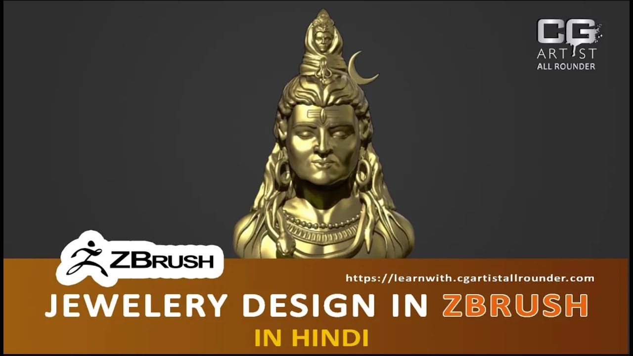
zbrush tutorial jewelry
Creating jewelry in ZBrush involves sculpting intricate designs and details. Here's a basic step-by-step tutorial for creating jewelry using ZBrush:Step 1: Setting UpOpen ZBrush and select a project or start a new one.Make sure your document size and resolution are suitable for detailed work. You can adjust these in the Document menu.Step 2: Basic ShapeChoose a base shape for your jewelry piece. You can start with a primitive like a sphere or cylinder.Use the basic sculpting brushes to shape your object. Pay attention to proportions and overall form.Step 3: DynaMeshEnable DynaMesh in the Geometry menu to add resolution where needed without stretching the mesh.Press "Ctrl + drag" on an empty canvas area to activate DynaMesh and refine the geometry.Step 4: DetailingSwitch to finer brushes like ClayBuildup, DamStandard, and Move to add intricate details.Use the Standard brush with a low intensity to carve patterns and designs into the surface.Step 5: Insert BrushesUtilize Insert Brushes to add pre-made elements like gemstones, loops, or other decorative elements.Adjust the placement and size of these elements to fit your design.Step 6: SubtoolsDivide your model into subtools for better organization.Create a new subtool for each distinct part of your jewelry piece, like the band, gems, or connectors.Step 7: PolypaintUse the Polypaint feature to add color to your jewelry. This is especially useful for visualizing the final result.Assign different materials to various subtools for a more realistic look.Step 8: RenderingSet up lighting and materials in the Render menu to showcase your jewelry in the best way possible.Experiment with different materials, reflections, and shadows to achieve the desired look.Step 9: ExportOnce satisfied with your design, export the model. Common formats include STL for 3D printing or OBJ for use in other software.Step 10: RefinementFine-tune your design based on feedback or personal preferences.Make sure the model is suitable for the intended purpose, whether it's for 3D printing, rendering, or other applications.Additional Tips:Brush Customization: Explore and customize your brushes to suit the specific needs of jewelry design.Reference Images: Use reference images for inspiration and to ensure accuracy in your designs.ZModeler: Experiment with the ZModeler brush for creating precise geometric shapes and clean edges.Remember, this is a basic overview, and there's a lot more to explore in ZBrush for jewelry design. Practice and experimentation will help you develop your skills further.YouWhat you'll learn in zbrush tutorial jewelry description ChatGPTChatGPTIn a ZBrush tutorial for jewelry design, you can expect to learn the following key concepts and skills:Basic ZBrush Navigation:Familiarize yourself with the ZBrush interface.Learn navigation controls, including rotating, panning, and zooming.Primitive Shapes and Sculpting:Start with primitive shapes as a base for your jewelry design.Use sculpting brushes to shape and refine the overall form of your jewelry piece.DynaMesh Workflow:Understand the basics of DynaMesh for adding and redistributing geometry.Learn how to use DynaMesh to maintain a uniform mesh resolution.Detailing Techniques:Explore various sculpting brushes for adding intricate details to your jewelry.Understand the importance of brush intensity, size, and stroke in detailing.Insert Brushes:Learn how to use Insert Brushes to add predefined elements like gemstones or decorative features to your design.Understand how to manipulate and customize inserted elements.Subtools and Organization:Divide your model into subtools for better organization and control.Create and manage subtools for different parts of your jewelry piece.Polypaint:Use the Polypaint feature to add color and texture to your jewelry model.Assign different materials to achieve a realistic appearance.Rendering in ZBrush:Set up lighting and materials for rendering your jewelry design within ZBrush.Experiment with different rendering settings to enhance the presentation of your model.Exporting for Different Purposes:Understand how to export your jewelry model in suitable formats for various purposes (e.g., 3D printing, rendering in other software).Refinement and Iteration:Learn the importance of refining your design based on feedback or personal preferences.Understand the iterative process of making adjustments to achieve the desired result.Advanced Techniques (Optional):Depending on the tutorial, you might explore more advanced techniques such as using ZModeler for precise geometry, customizing brushes, or incorporating additional features.Remember, each tutorial may have its own unique focus and may cover additional topics based on the instructor's expertise and the specific goals of the tutorial. It's also recommended to practice regularly and experiment with the tools and techniques to develop your skills further.#ZBrush#JewelryDesign#DigitalSculpting#3DModeling#ZBrushTutorial#JewelryArt#DigitalArt#3DPrinting#SculptingTechniques#ZBrushTips#JewelryRendering#ZBrushWorkflow#GemstoneDesign#JewelryCreation#ZBrushArtist#CreativeProcess#JewelryCrafting#DigitalDesign#ZBrushLearning#JewelryPrototyping
More detailsPublished - Mon, 11 Dec 2023

Created by - Shavikant Chauhan
ANIMATION
Maya, a 3D computer graphics software developed by Autodesk, is commonly used for animation, and animators often adhere to the principles of animation to create compelling and realistic movement. The 12 principles of animation were introduced by Disney animators Frank Thomas and Ollie Johnston in their book "The Illusion of Life." These principles are fundamental guidelines for creating lifelike and engaging animations. Here's how you can apply them in Maya:1. **Squash and Stretch:** - Use the squash and stretch technique to exaggerate the movement of objects or characters. This principle adds flexibility and weight to the animation.2. **Anticipation:** - Prepare the audience for an action by incorporating a brief movement in the opposite direction before the main action. This helps build tension and makes the movement more realistic.3. **Staging:** - Clearly present an idea, ensuring that the audience understands the action or story. Use composition, lighting, and camera angles to direct the viewer's attention.4. **Straight Ahead Action and Pose to Pose:** - In straight-ahead animation, the animator starts from the first frame and progresses to the last. In pose-to-pose animation, key poses are created first, and the animator fills in the intervals later. Use a combination of both approaches as needed.5. **Follow Through and Overlapping Action:** - Include secondary actions that follow the main movement to create a more natural and fluid motion. Overlapping action involves elements moving at different rates.6. **Slow In and Slow Out:** - Objects or characters should start and end their movements gradually, with more frames at the beginning and end of an action and fewer frames in the middle.7. **Arcs:** - Natural motions follow curved paths. Implementing arcs in your animations adds realism and fluidity to movement.8. **Secondary Action:** - Support the main action with additional, complementary movements to enhance the overall animation and add depth to the character or scene.9. **Timing:** - The timing of movements contributes to the overall feel of an animation. Experiment with different frame rates and spacing to achieve the desired effect.10. **Exaggeration:** - Enhance movements and expressions by exaggerating them. This makes animations more engaging and entertaining.11. **Solid Drawing:** - Understand three-dimensional space and ensure that characters and objects maintain a consistent volume and form as they move.12. **Appeal:** - Create characters and scenes that are visually appealing. This involves designing characters with interesting and memorable traits and ensuring that the animation is aesthetically pleasing.In Maya, animators typically use keyframes and the graph editor to manipulate objects and characters over time. Understanding these 12 principles and incorporating them into your workflow can significantly improve the quality of your animations in Maya or any other animation software.
More detailsPublished - Sat, 16 Dec 2023
Created by - Shavikant Chauhan
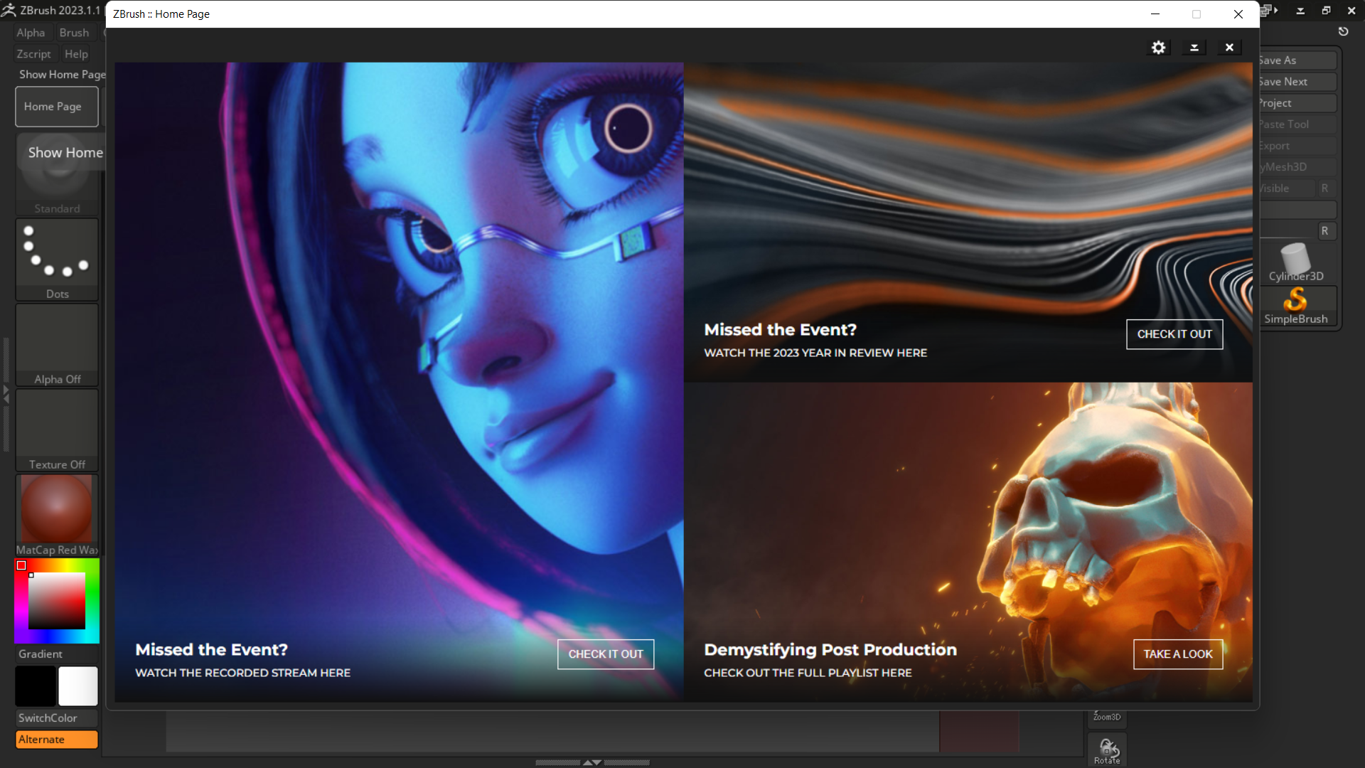
zbrush 2023.1.1
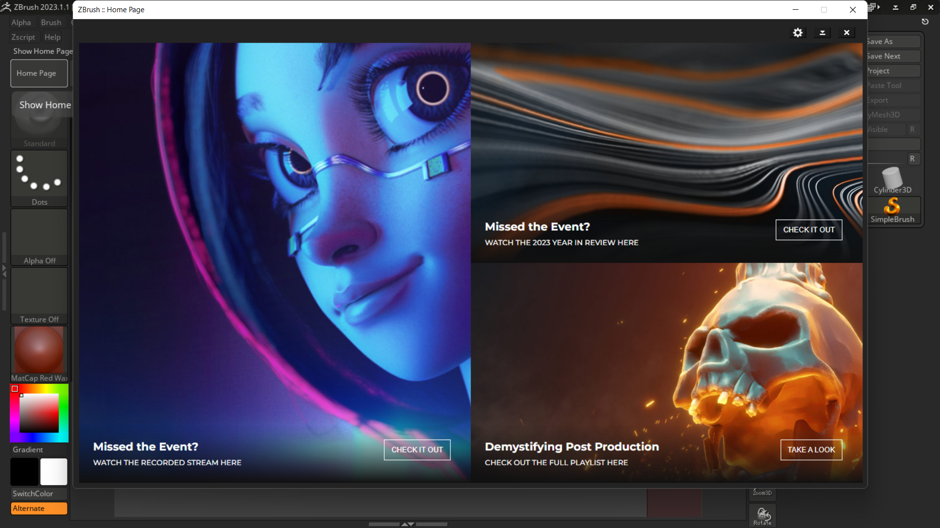
As of my last knowledge update in January 2023, I don't have specific details about the features introduced in ZBrush 2023.1.1. However, I can provide a general introduction to ZBrush and its features based on previous versions.**ZBrush Overview:**ZBrush is a digital sculpting and painting software that allows artists to create highly detailed 3D models. It is widely used in industries such as film, video games, and animation for its powerful and intuitive sculpting capabilities.**Key Features of ZBrush:**1. **DynaMesh:** ZBrush uses a unique modeling technology called DynaMesh, which allows artists to dynamically adjust the resolution of their models as they sculpt. This provides a flexible and non-destructive way to work with 3D geometry.2. **ZSpheres:** ZSpheres are a powerful tool for creating base meshes. They allow artists to quickly sketch out the main forms of a character or object before refining the details.3. **Sculpting Brushes:** ZBrush comes with a wide variety of sculpting brushes that simulate different artistic tools. These brushes allow artists to shape, smooth, and add intricate details to their models.4. **Subdivision Surfaces:** ZBrush supports subdivision surfaces, allowing artists to work with high-resolution models while maintaining control over the level of detail.5. **Polypaint:** ZBrush allows artists to paint directly on the surface of their 3D models using Polypaint. This is useful for adding color and texture details to the models.6. **ZRemesher:** ZRemesher is a tool for automatic retopology, helping artists create clean and optimized geometry for their models.7. **Fibermesh:** Fibermesh is a feature that enables the creation of realistic hair and fur on 3D models.8. **Rendering:** ZBrush includes a built-in renderer that allows artists to create high-quality renders of their models.9. **Live Boolean:** Live Boolean is a feature that allows artists to preview the results of boolean operations in real-time, making it easier to create complex shapes.**Learning Resources:**If you're new to ZBrush or want to learn about the latest features in ZBrush 2023.1.1, you can explore the following resources:1. **Official Documentation:** Check the official Pixologic website for the latest documentation and release notes.2. **Video Tutorials:** There are many video tutorials available online, including on the Pixologic website, YouTube, and other tutorial platforms.3. **Online Communities:** Joining ZBrush communities, forums, or social media groups can be a great way to connect with other users, share experiences, and get help.Remember to check the official sources for the most accurate and up-to-date information on ZBrush and its features.
More detailsPublished - Sat, 16 Dec 2023
Created by - Shavikant Chauhan
Getting started with zbrush
ZBrush is a powerful digital sculpting software widely used in the entertainment industry for creating detailed and high-resolution 3D models. Here's a basic guide to help you get started with ZBrush:### 1. **Installation:** - Download and install ZBrush from the official Pixologic website. - Make sure your computer meets the system requirements.### 2. **Interface Overview:** - Familiarize yourself with the ZBrush interface. It has a unique layout with various panels and customizable features. - Understand the navigation controls, such as rotating, panning, and zooming.### 3. **Basic Navigation:** - Rotate: Right-click and drag - Pan: Hold down the Alt key and right-click and drag - Zoom: Hold down the Alt key and right-click and drag up or down### 4. **ZBrush Concepts:** - **ZBrush Core Concepts:** Understand terms like ZSphere, Subtool, DynaMesh, ZRemesher, and more. These are fundamental to ZBrush workflows.### 5. **Brushes and Sculpting:** - Explore the Brush palette to understand different brushes for sculpting. - Start with simple shapes and experiment with brushes to understand their effects. - Use the "Sculptress Pro" mode for dynamic tessellation and detailed sculpting.### 6. **Subtools:** - Learn about Subtools, which allow you to work on separate pieces of geometry within the same project. - Use the Subtool palette to manage and manipulate different parts of your model.### 7. **Dynamesh and ZRemesher:** - DynaMesh is a feature that allows you to dynamically remesh your model, providing more uniform geometry. - ZRemesher helps in creating cleaner and more organized topology for your models.### 8. **PolyPainting:** - ZBrush allows you to paint directly on your 3D models. Use the Color palette to apply PolyPaint to your sculptures.### 9. **Texturing and Materials:** - Explore the Texturing and Material palettes to apply textures and materials to your models. - Experiment with the various materials and shaders available.### 10. **Rendering:** - Familiarize yourself with the BPR (Best Preview Render) functionality for rendering your models. - Learn about lighting, shadows, and other rendering settings.### 11. **Save and Export:** - Save your ZBrush project regularly. Use the Tool palette to save individual tools. - When finished, export your models in a suitable format for use in other software.### 12. **Community and Resources:** - Join the ZBrushCentral community for support, inspiration, and sharing your work. - Explore online tutorials and documentation on the official Pixologic website.### 13. **Practice:** - The best way to learn ZBrush is through hands-on practice. Sculpt different objects, characters, and environments to refine your skills.Remember that ZBrush has a steep learning curve, but with practice and exploration, you'll become more comfortable with its tools and features. Don't hesitate to consult the official documentation and community forums when you encounter challenges.
More detailsPublished - Sat, 16 Dec 2023
Created by - Shavikant Chauhan
Adobe After Effects 2023
Adobe After EffectsComputer programDescriptionAdobe After Effects is a digital visual effects, motion graphics, and compositing application developed by Adobe Inc.; it is used in the post-production process of film making, video games and television production. Among other things, After Effects can be used for keying, tracking, compositing, and animation. WikipediaInitial release date: January 1993Programming languages: C++, Compatibility of C and C++Developer(s): CoSA (1993); Aldus Corporation (1993-1994); Adobe Inc. (1994-present)License: Trialware, software as a service (SaaS)Operating system: Windows 10 (x64 only) V20H2 or later; macOS Monterey v12.0 or laterOriginal author(s): Company of Science and Art Stable release: 2023 (23.6) / June 20, 2023; 5 months agoAdobe After Effects 2023 FeaturesBelow are some noticeable features which you will experience after Adobe After Effects 2023 Free DownloadAllows you to create interactive motion graphics and visual effects for film, TV, video, and the web.Provides a wide range of innovative tools and features to design animated graphics and visual effects at professional level.Ideal tool for movie, TV, and audiovisual professionals to create animations.Apply all sorts of effects to moving images or work on all three dimensions of their videos.Combines everything from intros to transitions, logo reveals, titles in a single package.Brings high-quality, easy-to-use After Effects templates that will elevate your multimedia content.Allows you to create motion graphics compositions while preserving the integrity of key frames such as intros and outros.Customize your graphics easily by adding the text strings, camera lights, solid colors and new distinct layers.Lets you view the composition as a flowchart in order to ensure the smooth manipulation of its components.Ability to render the 3D graphics and add motion to them.Ability to combine 2D and 3D elements in the same composition.Offers a simple and intuitive interface with self-explaining and familiar options that can be operated by beginners and pros alike.Adobe After Effects 2023 Technical Setup DetailsPrior to start Adobe After Effects 2023 Free Download, ensure the availability of the below listed system specificationsSoftware Full Name: Adobe After Effects 2023Setup File Name: Adobe_After_Effects_v23.2.1.3.rarSetup Size: 2.5 GBSetup Type: Offline Installer / Full Standalone SetupCompatibility Mechanical: 64 Bit (x64)Latest Version Release Added On: 24th Feb 2023Developers: AdobeSystem Requirements for Adobe After Effects 2023Operating System: Microsoft Windows 10 (64-bit) V20H2 or laterRAM: 16 GB of RAM required.Hard Disk: 15 GB of free space required.Processor: Intel or AMD Quad-Core ProcessorGPU: 2 GB of GPU VRAMAdobe After Effects is a powerful motion graphics and visual effects software widely used in the film, television, and web design industries. Here's a basic guide to help you get started with After Effects:### 1. **Installation:** - Install Adobe After Effects on your computer. You can either purchase it as a standalone application or as part of the Adobe Creative Cloud subscription.### 2. **Interface Overview:** - Familiarize yourself with the After Effects interface. Understand the main panels like Project, Composition, Timeline, and Tools.### 3. **Project Setup:** - Create a new project and set your preferences. Organize your assets in the Project panel.### 4. **Create a Composition:** - Click on the "New Composition" button to create a new composition. Set the composition settings, including resolution, frame rate, and duration.### 5. **Import Media:** - Import your media files (footage, images, audio) into the Project panel. You can drag and drop files or use the File > Import menu.### 6. **Timeline and Layers:** - Understand the timeline. Layers in After Effects work similarly to Photoshop or Illustrator. Arrange your layers in the timeline to control the stacking order.### 7. **Keyframes and Animation:** - After Effects is keyframe-based. Use keyframes to animate properties over time. You can set keyframes for position, scale, opacity, and more.### 8. **Effects and Presets:** - Explore the Effects & Presets panel to add various effects to your layers. Experiment with different effects to enhance your composition.### 9. **Text and Typography:** - After Effects has powerful text tools. Create and animate text layers using the Text tool and properties in the timeline.### 10. **Masking:** - Learn how to use masks to control the visibility of layers. Masks are useful for isolating specific areas or creating complex visual effects.### 11. **Precomposing:** - Precomposing allows you to group layers together. Right-click on selected layers and choose "Pre-compose" to create a new composition with those layers.### 12. **Rendering and Exporting:** - Once your composition is ready, render and export your video. Go to Composition > Add to Render Queue. Set your output settings and click Render.### 13. **Plugins and Scripts:** - Explore third-party plugins and scripts to extend After Effects' capabilities. Popular plugins like Element 3D or Trapcode Suite can add advanced features.### 14. **Tutorials and Resources:** - There are plenty of online tutorials and communities dedicated to After Effects. Websites like Video Copilot, Adobe's official tutorials, and YouTube channels provide valuable learning resources.### 15. **Practice and Experiment:** - Practice is crucial. Experiment with different features, try out new effects, and create small projects to improve your skills.Remember, After Effects can be complex, but with regular practice and exploration, you'll become more comfortable and proficient in creating stunning visual effects and animations.
More detailsPublished - Mon, 18 Dec 2023

Created by - Shavikant Chauhan
Vray Introduction
Introduction to VrayV-Ray is a biased computer-generated imagery rendering software application developed by Bulgarian software company Chaos.What is V-Ray used for?What is V-Ray used for? V-Ray is used to create high-quality 3D visualizations in multiple industries. In design and architecture, V-Ray allows you to communicate your ideas to customers, engineers, and construction companies. ChatGPT 3.5 V-Ray is a powerful and widely used rendering engine that is popular in the field of computer graphics and 3D rendering. Developed by Chaos Group, V-Ray is known for its advanced rendering capabilities and is used in various industries, including architecture, interior design, product design, and visual effects in film and television. Here's a brief introduction to V-Ray: 1. Rendering Engine: · V-Ray is a rendering engine, which means it is a software component responsible for generating images from 3D models. It simulates the behavior of light in a virtual environment to create realistic images. 2. Integration: · V-Ray is designed to work as a plugin for various 3D modeling and animation software. Some of the most popular integrations include Autodesk 3ds Max, Maya, SketchUp, Rhino, Cinema 4D, and more. 3. Global Illumination: · One of V-Ray's strengths is its ability to simulate realistic global illumination effects. This includes accurate representations of how light interacts with surfaces, creating lifelike shadows, reflections, and refractions. 4. Materials and Textures: · V-Ray offers a wide range of materials and textures to simulate different surfaces accurately. This includes options for creating realistic reflections, bump maps, and specular highlights. 5. Adaptive DMC: · V-Ray uses an adaptive sampling technique called Distributed Monte Carlo (DMC), which helps in efficiently sampling the scene, reducing noise, and improving rendering speed. 6. V-Ray RT: · V-Ray RT (Real-Time) is a feature that allows users to see a nearly instantaneous preview of their scenes as they make changes. This is useful for iterative design and quick feedback. 7. Denoiser: · V-Ray includes a denoising feature that helps reduce the noise in rendered images, providing cleaner results in less time. 8. VR and Virtual Reality: · V-Ray supports virtual reality (VR) rendering, enabling users to create immersive experiences and walkthroughs of their 3D environments. 9. V-Ray Cloud: · Chaos Group provides a cloud rendering service called V-Ray Cloud, allowing users to offload rendering tasks to a cloud infrastructure, which can be particularly useful for resource-intensive projects. 10. Educational Resources: · V-Ray has an extensive community and numerous tutorials and documentation resources to help users learn and improve their rendering skills. Keep in mind that V-Ray is a professional-grade tool, and while it offers a wealth of features, it may have a learning curve for beginners. However, its capabilities make it a popular choice among professionals in the field of 3D rendering and visualization.
More detailsPublished - Tue, 19 Dec 2023
Search
Popular categories
Adobe After Effects 2025
30Unreal Engine
15zbrush
10Light
10Maya Animation
8zbrush tutorial jewelry
7Latest blogs
Introduction to Arnold in Maya
Mon, 24 Feb 2025
Substance to Maya Workflow
Sat, 22 Feb 2025
ZBrush User Interface Overview
Fri, 21 Feb 2025
Write a public review